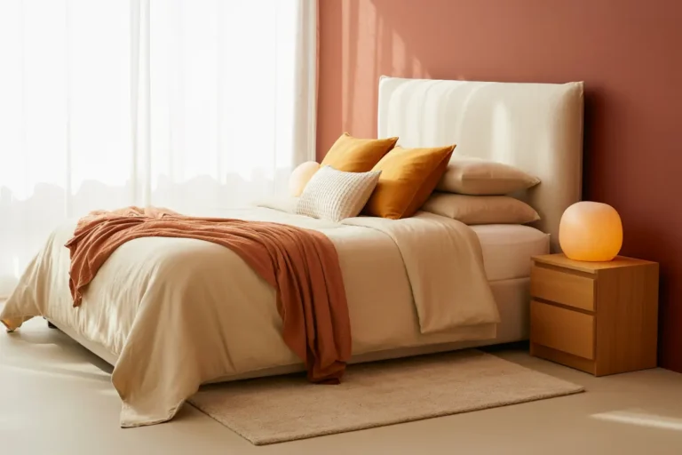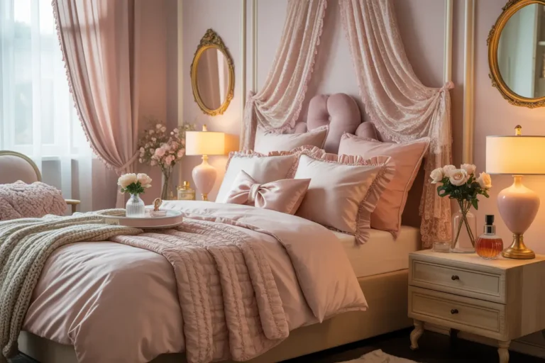
30 Bedroom Color Pairings for a Cozy, Modern Home

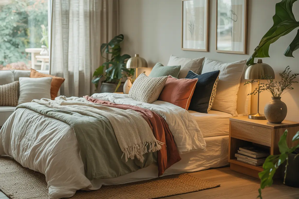
Your bedroom is the one room that gets to be selfish. It does not need to impress guests, match the kitchen, or survive muddy shoes. It only needs to make you exhale the second you walk in.
The fastest way to get that feeling? Pick two colors that like each other. Not five. Two. A grounding shade and a softening shade, working as a team.
Below you will find 30 bedroom color pairings that hit the sweet spot between cozy and modern — warm enough to sink into, clean enough to feel current. Each one includes the exact shades, the textures that make them sing, and one small change you can make this weekend.
Grab a coffee. Save your favorites. Let’s find your two.
1. Warm Ivory + Charcoal Gray
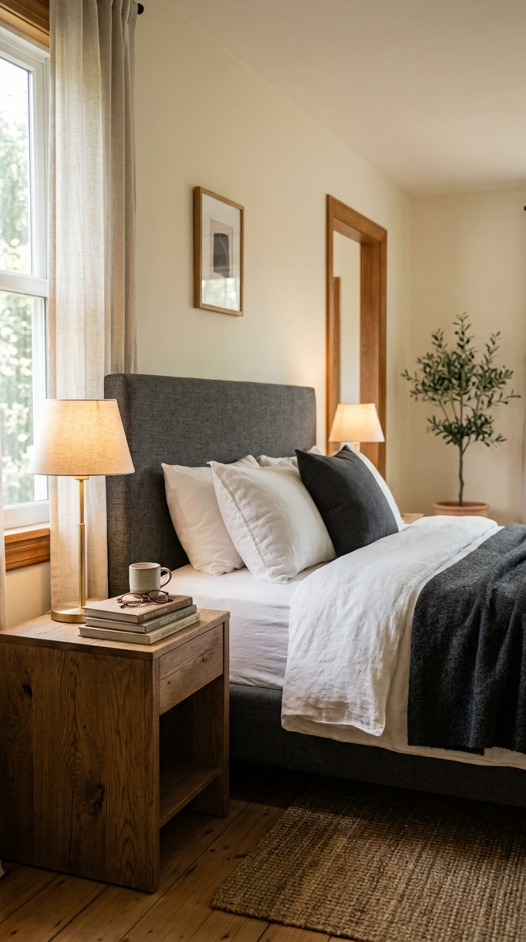
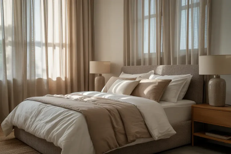
This pairing gives you contrast without coldness. Paint the walls warm ivory, then bring in charcoal through a linen headboard, a matte black-gray lamp base, and a chunky knit throw folded at the foot of the bed.
The trick is keeping charcoal off the walls entirely. Let it live in fabric and metal instead, where it reads as depth rather than heaviness.
Layer white cotton sheets under a charcoal wool blanket, then add one aged oak nightstand to warm the whole thing up. A single brass reading lamp with a warm bulb keeps the mood soft after dark.
Try this weekend: Swap your throw pillows for two charcoal linen covers. Instant weight, zero commitment.
2. Sage Green + Oat Beige
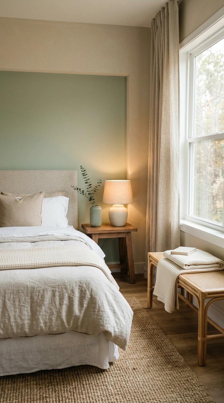
Sage green calms a room the way a quiet room calms your shoulders. Pair it with oat beige and you get a cozy modern bedroom that feels like a walk through a field at dusk.
Paint three walls oat beige and the headboard wall sage. Then echo the sage in a ribbed ceramic vase and a folded waffle blanket.Textures matter here: raw linen curtains, a jute rug with a low pile, and a rattan bench under the window. Skip anything glossy — sage looks best with matte and nubby finishes.
Try this weekend: Add one live eucalyptus stem in a clay bottle on your nightstand. It ties the palette together for under ten dollars.
I’ve found that a waffle weave sage green throw blanket is an easy way to repeat the accent color without making the room feel busy. The soft texture adds warmth and depth while blending naturally with linen, jute, and other matte finishes in the space.
3. Dusty Rose + Warm Cognac
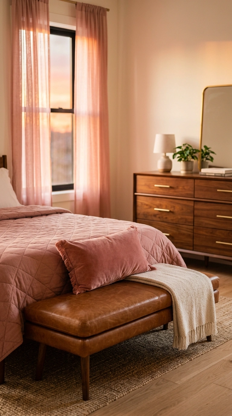
Dusty rose stops being sweet the second you put a leather-toned brown next to it. Cognac gives it a grown-up backbone.
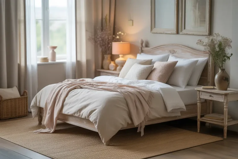
Keep the rose on soft surfaces — a quilted duvet, a velvet lumbar pillow, sheer rose curtains that glow at sunset. Put cognac in the hard stuff: a leather bench, a mid-century walnut dresser, brushed brass drawer pulls.
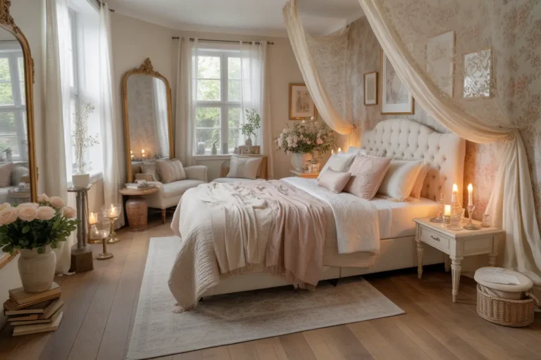
The room lands somewhere between romantic and editorial. Warm ivory walls let both colors breathe without competing.
Try this weekend: Drape a cognac leather strap or belt-style tray across your dresser. It sounds odd. It looks incredible.
One thing I always reach for is a dusty rose velvet lumbar pillow because it brings in the color with just enough texture. It softens the richer cognac tones and helps the whole bedroom feel warm, balanced, and quietly inviting without adding visual clutter.
4. Deep Olive + Cream
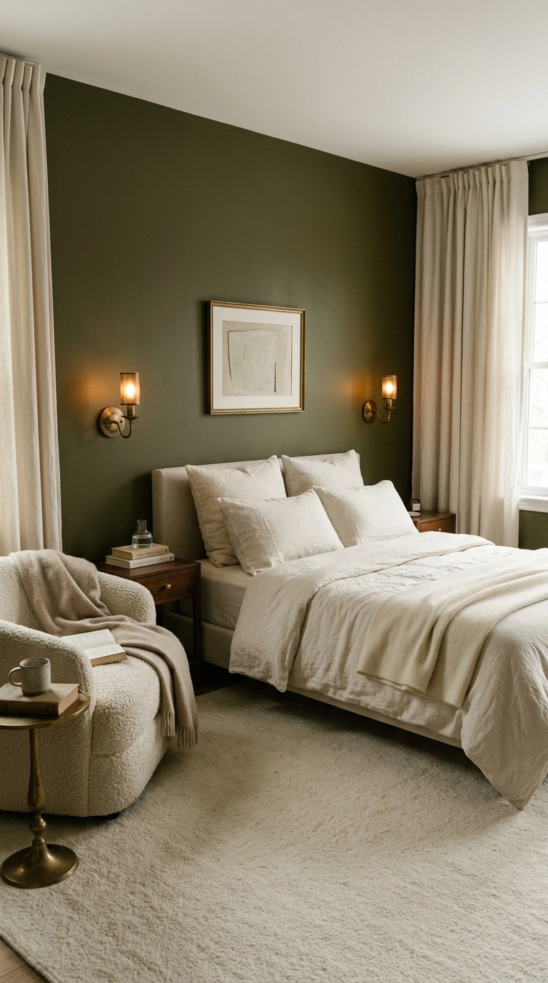
Olive is the most underrated bedroom color, and cream is the reason it works. Cream stops olive from turning murky.
Go bold: paint the full wall behind your bed deep olive, then flood everything else with cream — bedding, curtains, rug, ceiling. The bed becomes a soft landing spot against a moody backdrop.
Use unlacquered brass hardware and a cream boucle chair in the corner. Warm 2700K bulbs are essential here, because cool light drains olive of all its richness.
Try this weekend: Paint the inside of your closet doors olive. Small surface, huge payoff.
5. Terracotta + Warm White
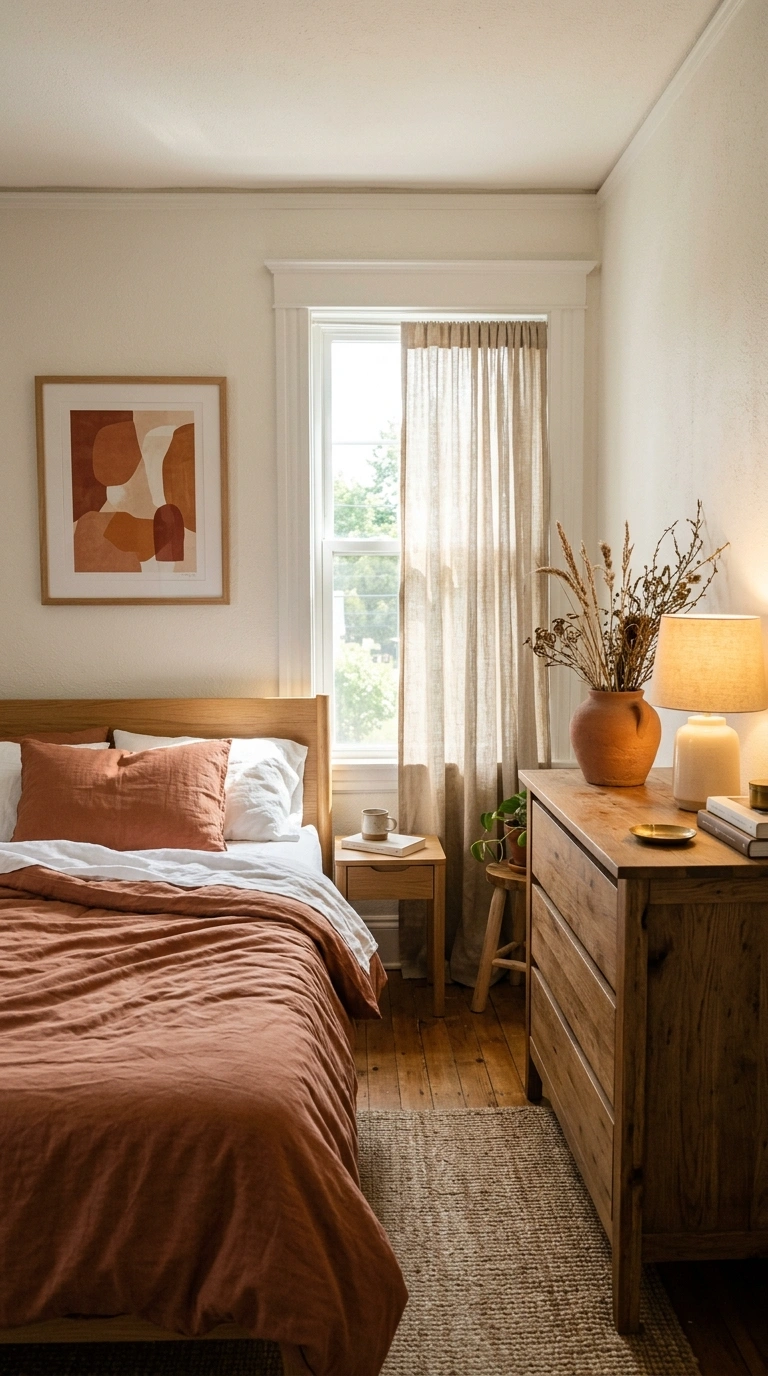
Terracotta brings the sunset indoors. Warm white keeps it from feeling like a theme.
Use terracotta in medium doses: a washed cotton duvet, a hand-thrown pot on the dresser, one framed abstract print. Warm white handles the walls and trim so the room still feels open.
Add unglazed clay, oak, and raw linen. These three materials share terracotta’s dusty finish, so the room feels collected rather than decorated.
Try this weekend: Replace one white pillowcase with a terracotta one and see how much warmth a single square of color adds.
6. Navy + Camel
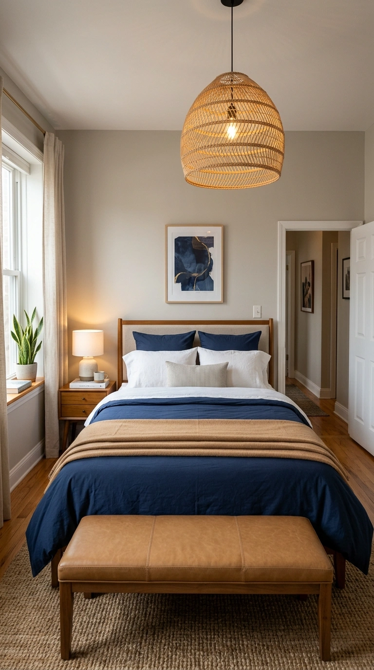
Navy and camel is the palette equivalent of a good coat. It never looks wrong.
Put navy on the walls or on the bedding, never both. If navy goes on the walls, keep the bed camel and cream. If navy goes on the bed, keep the walls a soft greige.
Camel shows up beautifully in leather, suede, and wool. A camel throw over a navy duvet, a camel-toned wood floor, a rattan pendant overhead — it all clicks.
Try this weekend: Add a camel wool blanket folded in thirds across the bottom third of your bed. That fold is the whole look.
I’ve found that a camel wool throw blanket adds warmth without competing with the deep navy tones. Folded neatly across the foot of the bed, it creates a layered look that makes the room feel cozy, balanced, and thoughtfully styled.
7. Mushroom Taupe + Soft White
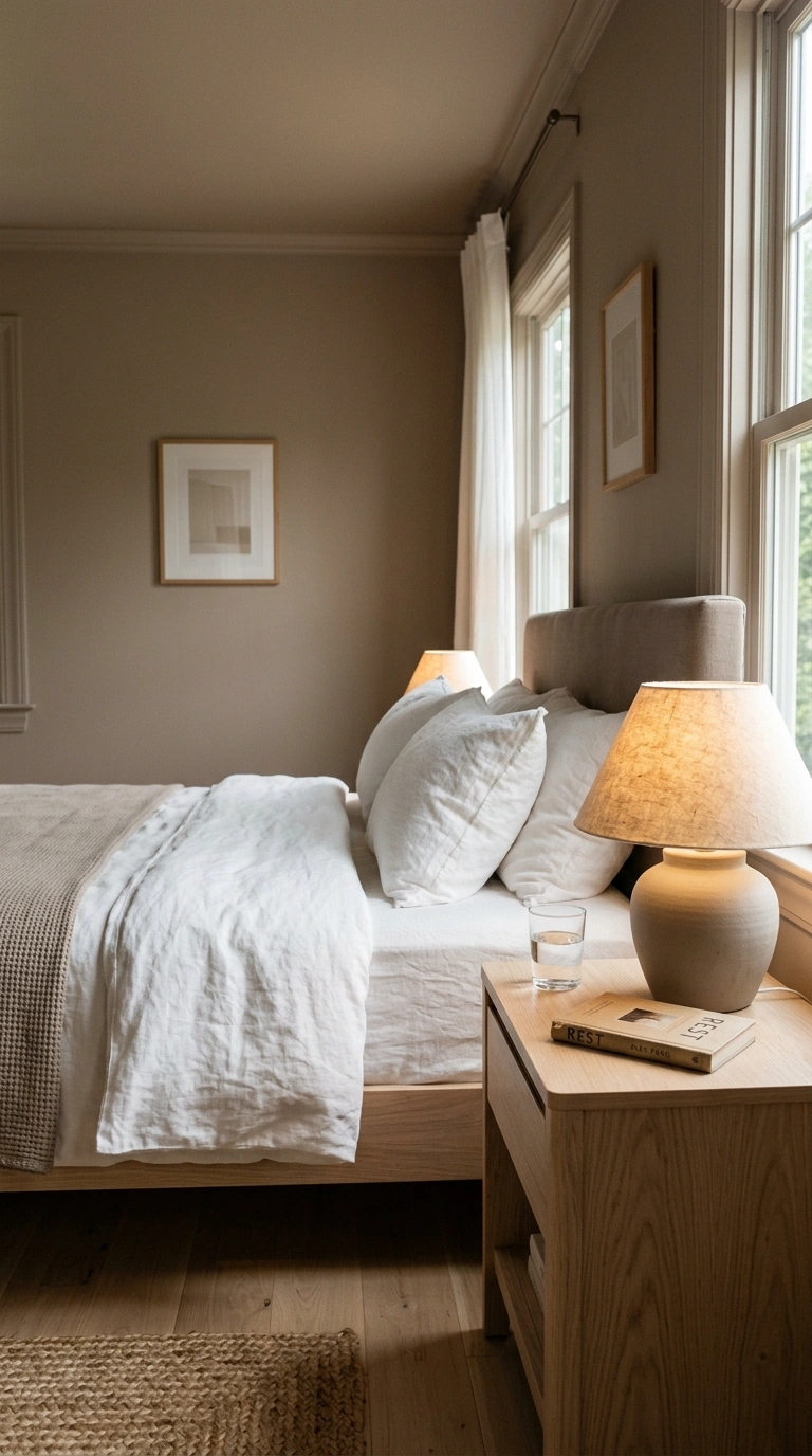
Mushroom taupe is gray that went outside and got some sun. It gives you neutral walls with actual personality.
Paint everything mushroom — walls, trim, even the ceiling — then let soft white bedding pop against it. The color-drenched approach makes a small bedroom feel bigger, not smaller.
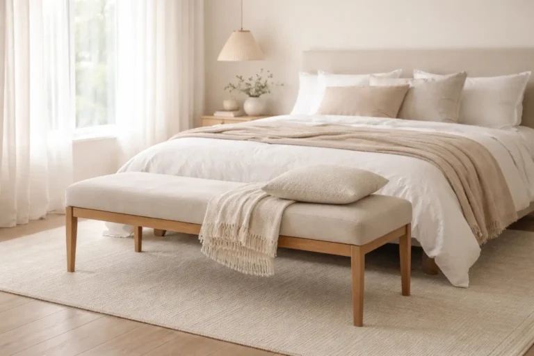
Layer in white linen, a pale oak nightstand, and a ceramic lamp with a natural paper shade. The whole room reads like a soft-focus photograph.
Try this weekend: Paint your trim the same taupe as your walls. Removing that white line instantly modernizes the space.
8. Clay Pink + Muted Sage
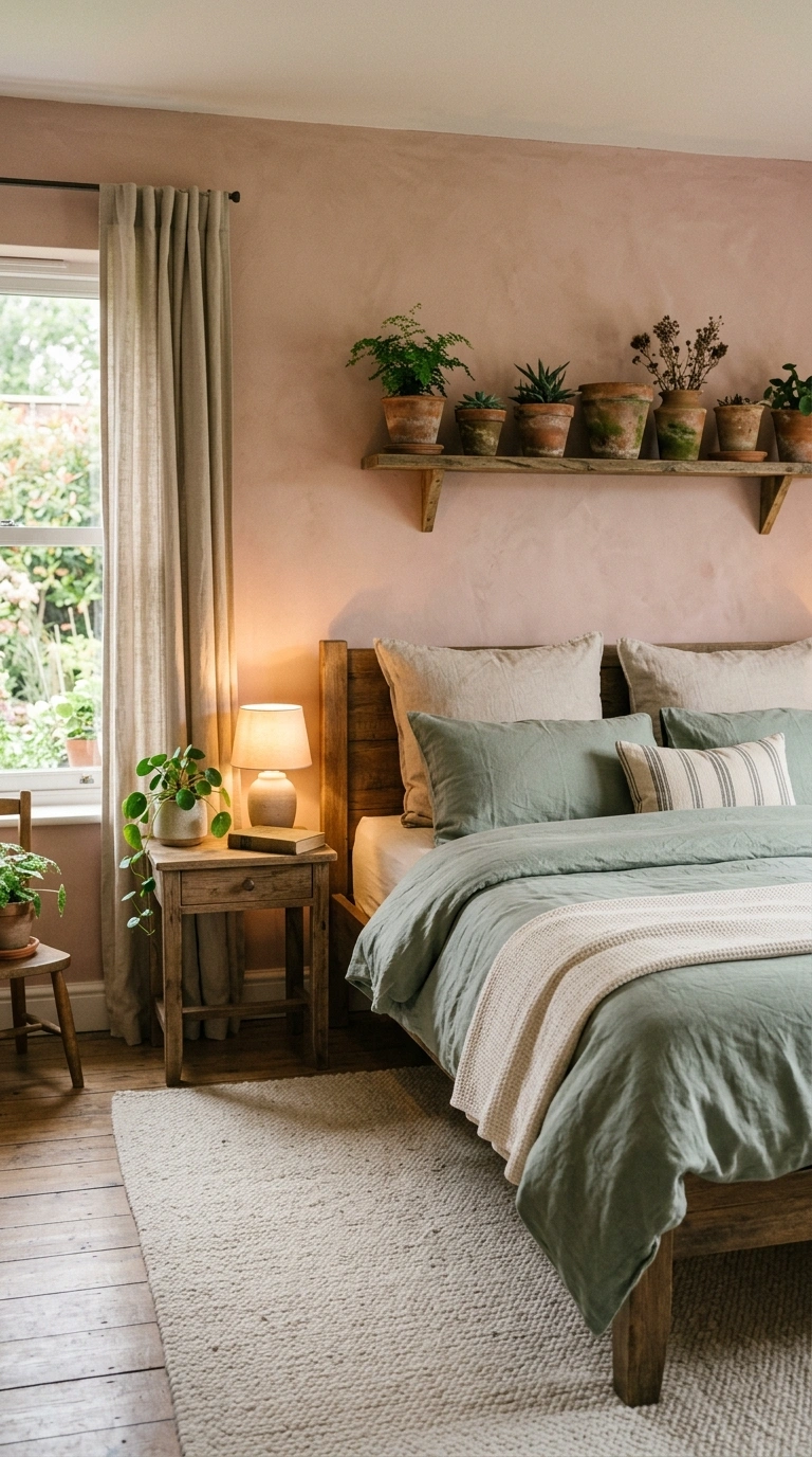
Two dusty colors, zero clashing. Clay pink and muted sage sit next to each other on the color wheel’s warm-cool border, which is why they feel so restful together.
Keep the ratio at 70/30 — mostly clay pink, sage as the accent. A clay pink wall, sage bedding, and a cream rug between them.
Bring in aged terracotta pots, a linen sham, and one small trailing plant. The mood is garden-adjacent without a single floral print.
Try this weekend: Buy one sage green ceramic lamp base. It will do more work than a whole gallery wall.
9. Chocolate Brown + Buttermilk
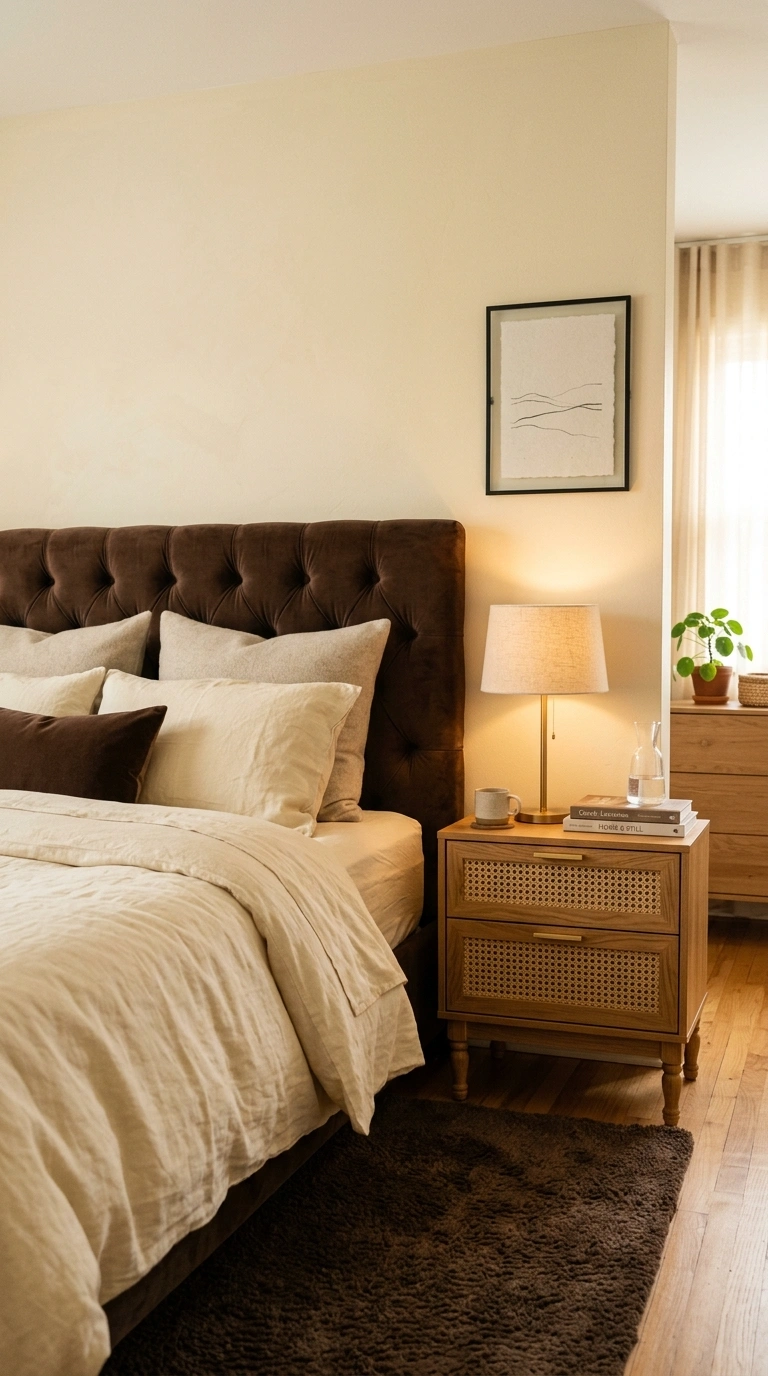
Brown is back, and buttermilk is its best friend. This pairing feels like a bakery at 7 a.m. — warm, soft, quietly luxurious.
Use chocolate for the big anchor: a brown velvet headboard or a brown wool rug. Buttermilk handles walls and bedding, keeping the room from going cave-like.
Add cane webbing, honey oak, and a single black metal accent for crispness. Warm lighting makes chocolate glow instead of flattening it.
Try this weekend: Swap your white lampshade for a buttermilk linen one. The light it throws changes everything.
10. Slate Blue + Sand
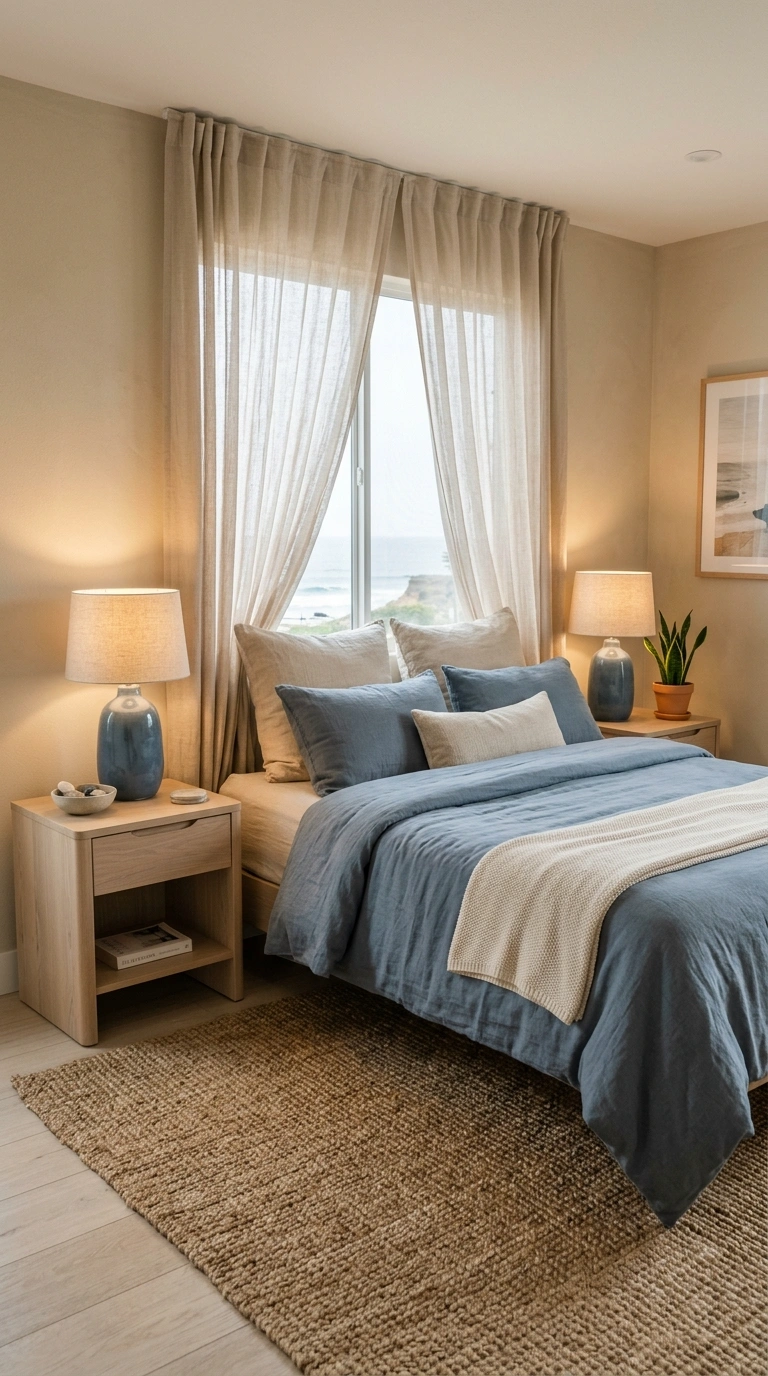
Slate blue has just enough gray to feel modern and just enough blue to feel calm. Sand warms it up so the room never turns chilly.
Paint the walls sand, then bring slate blue in through a washed cotton duvet and a pair of ceramic table lamps. A jute rug bridges the two.
The texture list here is short and effective: nubby linen, smooth ceramic, raw jute, and pale wood. Keep metals in soft nickel rather than brass.
Try this weekend: Add sand-colored sheer curtains. They filter daylight into something that flatters slate blue all afternoon.
One thing I always reach for is a washed slate blue cotton duvet cover because it introduces the color in a soft, relaxed way. The gentle texture pairs naturally with sand walls, jute, and pale wood, helping the whole room feel calm and inviting.
11. Plum + Greige
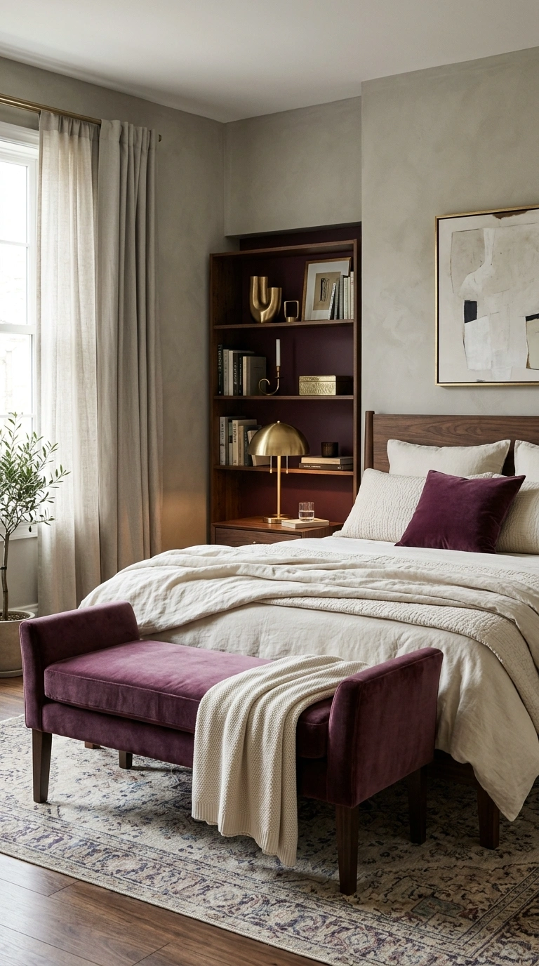
Plum sounds risky until you pair it with greige. Then it just looks expensive.
Use plum sparingly — a velvet bench, one pillow, or the inside of an open shelf. Greige covers the walls and keeps everything grounded.
Velvet is plum’s natural home because it shifts between deep purple and soft brown as the light moves. Add brushed brass and dark walnut to lock in the richness.
Try this weekend: Paint the back panel of a bookshelf plum. It’s a five-inch strip of color that changes the whole room.
I’ve found that a plum velvet accent pillow is enough to introduce this rich color without overwhelming the room. The soft fabric catches the light beautifully and adds depth against calm greige tones, making the whole palette feel warm and balanced.
12. Forest Green + Blush
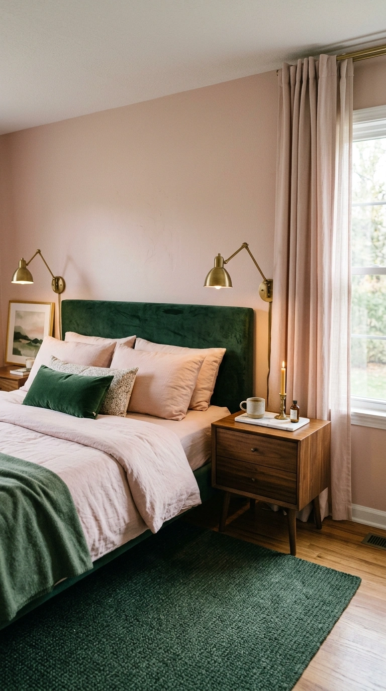
Forest green gives structure. Blush gives softness. Together they make a bedroom that feels both serious and gentle.
Keep forest green low and heavy: a green velvet headboard, a dark green rug, or a painted lower wall with blush above. Blush belongs up high — walls, curtains, bedding.
Add aged brass, walnut, and one marble surface for a little polish. The contrast between green’s depth and blush’s lightness is the whole point.
Try this weekend: Add two blush pillowcases to green bedding and notice how much lighter the bed looks.
13. Cocoa + Dusty Lavender
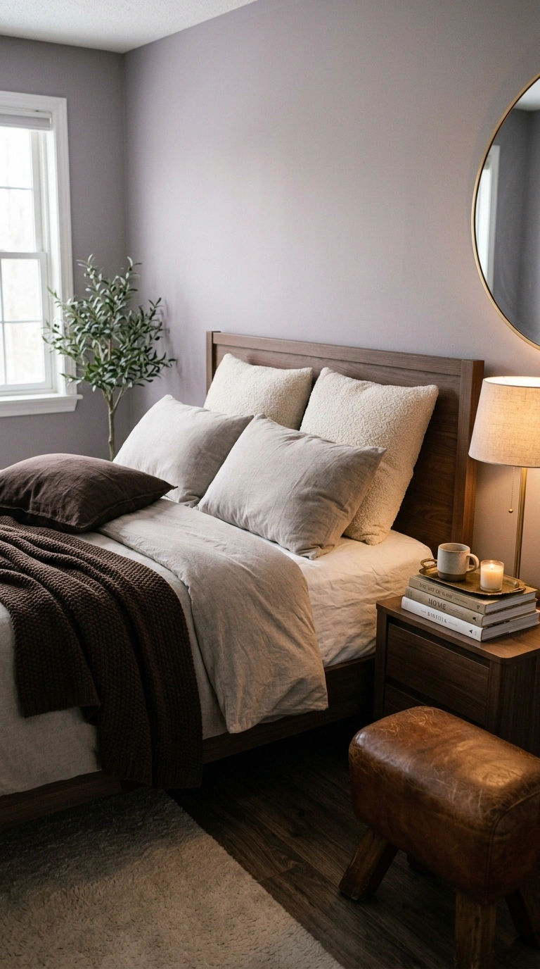
Lavender usually reads young. Cocoa fixes that immediately.
Paint the walls dusty lavender — the grayed-out version, not the purple one — and bring cocoa in through a wood bed frame, a brown leather stool, and a dark chocolate throw.
Look for boucle, brushed cotton, and matte ceramic. These finishes absorb light, which keeps lavender from going candy-colored.
Try this weekend: Put a cocoa brown book stack and a small brass tray on your lavender nightstand. Grown-up in thirty seconds.
14. Rust + Denim Blue
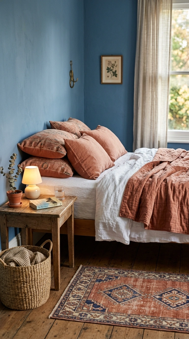
This is the color version of your favorite jeans and a worn leather jacket. Rust and denim blue have been friends forever.
Use denim blue on the walls in a chalky matte finish. Rust goes on the bed — a washed cotton quilt, a couple of pillows, maybe a rust rug with a faded pattern.
Everything should look slightly sun-bleached. Add worn oak, canvas, and a woven basket for storage. Nothing here should look new.
Try this weekend: Fold a rust quilt at an angle across the bed instead of straight. The casual line makes the room feel lived-in.
15. Almond + Black
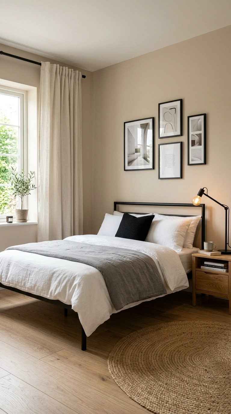
Almond keeps a room warm. Black keeps it from getting sleepy. This is the easiest modern bedroom color combination on the list.
Paint walls almond, then use black in thin lines only: a slim metal bed frame, black picture frames, a black lamp arm, black curtain rods.
Never let black take a big surface. It works as punctuation, not paragraphs. Add oak, cream linen, and one woven jute element to soften the edges.
Try this weekend: Swap your curtain rod for a matte black one. It frames the window and sharpens the whole wall.
16. Moss Green + Rust
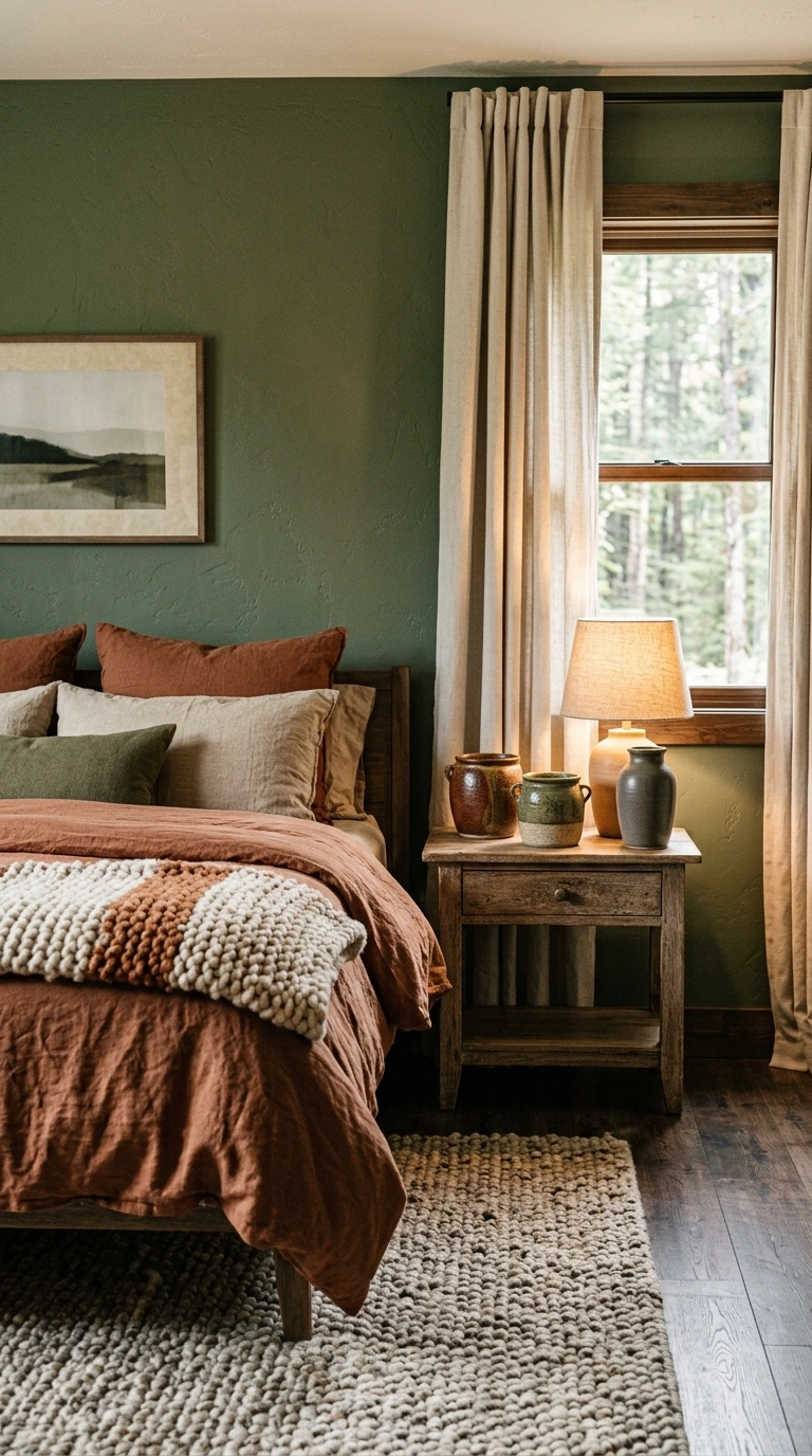
Two earth tones, both slightly faded, both a little wild. Moss green and rust make a bedroom feel like a cabin that reads good books.
Split them evenly. Moss on the walls, rust in the bedding, or the reverse — this pair is balanced enough to handle either.
Bring in aged oak, hand-thrown stoneware, and a wool rug with visible texture. Keep white completely out of it. Cream or bone works better and keeps the palette honest.
Try this weekend: Group three stoneware pots in rust and moss glazes on your dresser. One tall, two short.
I’ve found that a rust linen duvet cover adds warmth without making the room feel heavy. The relaxed texture pairs naturally with moss green walls, aged oak, and stoneware, helping the bedroom feel cozy, earthy, and quietly collected.
17. Pale Butter Yellow + Warm Gray
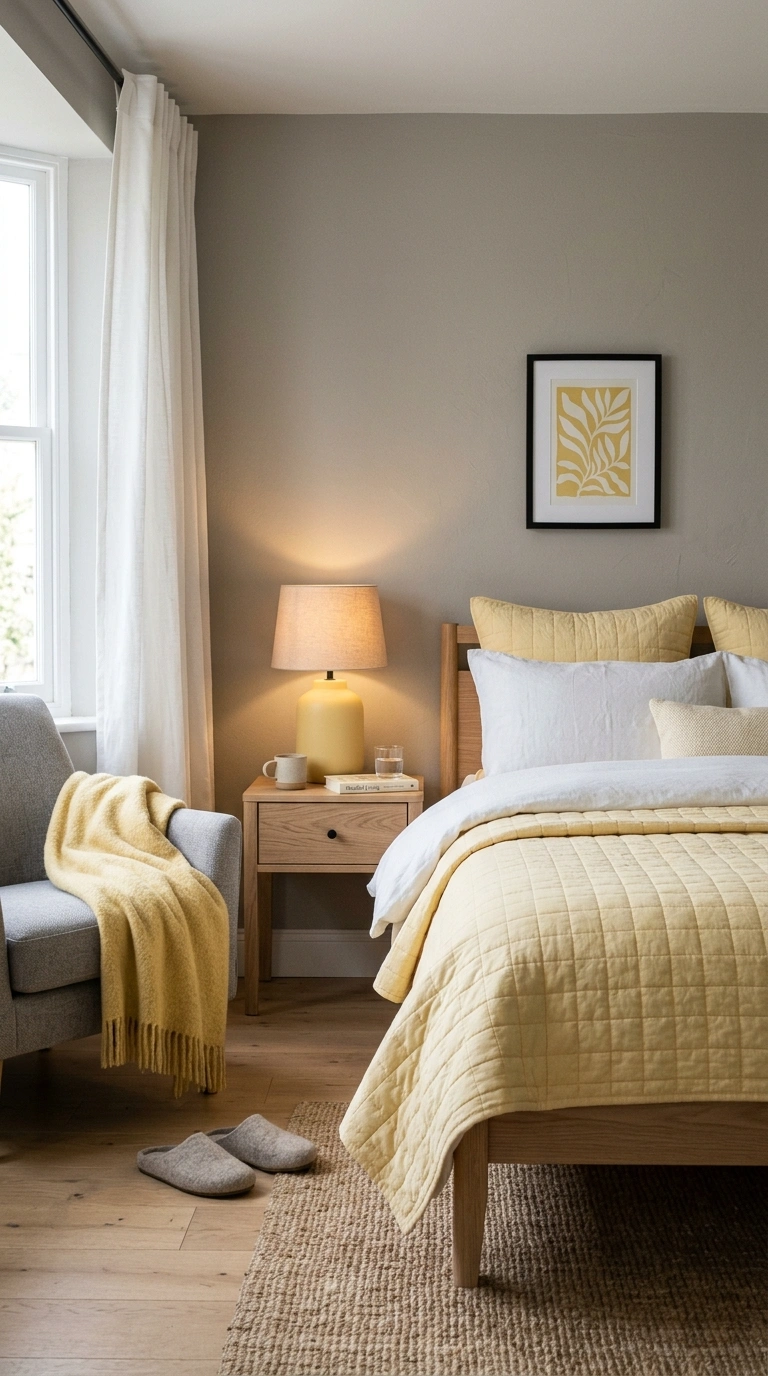
Butter yellow is having a moment, and warm gray is what keeps it from feeling like a nursery.
Paint the walls warm gray, then let butter yellow appear in soft, small ways: a quilted coverlet, one framed print, a ceramic lamp.
The yellow should look like sunlight hit the wall, not like someone painted a highlight. Add pale oak, white linen, and matte black hardware for a clean edge.
Try this weekend: Add a butter yellow throw blanket over a gray chair. That single hit of color makes the corner feel intentional.
18. Burgundy + Oat
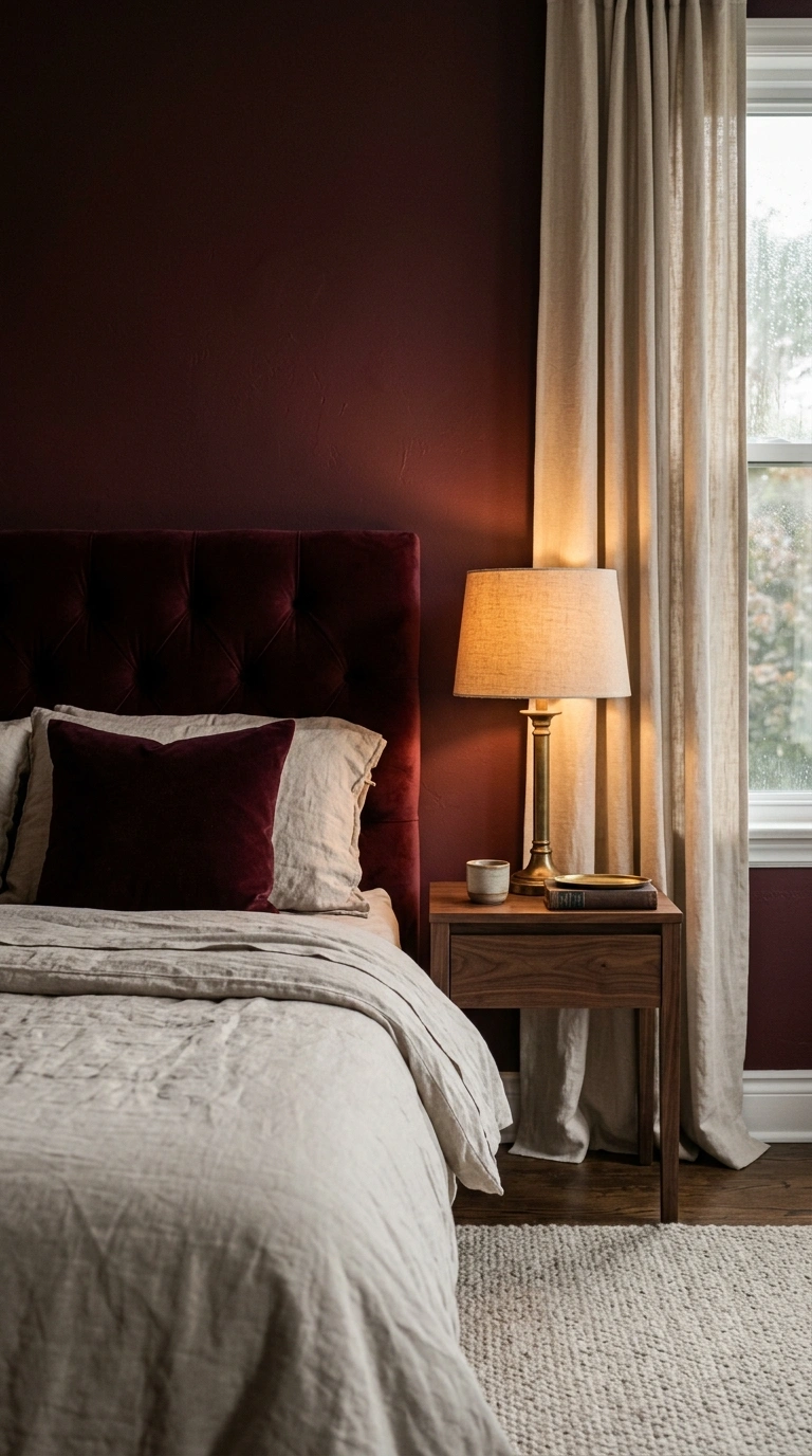
Burgundy is deep, moody, and surprisingly restful. Oat keeps it breathable.
Use burgundy for the headboard wall or a velvet headboard itself. Everything else stays oat — bedding, rug, curtains, lampshade.
The contrast is soft because both colors share a warm base. Add walnut, aged brass, and a low-pile wool rug. Keep the lighting at 2700K so burgundy stays wine-colored instead of turning brick.
Try this weekend: Add a burgundy pillow to oat bedding. It’s the smallest possible dose of drama.
19. Fog Gray + Honey Oak
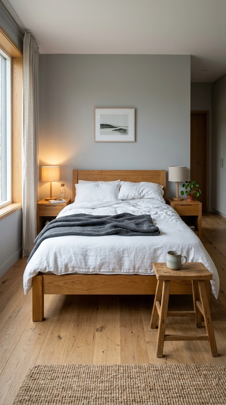
Sometimes the second color is not paint at all — it’s wood. Fog gray walls paired with honey oak furniture make one of the most livable bedrooms you can build.
Keep the gray cool-to-neutral and let the oak deliver every bit of warmth: the bed frame, the nightstands, a wide-plank floor, a small stool.
Add white linen bedding and one soft charcoal throw. The room stays quiet, and the wood grain becomes the pattern.
Try this weekend: Remove one gray or black item from your room and replace it with something in honey oak. Watch the temperature rise.
One thing I always reach for is a solid honey oak bedside table because it brings natural warmth exactly where you notice it most. The visible wood grain softens cool gray walls and helps the bedroom feel welcoming without adding extra color or pattern.
20. Eucalyptus + Chalk White
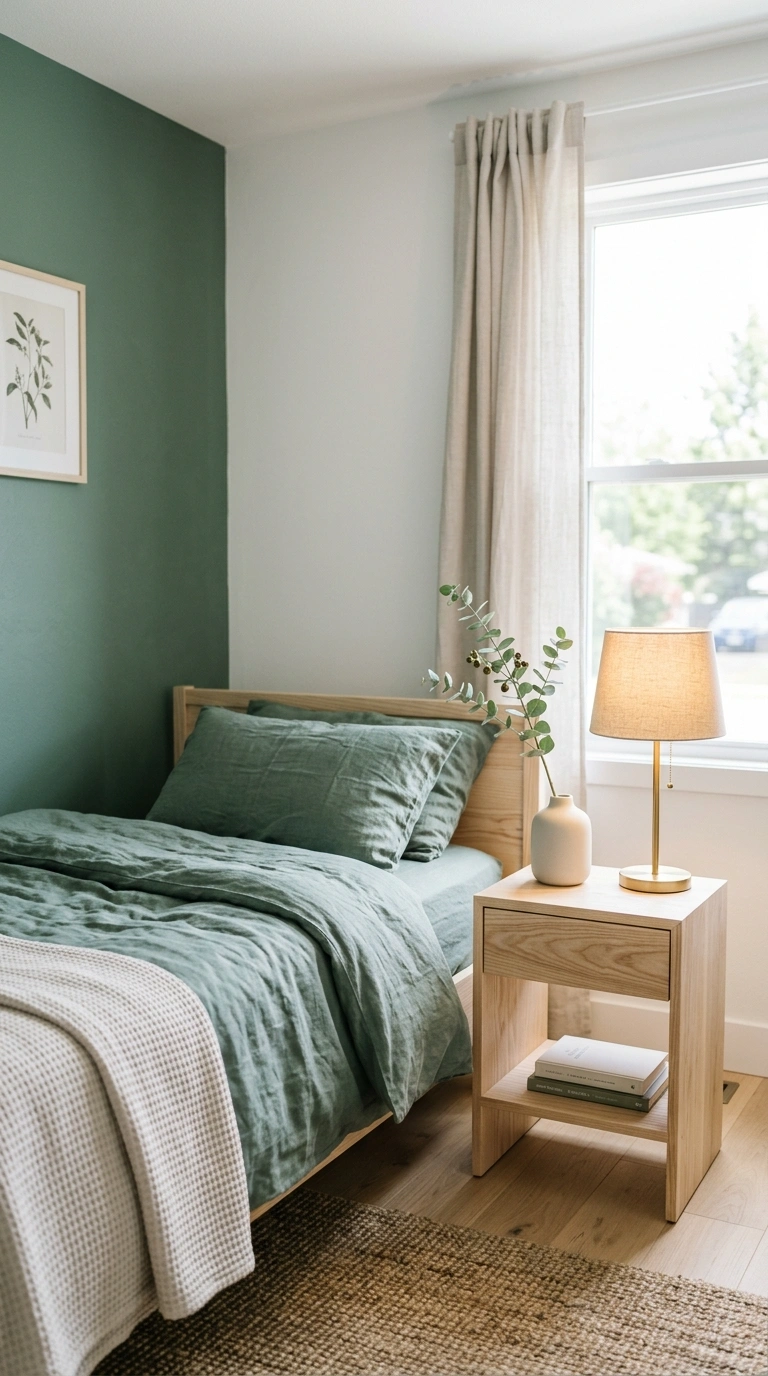
Eucalyptus is sage with a little more blue in it. Chalk white — flat, no shine — makes it look like morning air.
Use eucalyptus on the bedding and one accent wall. Chalk white takes the rest. The flat finish is doing real work here; anything eggshell or satin will look plasticky next to eucalyptus.
Add washed linen, unfinished ash wood, and a low ceramic vase. This is a genuinely airy cozy bedroom color scheme for a small room.
Try this weekend: Test a chalk-finish white on one wall. Flat paint makes daylight look softer.
21. Caramel + Ink Blue
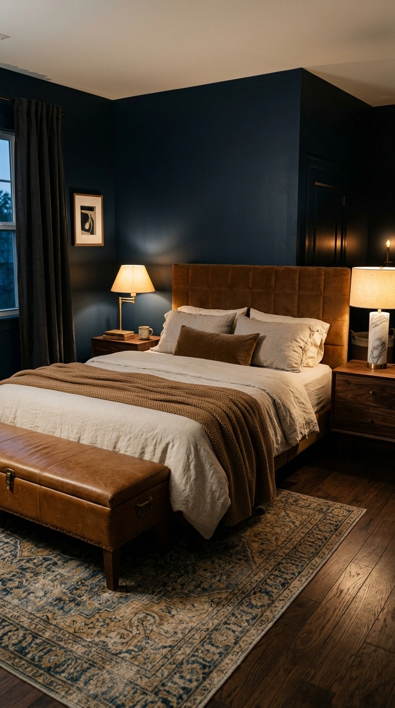
Caramel is camel with more sugar. Ink blue is navy with more mystery. Together they feel like a hotel bar in the best way.
Put ink blue on the walls and let caramel take the bed: a caramel velvet headboard, a caramel throw, a leather bench at the foot.
Add aged brass, dark walnut, and one marble lamp base. This pairing needs low, warm light to work — three small lamps beat one ceiling fixture every time.
Try this weekend: Turn off your overhead light and add a second lamp on the opposite side of the room.
22. Mauve + Cream
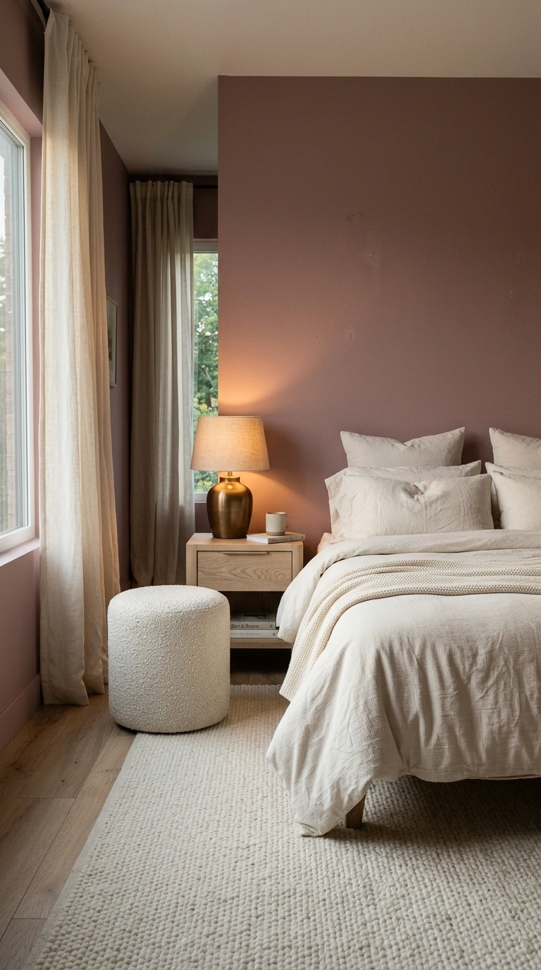
Mauve sits between pink, brown, and gray, which means it changes personality all day long. Cream gives it a steady partner.
Paint the walls mauve and keep everything else cream — bedding, curtains, rug. The room will feel pink at sunrise and almost taupe at night.
Use brushed cotton, boucle, and pale oak. Skip silver metals; they turn mauve gray. Brass or bronze keeps the warmth.
Try this weekend: Look at your mauve swatch at 8 a.m. and 8 p.m. before you commit. That shift is a feature, not a bug.
I’ve found that a cream bouclé accent chair adds soft texture without taking attention away from the walls. It keeps the palette light and cozy while giving the changing mauve tones a warm, balanced backdrop throughout the day.
23. Pewter + Soft Peach
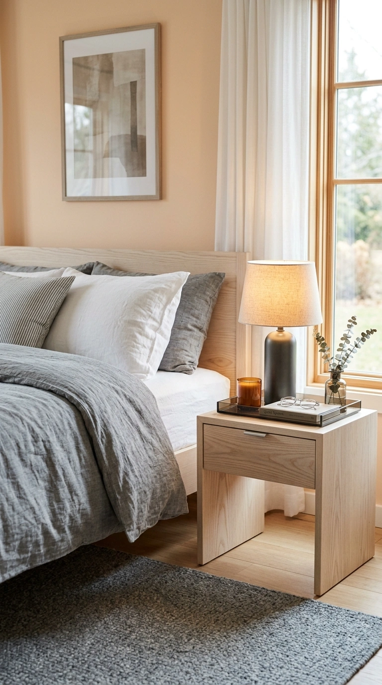
Pewter is a gray with a metallic soul. Soft peach warms it up without turning it sweet.
Use pewter on textiles — a pewter linen duvet, gunmetal lamp bases, a slate-toned rug. Soft peach handles the walls, giving off a low glow.
Add smoked glass, brushed nickel, and pale ash wood. This is a quietly modern pairing that photographs beautifully in daylight.
Try this weekend: Swap one bedside lamp for a pewter or gunmetal base. It grounds a peach room fast.
24. Espresso + Sage
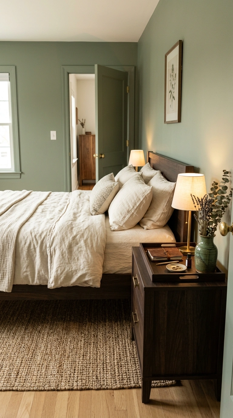
Espresso brings the weight. Sage brings the calm. It’s the most restful dark-and-light pairing here.
Paint the walls sage, then use espresso for the bed frame, nightstands, and picture frames. The dark wood makes sage look richer, almost herbal.
Layer cream linen, a jute rug, and one green-glazed ceramic piece. Keep the metals in aged brass so nothing turns cold.
Try this weekend: Add an espresso-toned wood tray to your sage nightstand and corral your clutter on it.
25. Teal + Toasted Almond
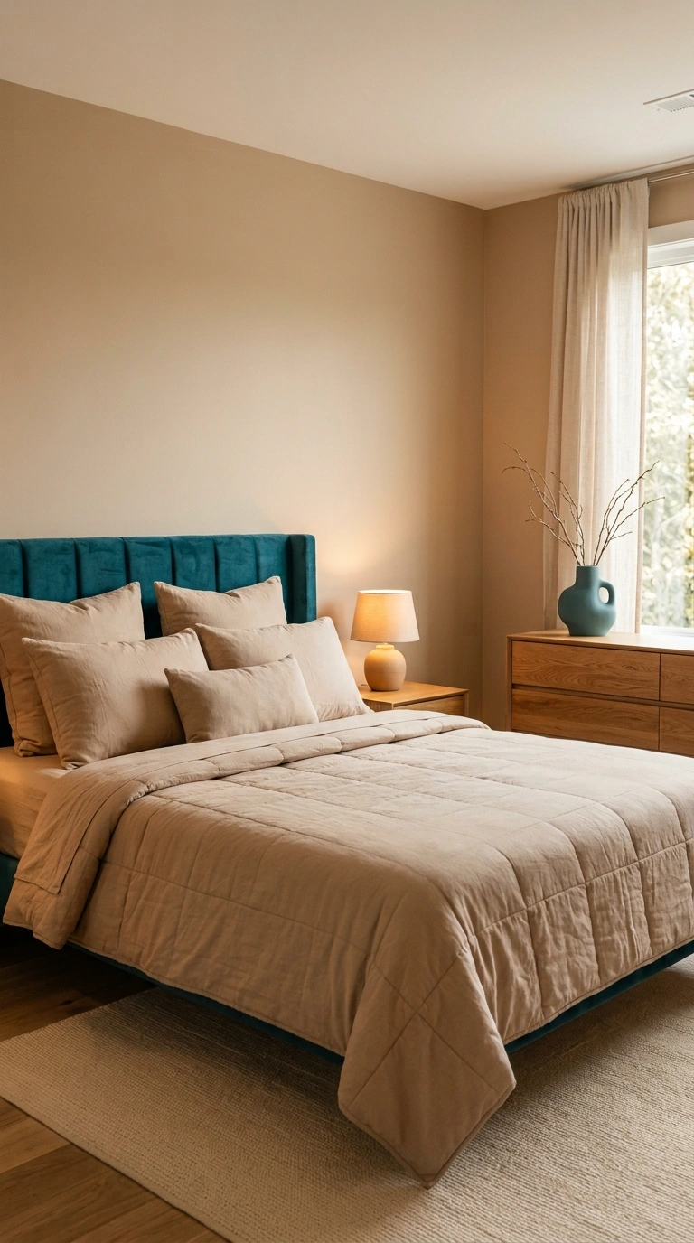
Teal can go tropical fast. Toasted almond pulls it back to something quiet and modern.
Keep teal in one place only — a velvet headboard, a single armchair, or a stack of books. Toasted almond walls and bedding do the rest.
Use velvet, oak, and matte ceramic. The gentle contrast means you can live with the teal for years without tiring of it.
Try this weekend: Add one teal ceramic object to your dresser. One. That’s the whole rule.
26. Apricot + Stone Gray
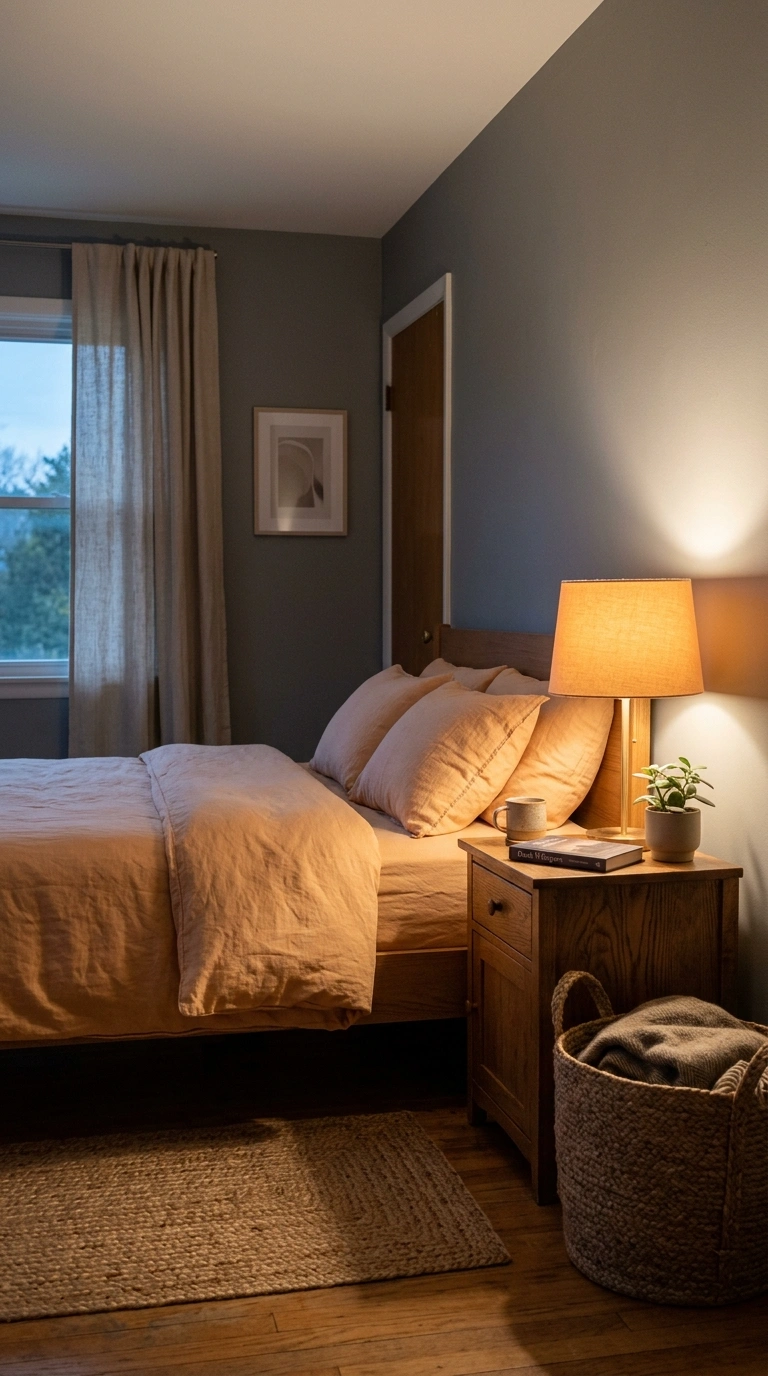
Apricot is the friendliest warm color there is. Stone gray keeps it from getting loud.
Paint the walls stone gray, then let apricot appear in bedding and a lampshade. The light coming through an apricot shade will warm the entire room.
Add linen, aged oak, and a woven jute basket. Keep the pattern count at zero — these two colors are interesting enough on their own.
Try this weekend: Put an apricot bulb-friendly lampshade on your bedside lamp and turn it on at dusk.
I’ve found that an apricot linen bedside lampshade gently warms the light in the evening without changing the whole room. It adds a soft layer of color that works beautifully with stone gray walls, natural wood, and simple textured fabrics.
27. Midnight Blue + Warm Ivory
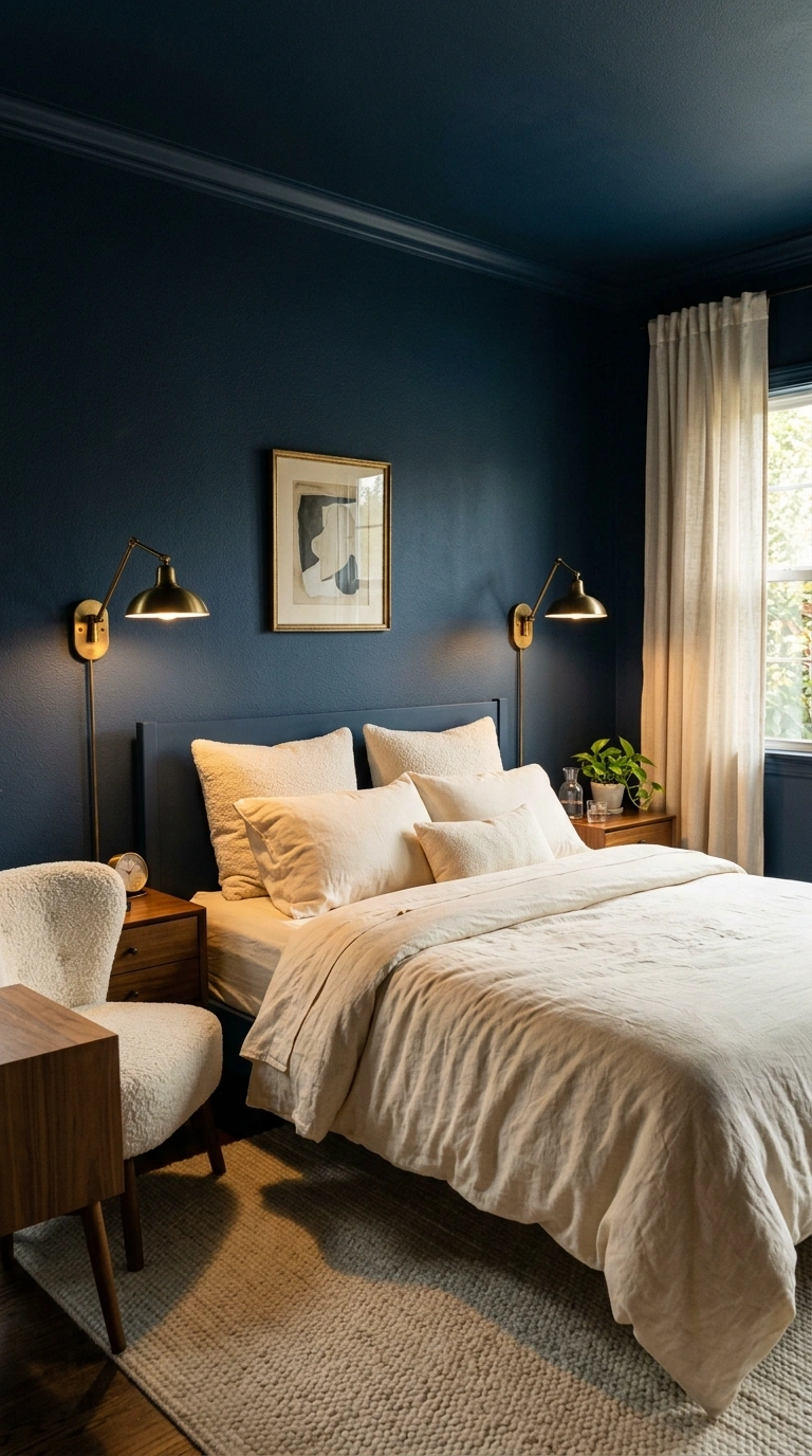
This is the classic that never quits. Midnight blue gives you a room that feels like the inside of a good night’s sleep.
Color-drench the walls, trim, and ceiling in midnight blue, then keep bedding, curtains, and rug in warm ivory. The bed will glow like a lantern.
Add aged brass sconces, walnut nightstands, and one ivory boucle chair. Warm bulbs are mandatory — cool light turns midnight blue into a corporate lobby.
Try this weekend: Add two ivory pillows in front of your dark headboard and turn on a warm lamp. That’s the whole effect.
28. Wheat + Cocoa
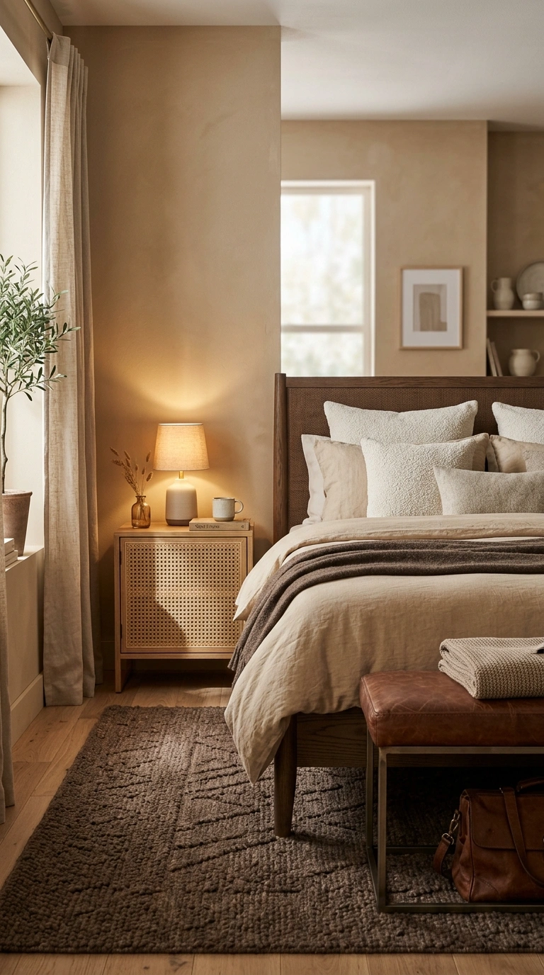
Wheat and cocoa is the tonal pairing for people who don’t want to think about color again. Same family, different depths.
Wheat covers the walls and bedding. Cocoa shows up in the rug, the bed frame, and a leather bench.
Because the colors are so close, texture does all the work: boucle, wool, cane, linen, and grainy oak. Stack at least four different textures or the room will fall flat.
Try this weekend: Add one cane or rattan piece. Its shadow pattern gives a tonal room instant life.
29. Lilac Gray + Soft White
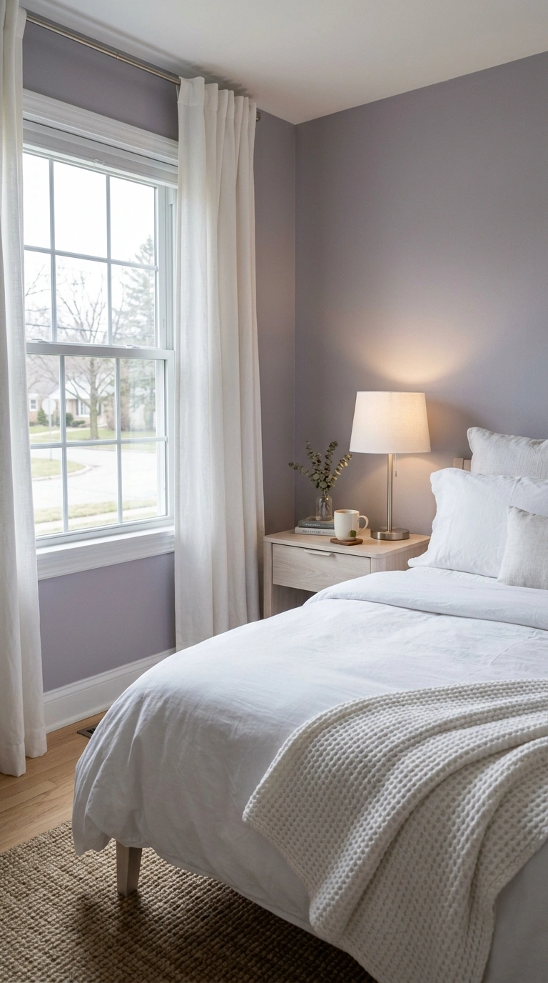
Lilac gray is a whisper of purple in a gray base. Soft white makes it feel intentional instead of accidental.
Paint the walls lilac gray and keep bedding, trim, and curtains soft white. The room reads neutral until the afternoon light hits and the lilac wakes up.
Add pale ash, brushed nickel, and a chunky white knit throw. This is a great palette for a bedroom with a north-facing window.
Try this weekend: Add a white waffle-weave blanket. The texture keeps a soft palette from looking flat.
30. Charcoal + Blush
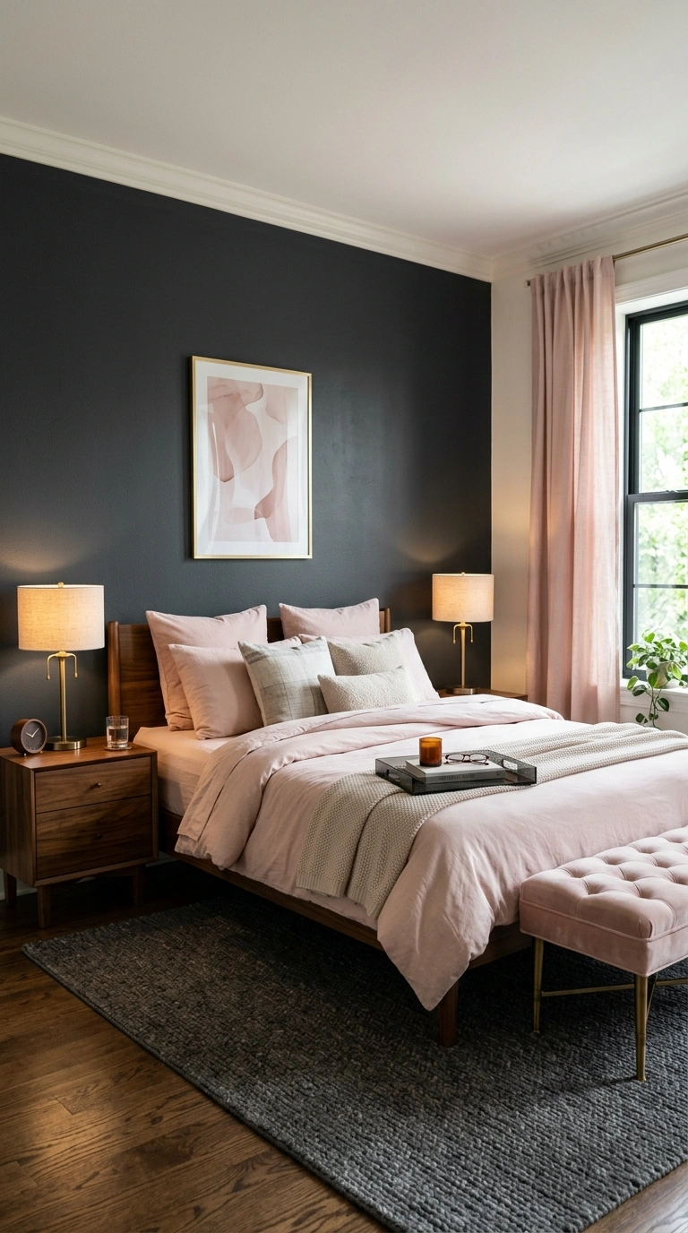
The last pairing is the boldest, and it works because charcoal and blush balance each other perfectly. One is hard, one is soft.
Charcoal takes the accent wall and the rug. Blush takes the bedding, the curtains, and a velvet stool.
Add aged brass, walnut, and smoked glass. This is the pairing to pick if you want a bedroom that looks like it belongs in a magazine but still lets you nap in it.
Try this weekend: Hang a blush art print on a charcoal wall. That single contrast is the entire design.
One thing I always reach for is a blush velvet quilt cover because it softens the depth of charcoal without making the room feel overly sweet. The rich texture adds warmth, while the gentle color keeps the whole bedroom feeling calm and balanced.
Bringing It All Together
The best bedrooms are not the ones with the most colors. They’re the ones where two shades trust each other — one to ground the room, one to soften it. Every pairing above follows that rule, whether it’s sage green and oat beige or charcoal and blush.
Start small. Pick one pairing, buy one pillow or one lamp in the accent shade, and live with it for a week before you touch a paint can. Warm bulbs, layered texture, and a little restraint will carry you further than any trend.
Pick your two, try one small change this weekend, and save your favorite pairings to Pinterest so they’re ready when the paint mood strikes.
FAQs
What are the best bedroom color pairings for a small bedroom?
Soft, low-contrast pairings work best in small bedrooms because they blur the corners and make walls recede. Try mushroom taupe with soft white, eucalyptus with chalk white, or lilac gray with soft white. Painting the trim the same color as the walls makes the room feel even more open.
What two colors make a bedroom feel cozy?
A deep, warm anchor color plus a soft light color is the reliable formula. Chocolate brown with buttermilk, burgundy with oat, and midnight blue with warm ivory all deliver that wrapped-up feeling. Add warm 2700K bulbs and at least one wool or boucle texture to complete the effect.
Can I use dark paint in a bedroom without making it feel small?
Yes — dark paint actually helps a bedroom feel intimate rather than cramped, as long as your bedding, curtains, and rug stay light. Color-drenching the walls, trim, and ceiling in one dark shade removes the visual lines that make a room feel boxed in. Keep the lighting low and warm with two or three lamps instead of one overhead fixture.
What colors go with sage green in a bedroom?
Sage green pairs beautifully with oat beige, cream, clay pink, and espresso-toned wood. These shades share sage’s dusty, matte quality, so nothing competes for attention. Avoid glossy finishes and cool metals — aged brass and jute suit sage far better.
How do I pick a bedroom color scheme that won’t feel dated in two years?
Stick to pairings built on earth tones and true neutrals, then let one accent shade carry the trend. Navy and camel, fog gray and honey oak, or almond and black stay current because they lean on texture and light rather than a trendy color. Keep the bold shade in items you can swap — pillows, throws, art — instead of on the walls.