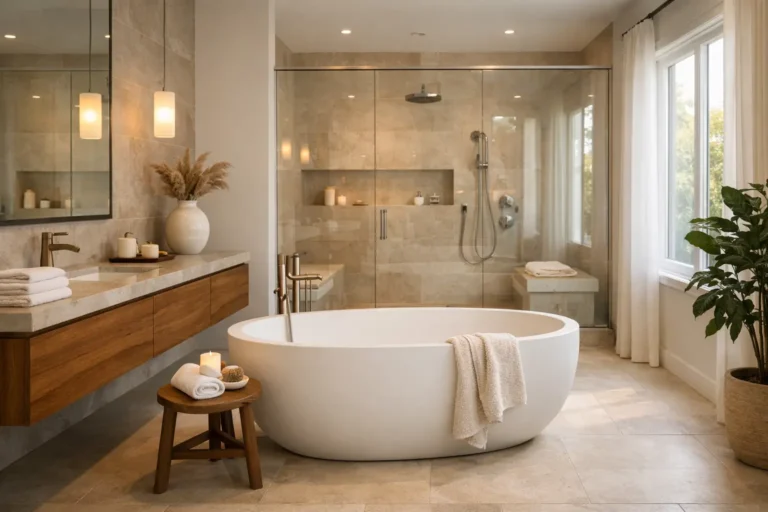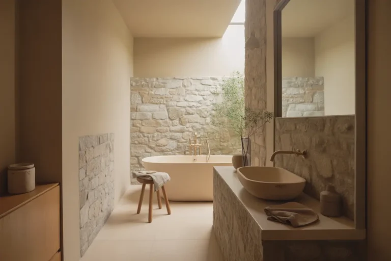
19 Modern Bathroom Color Ideas With Timeless Appeal

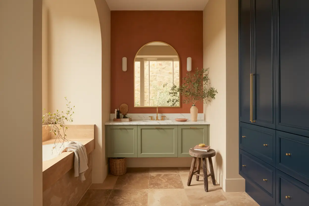
Bathroom colors go in and out of style faster than almost any other room in the house, but a handful of shades manage to stay looking fresh no matter what year it is. The trick to picking a bathroom color that holds up over time is leaning toward tones found in nature, stone, and old buildings, rather than chasing whatever shade is trending on social media this month. A good bathroom color also needs to work with your fixtures, your lighting, and how much natural light the room actually gets, since a shade that looks gorgeous in a bright showroom can feel completely different in a small windowless bathroom. Below are 19 color ideas that photograph beautifully and tend to age well, whether you are painting a full room, tiling a shower, or just picking a new vanity color for a small powder room.
1. Sage Green Vanity
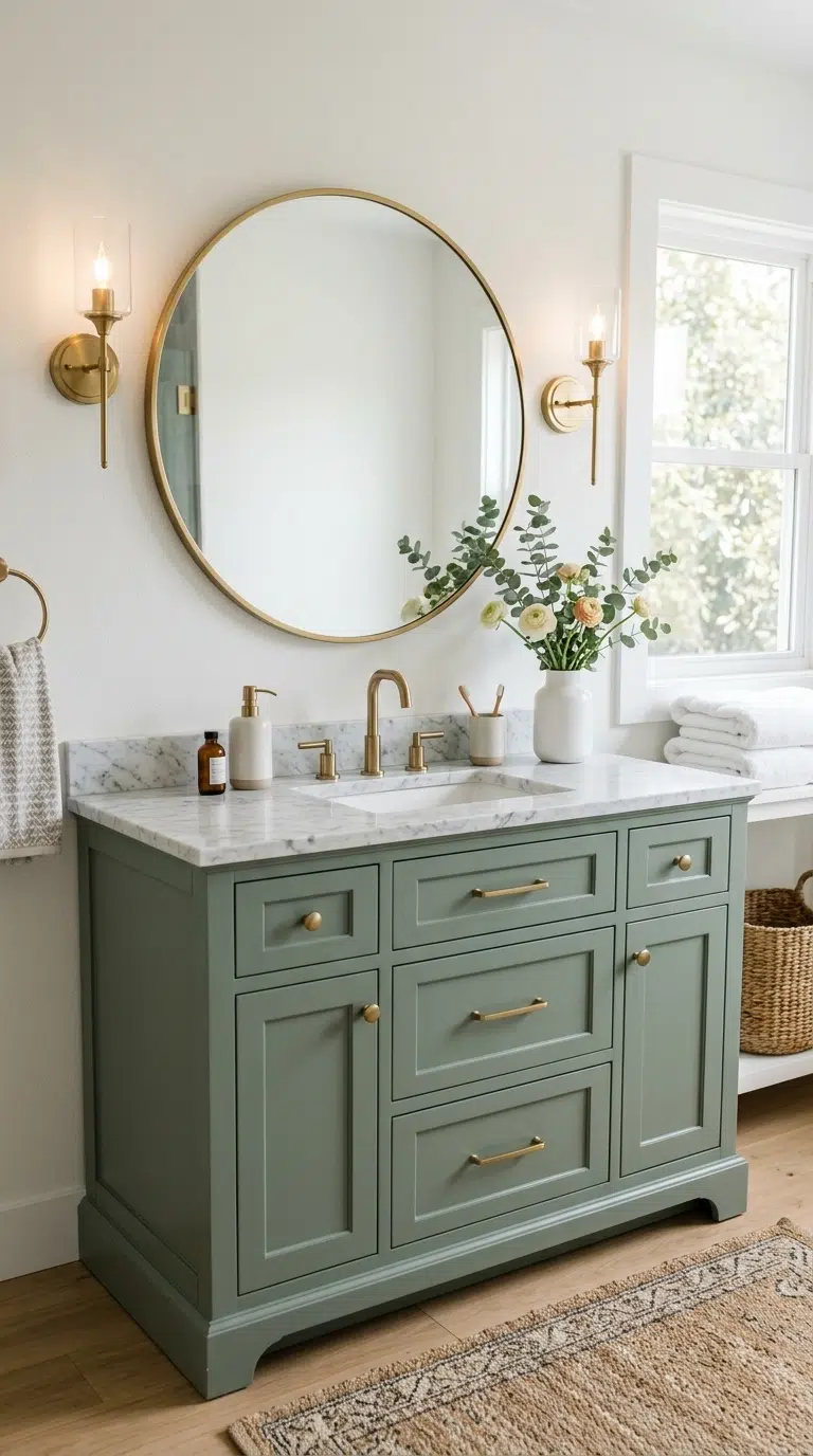
A painted vanity in a muted sage green brings a soft, spa-like calm to a bathroom while still feeling grounded and current no matter the year. Choose a matte or eggshell finish paint made for cabinets, since a satin or gloss sheen shows brush marks more easily on furniture pieces you touch often. Pair the vanity with brass or unlacquered brass hardware, since warm metals bring out the green’s earthy undertone better than chrome or nickel would.
Keep the walls around the vanity a soft white or warm cream so the green stays the focal point of the room rather than competing with a bold wall color. This look works especially well in a powder room or a secondary bathroom, since sage green is calming enough for daily use but still has enough personality to stand out from an all-white bathroom. Sand and repaint the vanity every few years if it starts to show wear, since cabinet paint holds up differently than wall paint.
2. Warm Terracotta Walls
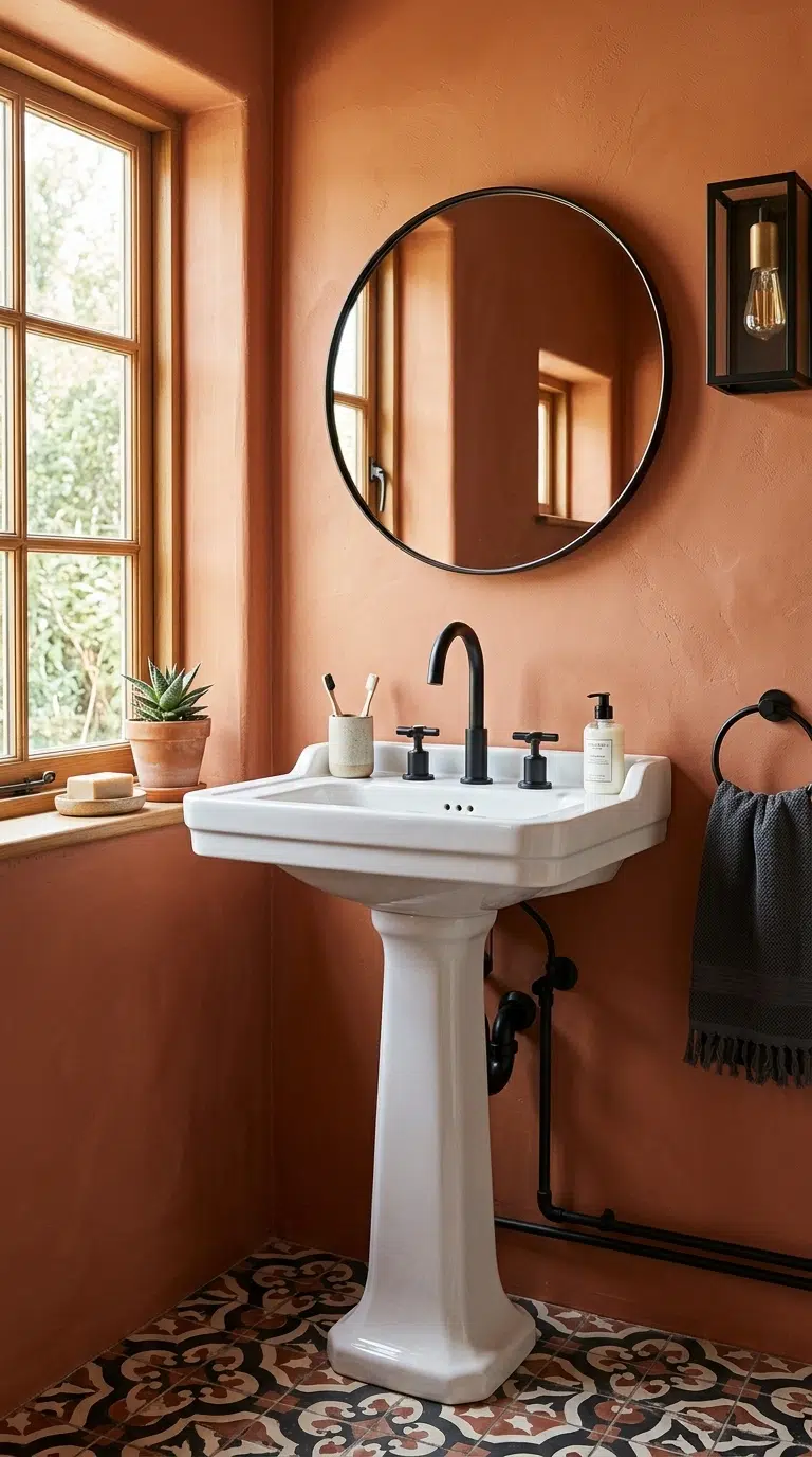
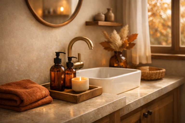
Painting bathroom walls in a warm, earthy terracotta gives the room a sunbaked, grounded feeling that pairs beautifully with both matte black and warm brass fixtures. Choose a shade closer to clay or brick than bright orange, since the muted, dusty version of terracotta is what keeps this color from feeling like a passing trend. This color works especially well in bathrooms with plenty of natural light, since terracotta can feel a bit heavy in a room with only artificial lighting.
Pair the walls with white or cream tile on the floor and around the shower, so the terracotta reads as a warm accent rather than overwhelming the whole room. Add simple wood accessories, like a stool or a small shelf, to tie the earthy tones together. This color choice works in full bathrooms and powder rooms alike, and it photographs especially well in the soft light of morning or late afternoon.
3. Classic Navy Cabinets
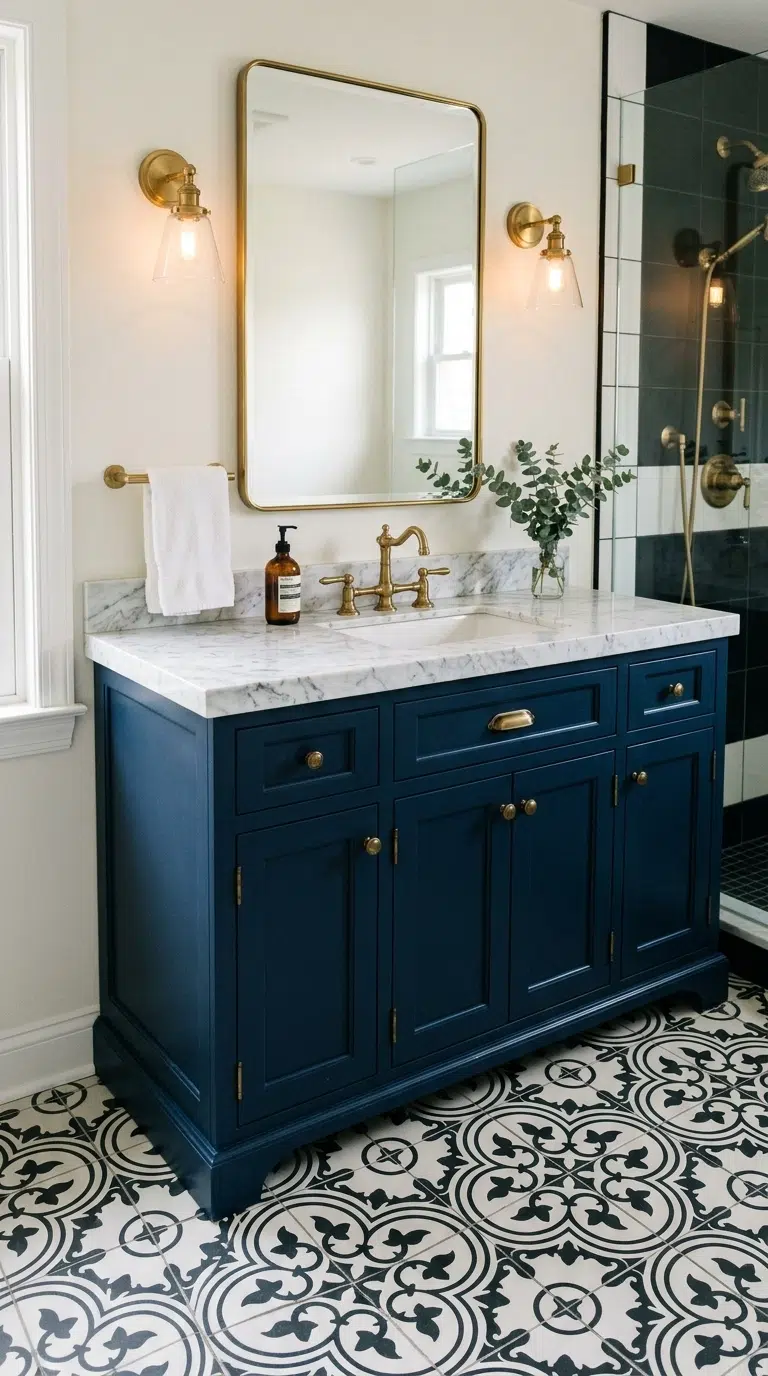
A navy blue vanity or set of bathroom cabinets brings a rich, tailored look that has stayed popular in bathrooms for decades without ever feeling dated. Choose a true navy rather than a bright royal blue, since the deeper, slightly muted shade reads as more classic and works with almost any tile or countertop color you pair it with. Brass or polished nickel hardware both work well against navy, so choose based on the rest of your fixtures rather than the cabinet color itself.
Pair navy cabinets with a white or marble-look countertop to keep the overall palette from feeling too dark, and add a patterned tile floor in white and navy or black and white for a finished, coordinated look. This color choice works especially well in a primary bathroom or a powder room where you want a bit of drama without repainting every wall in the room.
4. Soft Clay Pink Walls
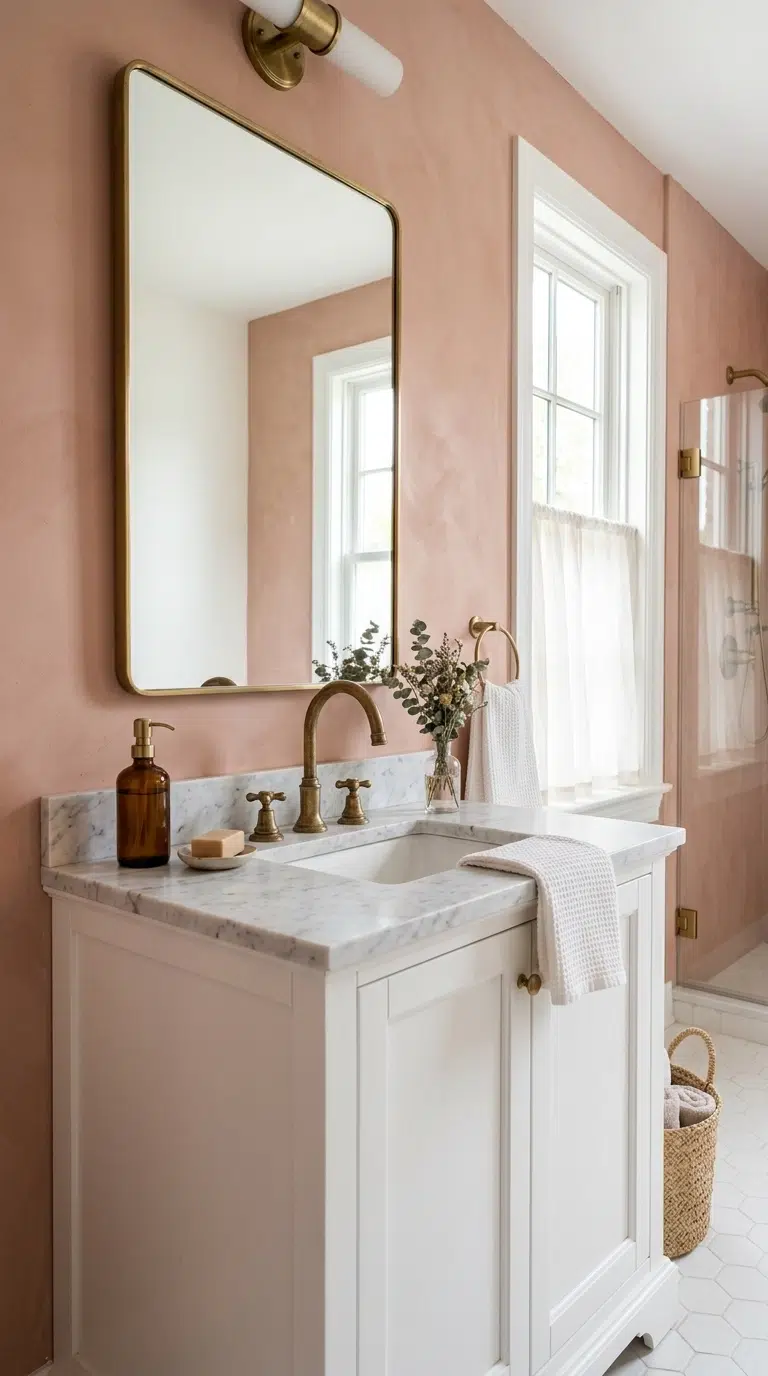
A dusty, muted clay pink on bathroom walls gives a soft warmth to the room without leaning into a color that feels overly sweet or trendy. Choose a shade with gray or brown undertones rather than a bright bubblegum pink, since the muted version reads as sophisticated and pairs easily with warm wood tones and brass fixtures. This color works particularly well in bathrooms that get good natural light, since the pink can look a bit flat under cool artificial bulbs alone.
Pair the walls with a simple white vanity and unlacquered brass faucet to keep the room feeling balanced rather than overly colorful. Add a woven bath mat or a linen shower curtain in a neutral tone to soften the space further. This color choice works in primary bathrooms, guest bathrooms, and powder rooms, and it tends to photograph with a warm, flattering glow in daylight.
5. Charcoal Accent Wall
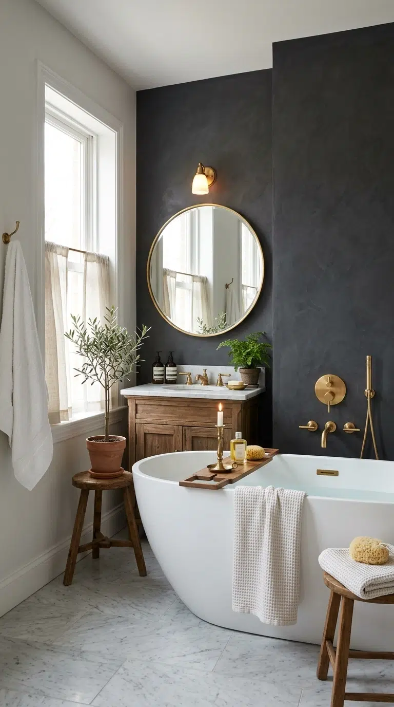
Painting just the wall behind the vanity or bathtub in a deep charcoal gray creates a dramatic focal point without committing the whole room to a dark color. Choose a charcoal with a slight warmth to it rather than a pure cool black, since the warmer undertone feels more timeless and less severe. Keep the surrounding walls in white or a soft cream so the charcoal reads as an intentional accent rather than making the room feel small or closed in.
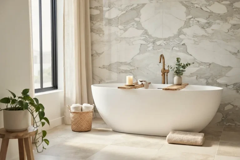
This idea works especially well behind a freestanding tub or a double vanity, since the dark backdrop makes fixtures and mirrors stand out clearly against it. Pair the accent wall with brass or matte black fixtures and a few brass framed mirrors for a polished, coordinated look. This color choice suits primary bathrooms with good natural light, since the contrast between the dark wall and white trim photographs beautifully.
6. Warm Greige Palette
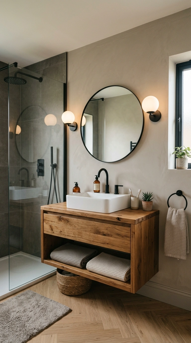
A warm greige, somewhere between gray and beige, is one of the safest and most enduring color choices for bathroom walls, since it shifts subtly depending on the light without ever looking dated. Choose a greige with warm undertones rather than a cool, blue-based gray, since the warmth keeps the room feeling inviting rather than cold and clinical. This color works well as an all-over wall color in bathrooms of any size, since it acts almost like a neutral backdrop for whatever tile, fixtures, or accessories you choose.
Pair greige walls with white trim and a wood vanity for a soft, collected look, or with black fixtures for more contrast. This palette photographs consistently well across different lighting conditions, which makes it a safe choice if you plan to sell your home eventually, since greige tends to appeal to a wide range of tastes without feeling like a bold statement.
7. Deep Forest Green Tile
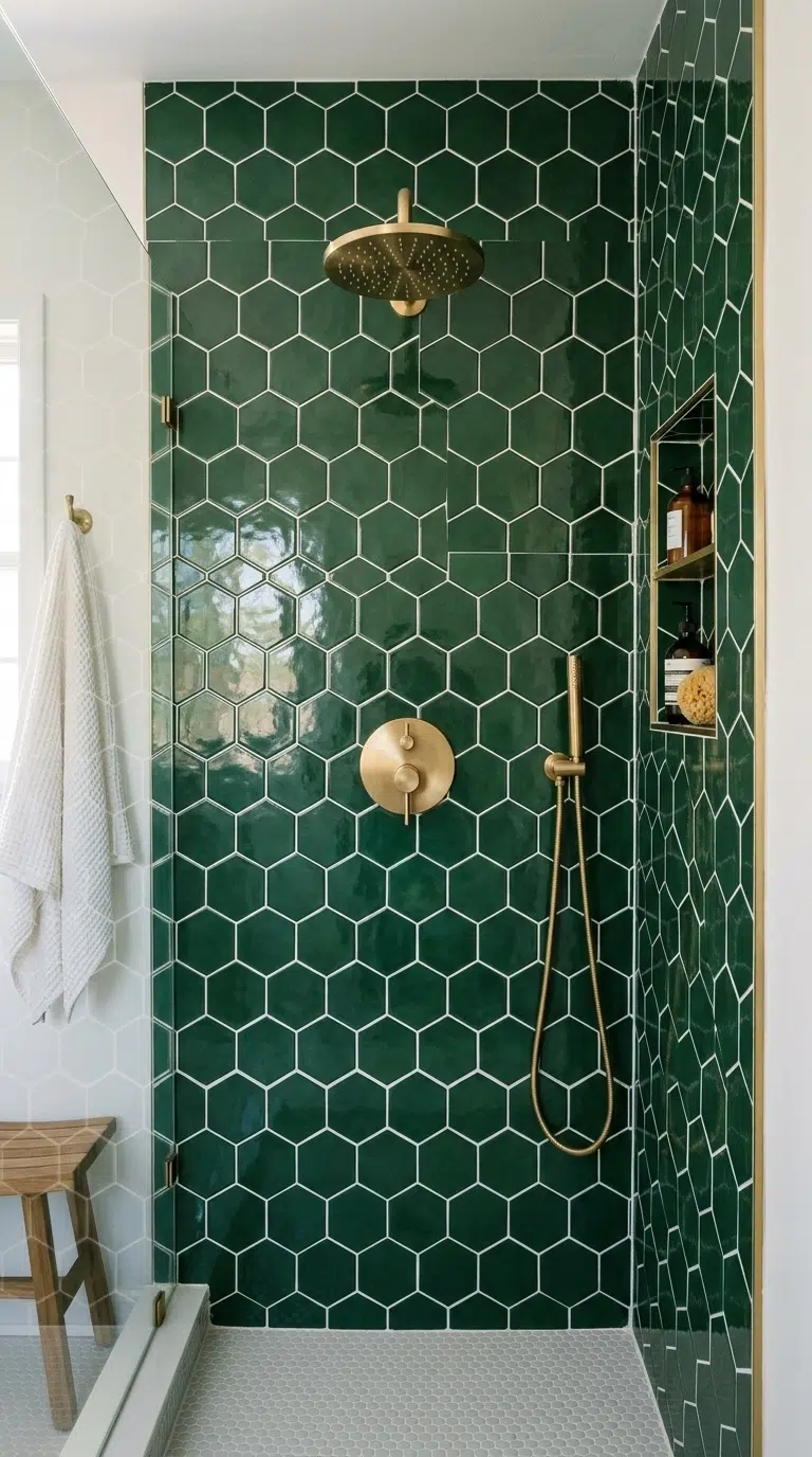
Forest green tile on a shower wall or bathroom floor brings a rich, nature-inspired color that has stayed popular in bathrooms since the art deco era and shows no sign of fading from style. Choose a tile with a slight sheen, like a glossy subway tile or a small hexagon shape, since the shine helps the deep green catch available light rather than looking flat. Pair the tile with brass fixtures and white grout for the most classic combination, or black grout for a more modern, graphic look.
Keep the rest of the bathroom relatively neutral, with white walls and simple fixtures, so the green tile remains the star of the room. This idea works particularly well in a shower surround or as a half wall of tile behind a vanity, giving you the impact of a bold color choice without tiling the entire room.
8. Creamy Ivory Walls
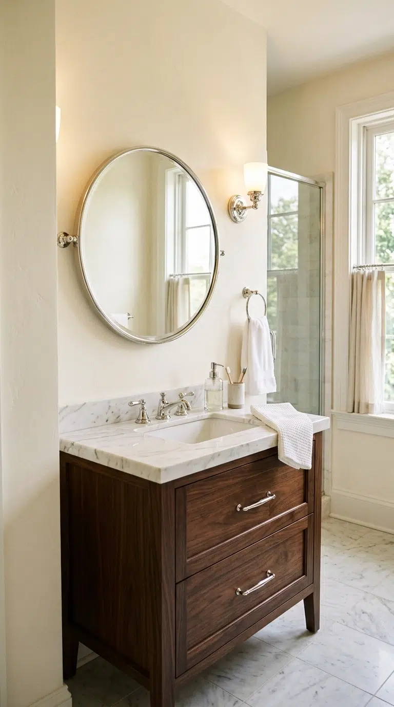
A soft, creamy ivory on bathroom walls gives a warmer alternative to stark white while still keeping the room feeling bright, clean, and timeless. Choose a shade with a hint of yellow or beige rather than a cool, blue-based off-white, since the warmth keeps the room from feeling sterile under bathroom lighting. This color pairs beautifully with almost any fixture finish, from polished chrome to warm brass, which makes it a flexible choice if you plan to update hardware or accessories over time.
Ivory walls also make a small, windowless bathroom feel a bit more open than a stark white would, since the warmth softens harsh overhead lighting. Pair the walls with a white or marble-look vanity top and simple woven accessories for a soft, classic look. This color choice works in every type of bathroom, from a small powder room to a large primary suite.
9. Muted Olive Vanity
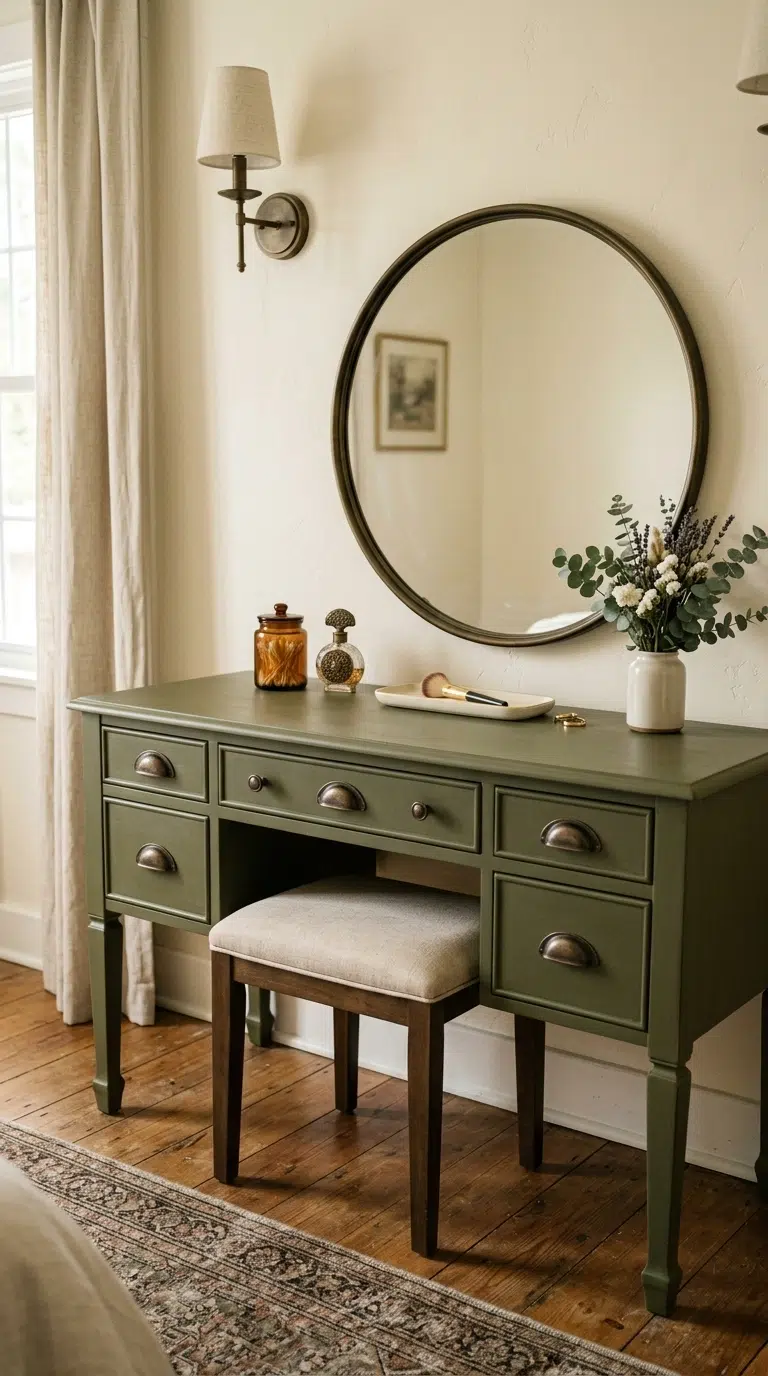
An olive green vanity brings an earthy, slightly vintage feel to a bathroom, and the muted, grayed-down version of olive tends to age far better than a bright, grassy green. Choose a matte cabinet paint in olive, and pair it with brass or aged bronze hardware to bring out the warmth in the color. Keep the surrounding walls in a soft white or warm cream so the vanity stands out as the room’s main color statement.
This idea works especially well paired with natural stone or wood accessories, like a wood stool or a stone soap dish, since these materials echo the earthy tone of the vanity itself. Olive is a particularly good choice if you want a color that feels different from the sage green and navy options that have become common in recent years, while still staying within the same timeless, muted color family.
10. Soft Blue-Gray Walls
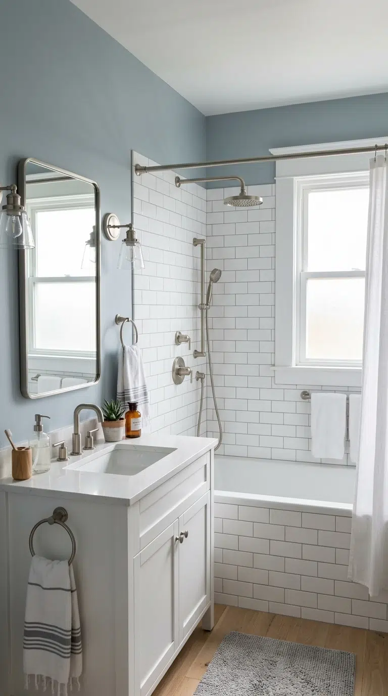
A soft, dusty blue-gray on bathroom walls brings a calm, spa-like feeling that works in almost any lighting condition, from bright natural daylight to warm evening bulbs. Choose a shade that leans slightly gray rather than a true, saturated blue, since the muted version feels more sophisticated and less like a nursery color. This palette pairs beautifully with white subway tile, brushed nickel fixtures, and simple woven bath textiles in cream or white.
Blue-gray walls work particularly well in bathrooms attached to a bedroom, since the calming tone extends the same relaxed feeling from one room into the next. This color choice photographs especially well with natural light coming through a window, since the blue undertone shifts subtly depending on the time of day, giving the room a slightly different mood in the morning compared to the evening.
11. Warm Chocolate Brown Tile
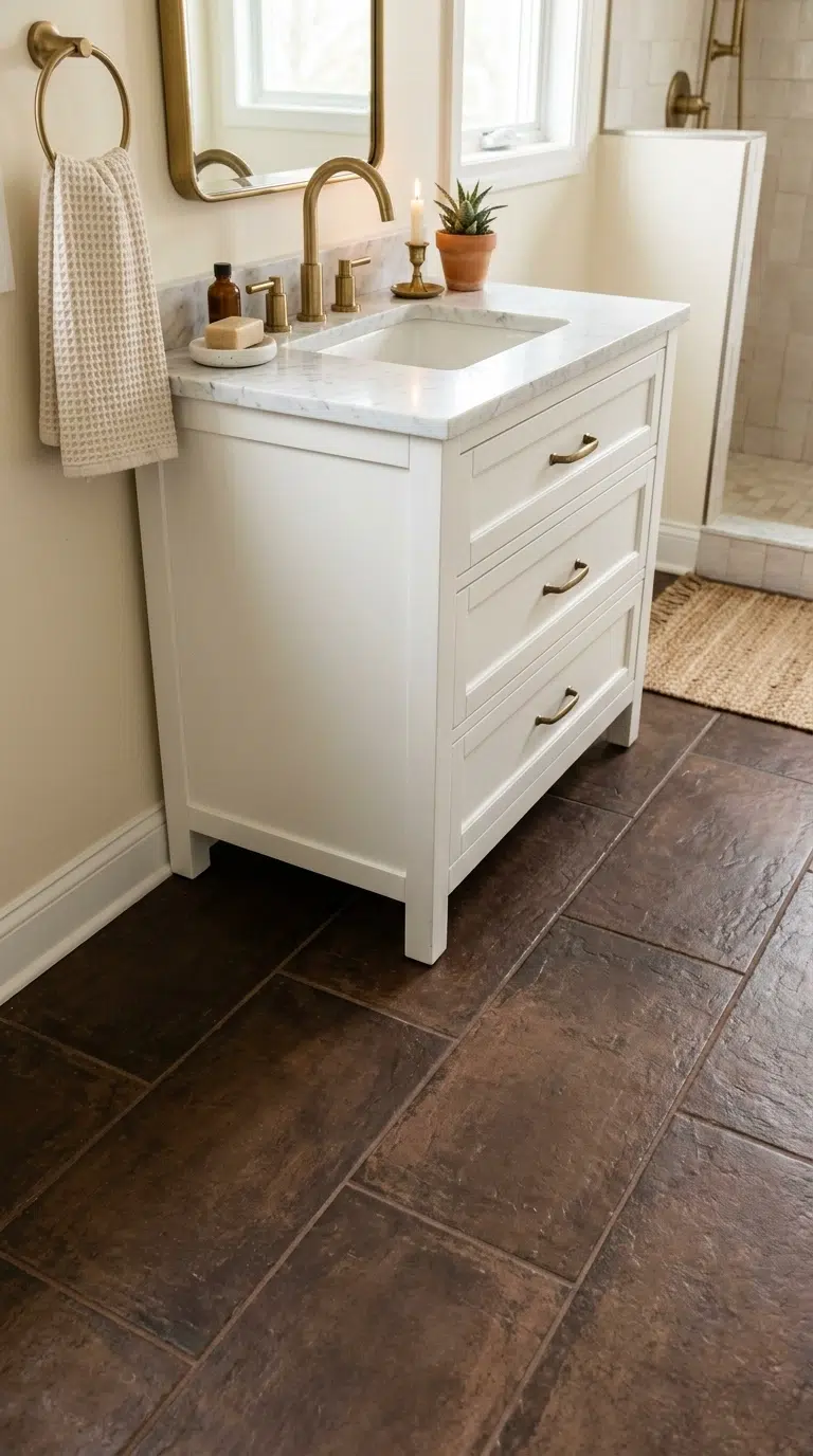
Rich chocolate brown tile on a bathroom floor or shower wall brings a warm, grounded feeling that has quietly stayed in style for decades, especially in bathrooms that lean traditional or transitional. Choose a tile with a slight texture or variation in tone, like a hand-glazed look, rather than a completely flat, uniform brown, since the variation keeps the color from looking heavy or dated. Pair the tile with white walls and brass or nickel fixtures to keep the overall palette balanced and bright.
This color choice works especially well on bathroom floors, since brown hides everyday wear and water spots better than a lighter tile would. Add a cream or white bath mat and towels to keep the room feeling fresh rather than overly dark, and use good lighting, since brown tile can look flat under dim bulbs alone.
12. Dusty Lavender Accent
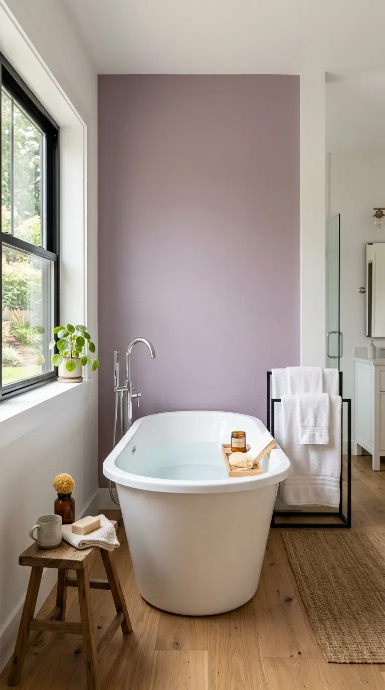
A muted, dusty lavender used as an accent wall or on cabinetry brings a soft, unexpected color into a bathroom without feeling overly feminine or trendy. Choose a grayed-down lavender rather than a bright purple, since the dusty version reads as sophisticated and pairs surprisingly well with warm wood tones and brass fixtures. This color works especially well as a single accent wall behind a freestanding tub, paired with white walls everywhere else in the room.
Keep accessories simple and neutral, like white towels and a plain woven bath mat, so the lavender wall remains the focal point without the room feeling too busy. This idea suits primary bathrooms and guest bathrooms alike, and it offers a fresh alternative to the greens and blues that have become more common choices for bathroom color in recent years.
13. Classic Black and White
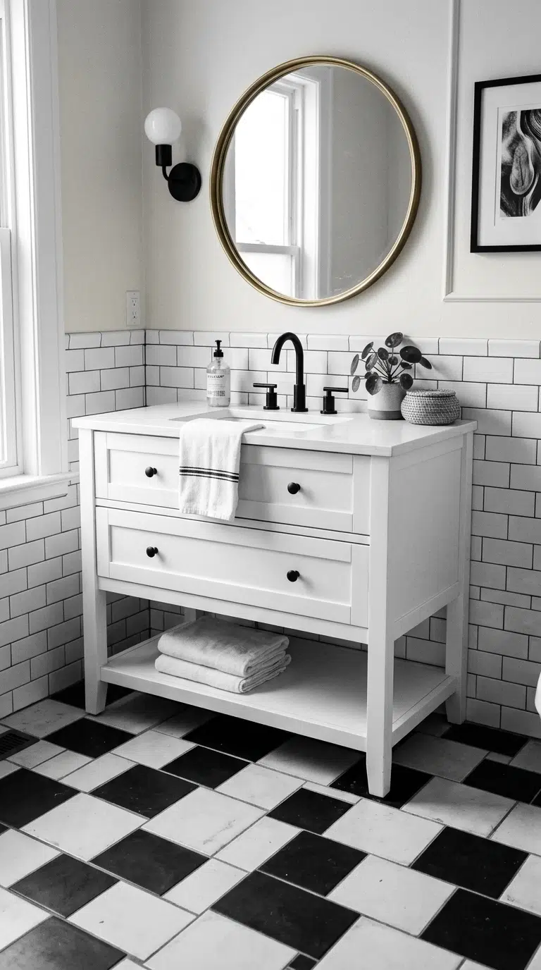
A black and white color scheme, whether through checkerboard floor tile, black fixtures against white walls, or a simple black and white striped wallpaper, is one of the most enduring combinations in bathroom design. Choose a matte black finish for fixtures and hardware, since matte tends to look more current than a high shine finish. Pair black and white with brass accents, like a mirror frame or a light fixture, to warm up what could otherwise feel like a stark, cold palette.
This color combination works in bathrooms of every size and style, from a small powder room with graphic wallpaper to a large primary bathroom with checkerboard marble floors. Because black and white has stayed popular across nearly a century of design trends, it is one of the safest color choices if you want a bathroom that will still look intentional many years from now.
14. Warm Camel Tile Floor
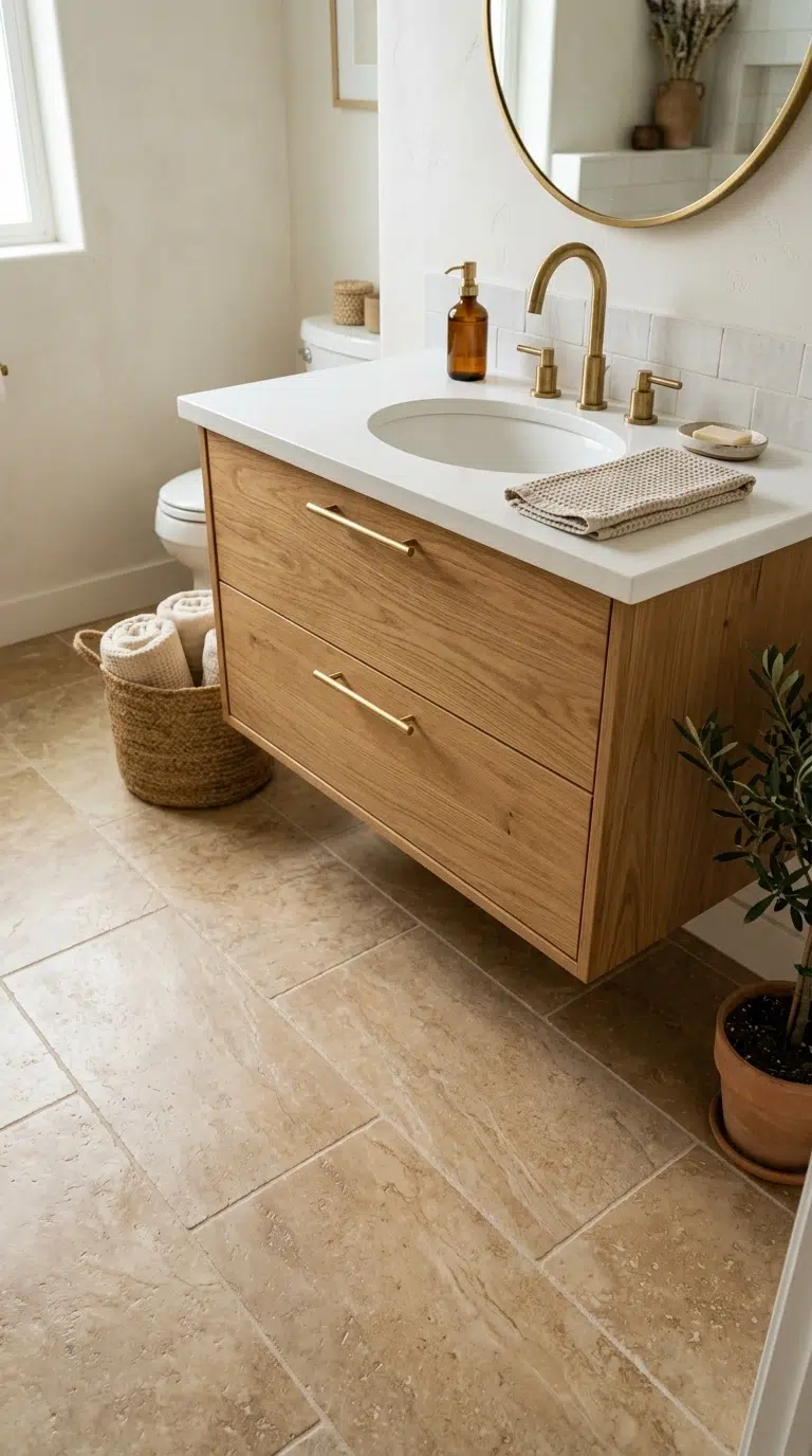
A warm camel or tan colored tile on a bathroom floor brings a soft, sandy warmth that pairs beautifully with white walls and natural wood accessories. Choose a tile with subtle veining or texture rather than a completely flat color, since the variation gives the floor more depth and helps hide water spots between cleanings. This color works especially well in bathrooms that get natural light, since the warm tone reflects sunlight nicely throughout the day.
Pair camel tile with a white or light wood vanity and brass fixtures for a warm, cohesive look, or with black fixtures for a bit more contrast. This palette suits primary bathrooms and guest bathrooms alike, and it tends to feel especially at home in a bathroom styled with linen textiles and simple, natural materials rather than anything too polished or glossy.
15. Soft Butter Yellow Walls
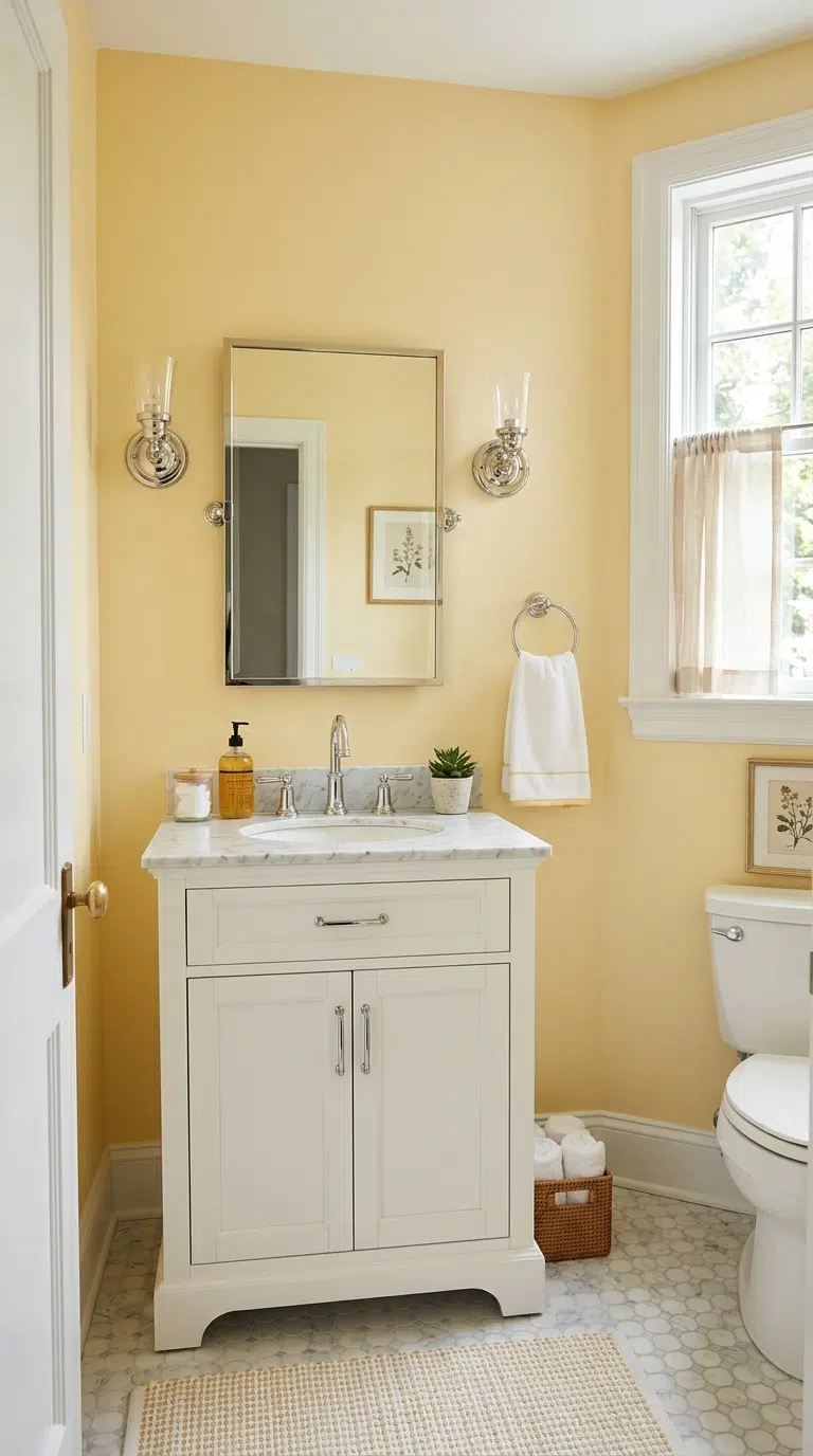
A soft, muted butter yellow on bathroom walls brings a cheerful warmth to the room without feeling as bold or trend-driven as a bright, saturated yellow would. Choose a pale, creamy version of yellow rather than a bright lemon shade, since the softer tone feels more timeless and works well even in small bathrooms with limited natural light. Pair butter yellow walls with white trim, a white vanity, and simple chrome or nickel fixtures to keep the room feeling bright and classic rather than overly playful.
This color works particularly well in a powder room or a bathroom attached to a sunny bedroom, since the warm tone photographs beautifully with natural daylight streaming through a window. Add simple white or cream towels to keep the overall palette soft rather than overwhelming.
16. Slate Blue Shower Tile
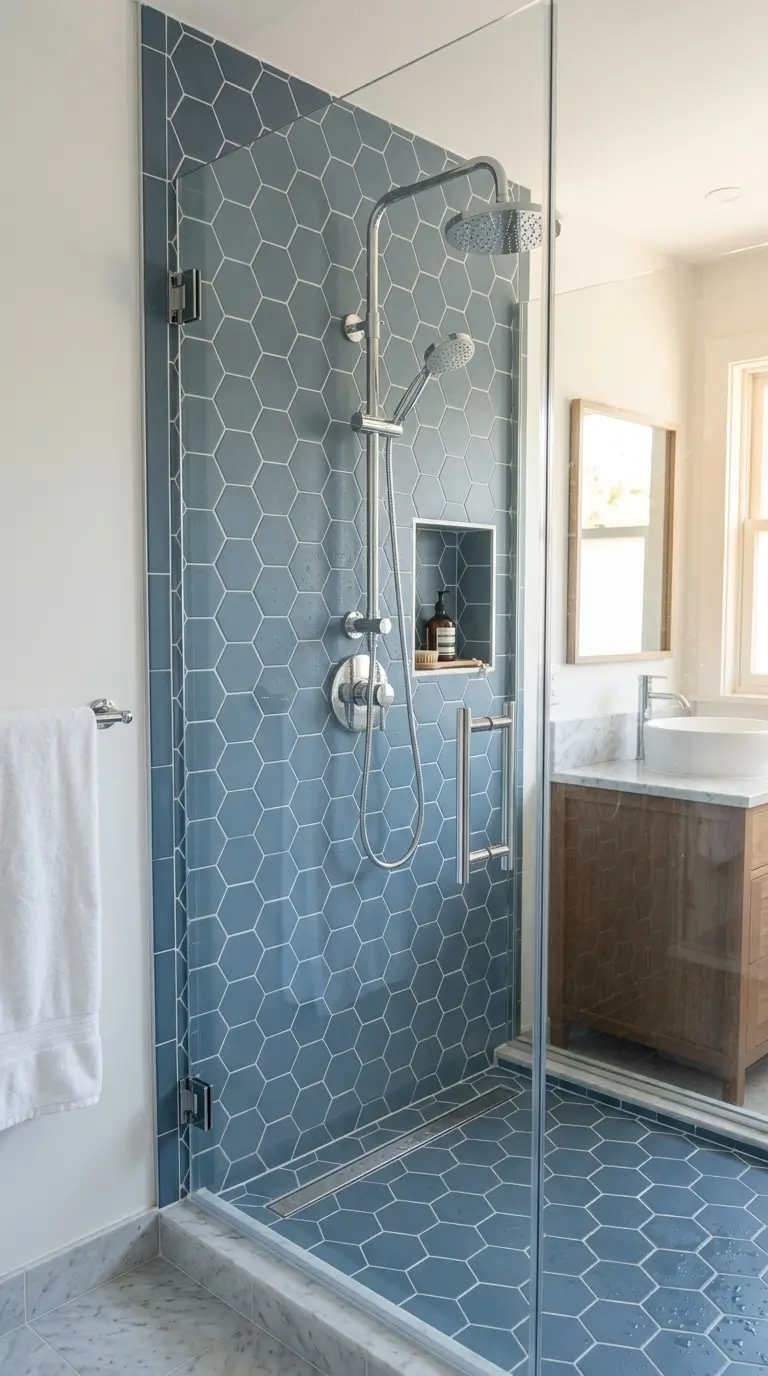
Slate blue tile in a shower surround brings a deep, moody color into a bathroom while still feeling calm rather than overly dramatic. Choose a matte finish tile in a subway or small hexagon shape, since the muted finish keeps the deep blue from looking too shiny or cold. Pair the tile with white grout for a classic, contrasted look, or with matching blue grout for a more seamless, modern effect.
Keep the walls outside the shower in white or a soft cream so the slate blue remains contained to the shower area rather than making the whole room feel dark. This idea works especially well in bathrooms with a glass shower door, since the glass lets the tile color show through without blocking natural light from reaching the rest of the room.
17. Warm Taupe Palette
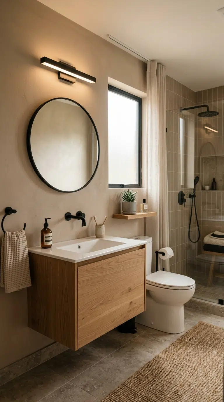
A warm taupe, sitting somewhere between brown and gray, is one of the most versatile and enduring color choices for an all-over bathroom palette, whether on walls, cabinetry, or tile. Choose a taupe with warm undertones rather than a cool, ashy gray, since the warmth keeps the room feeling inviting under both natural and artificial light. This color pairs well with nearly any fixture finish, from brass to matte black to brushed nickel, which makes it a flexible base if you like to update small details over time without repainting the whole room.
Pair taupe walls with white trim and a simple wood vanity for a soft, layered neutral look. This palette works in every type of bathroom and tends to photograph consistently well, since the warm undertone keeps the color from looking flat or gray under different lighting conditions.
18. Deep Burgundy Accent Wall
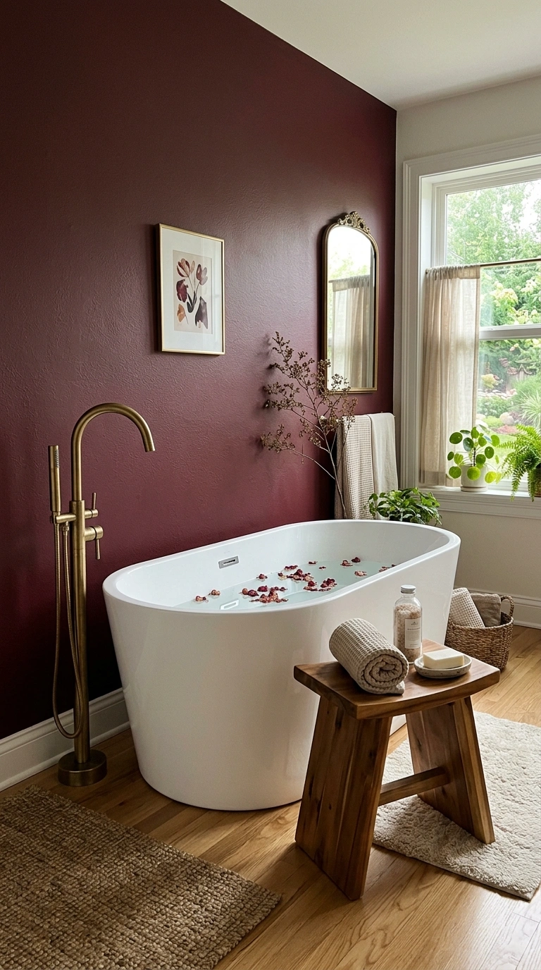
A deep burgundy or oxblood accent wall brings a rich, jewel-toned color into a bathroom that feels a bit more daring than the greens and blues that have become common choices in recent years. Choose a matte finish paint for the most current, sophisticated look, and apply it to just one wall, like the space behind a freestanding tub or a double vanity, rather than the whole room. Pair the burgundy wall with brass fixtures and warm wood accessories to bring out the color’s warmth, and keep the surrounding walls in white or cream so the accent wall has room to stand out.
This color choice works especially well in a primary bathroom with good lighting, since burgundy can look a bit heavy in a small, dim space, but reads as rich and inviting in a bathroom with natural light or good overhead fixtures.
19. Soft Sand Neutral Palette
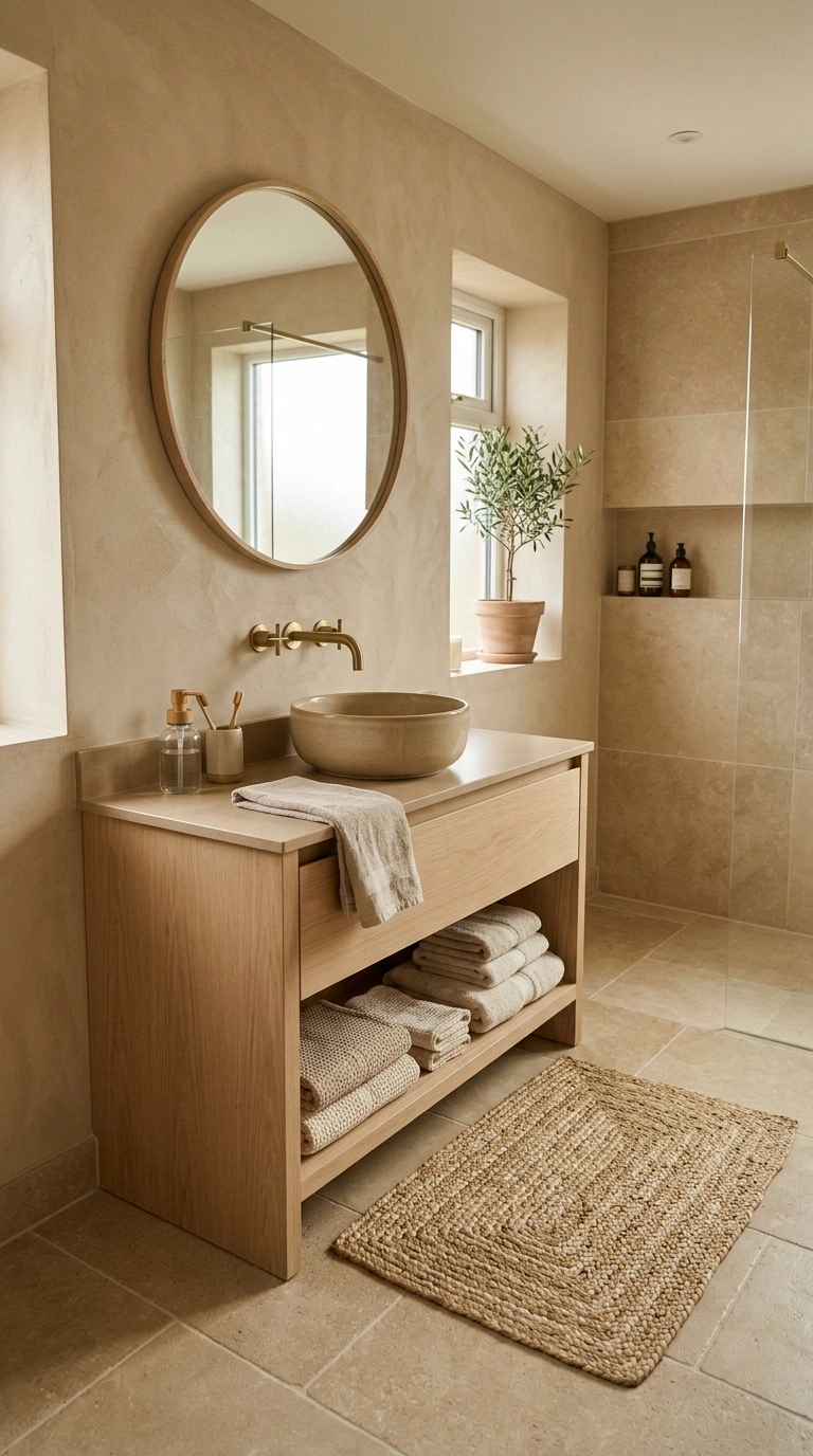
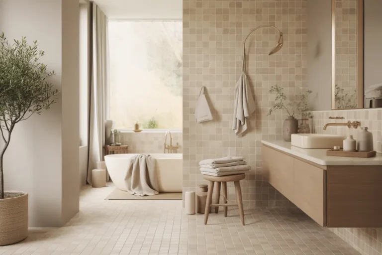
A soft, sandy beige used across walls, tile, and even cabinetry creates a warm, neutral bathroom palette that feels closer to natural stone than to a typical builder-grade beige. Choose a shade with warm, slightly pink or golden undertones rather than a flat, yellow-based beige, since the warmer version feels more current and pairs beautifully with both brass and matte black fixtures. This palette works especially well as an all-over color scheme, since sand tones on walls, floor tile, and vanity all together create a calm, cohesive look rather than a mix of competing neutrals.
Add texture through a woven bath mat, linen towels, or a wood stool to keep an all-sand palette from feeling flat. This color choice suits primary bathrooms and spa-style bathrooms especially well, and it tends to photograph with a warm, soft glow regardless of the time of day.
Final Thoughts
Picking a bathroom color does not have to mean guessing what will still look good in ten years. Stick to shades pulled from nature, stone, and old buildings, keep your fixtures simple, and let the color do the work. Whether you paint one wall or tile a whole shower, any of these 19 ideas will hold up long after this year’s trending shade has come and gone.
FAQs
What is the most timeless bathroom color?
Soft neutrals like warm white, ivory, greige, taupe, and muted sage green remain timeless because they pair well with different fixtures, materials, and decorating styles while staying fresh for years.
Which bathroom colors make a small bathroom look bigger?
Light shades such as creamy white, soft ivory, pale greige, and light blue-gray reflect more light, helping small bathrooms feel brighter, more open, and more spacious.
Are dark bathroom colors still in style?
Yes. Rich colors like navy, charcoal, forest green, and burgundy are still popular when used as accent walls, cabinetry, or shower tile, especially when balanced with lighter walls and natural materials.
How do I choose the right bathroom color?
Consider your bathroom’s natural lighting, existing tile, vanity, and fixture finishes. Warm, nature-inspired colors usually create a timeless look that complements most bathroom styles.
What colors work best with brass bathroom fixtures?
Brass fixtures pair beautifully with sage green, terracotta, navy, forest green, taupe, ivory, and warm sand tones because these colors enhance the warmth and elegance of the metal finish.