23 Living Room Paint Color Combinations to Try

Picking paint for a living room is one of those jobs that sounds simple until you are standing in the paint aisle holding five different swatches and none of them look right together. I have repainted my own living room three times over the years, and every time I learned the same lesson. It is never about finding one pretty color. It is about finding two colors that actually get along. Some pairs feel calm and pulled together the second they go on the wall, while others fight each other no matter how nice they looked on the little paper chip. This list is built around real color pairings that work in real homes, not just on a design board. Each one is something you could walk into a paint store today and mix yourself, whether your living room gets a lot of sunlight or barely any at all.
1. Soft White and Sage Green
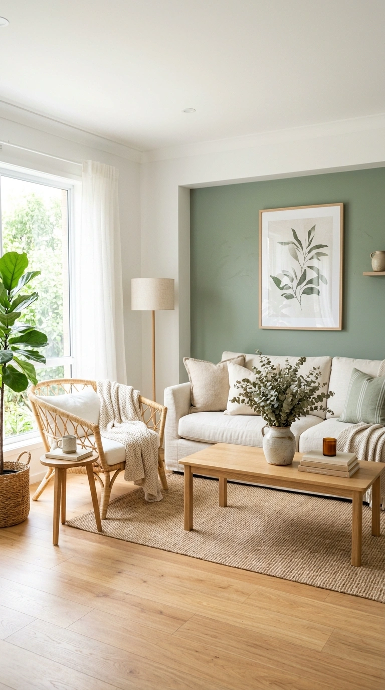
Soft white paired with sage green gives a living room a quiet, garden like feeling without turning the space into a greenhouse. Paint the main walls in soft white and use sage green on one accent wall behind the sofa or the TV console. This combination works especially well in rooms with a lot of natural light, since the green stays soft instead of looking heavy. Add wooden furniture pieces like a light oak coffee table or a rattan chair to bring warmth into the mix. For textiles, cream linen curtains and a chunky knit throw in off white keep the room feeling airy. If you want a little more depth, add a few dried eucalyptus stems in a plain ceramic vase. This pairing photographs beautifully in the late morning when light comes through sheer curtains, and it works in both small apartments and larger open plan living rooms without feeling overpowering.
2. Warm Beige and Terracotta
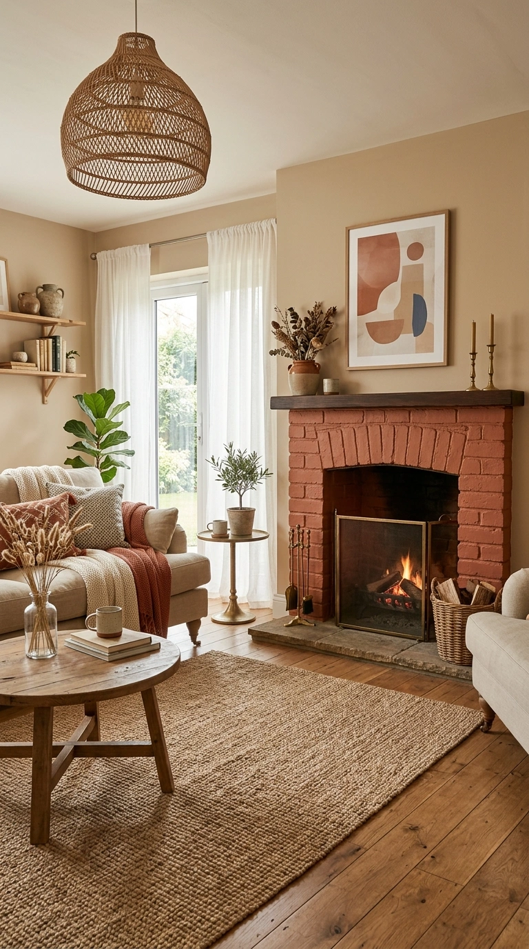
Warm beige walls with terracotta accents bring a sunbaked, cozy feeling into a living room, almost like a room you would find in a Mediterranean home. Paint the walls in warm beige and let terracotta show up through an accent chair, floor cushions, or a painted brick fireplace surround. This combination is especially good for living rooms with wood floors, since the warm tones in the beige and the terracotta both pull nicely against natural wood. Layer in woven textures like a jute rug or a rattan pendant light to keep the space from feeling flat. A few brass details, like a small side table or picture frames, add a warm glow without competing with the wall color. This pairing works well in rooms that do not get direct sunlight all day, since the warmth in both colors keeps the space feeling inviting even on cloudy afternoons.
3. Navy Blue and Cream
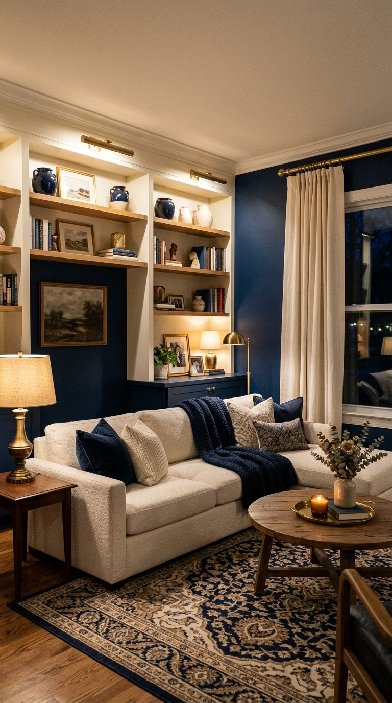
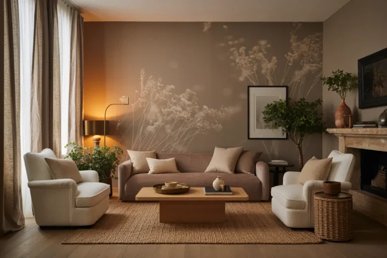
Navy blue and cream is a classic pairing that never really goes out of style, and it works in almost any size of living room. Use navy on a single accent wall or on built in shelving, and keep the rest of the walls in a soft cream shade. This combination looks sharp with brass or gold hardware, so consider swapping out plain switch plates or curtain rods for something with a warm metallic finish. A cream sofa against a navy wall becomes an instant focal point, especially when paired with a patterned rug that pulls in both colors. For a softer version of this look, choose a navy with a slight gray undertone instead of a true bright navy, since it reads a little more relaxed. This combination photographs especially well in the evening with warm lamp light, giving the room a cozy, almost hotel lounge feeling.
4. Charcoal Gray and Blush Pink
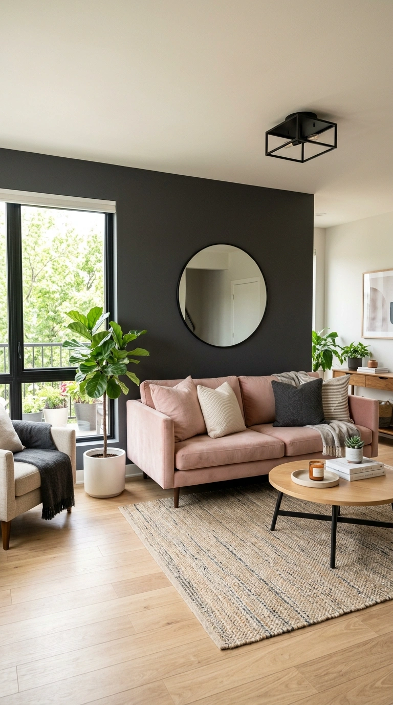
Charcoal gray and blush pink might sound like an unlikely pair, but together they create a living room that feels modern and a little unexpected. Paint the main wall in charcoal gray and bring in blush through a sofa, accent pillows, or a soft area rug. This combination works best in rooms with good natural light, since the charcoal can feel heavy in a dark space. Balance the two tones with plenty of white trim and light colored flooring so the room does not feel too moody. Adding brushed gold or matte black light fixtures ties the two colors together nicely. A round mirror with a thin metal frame above the sofa adds a soft reflective touch that keeps the space feeling open. This pairing works particularly well for people who want a living room that feels stylish and current without going fully bold or bright.
5. Olive Green and Ivory
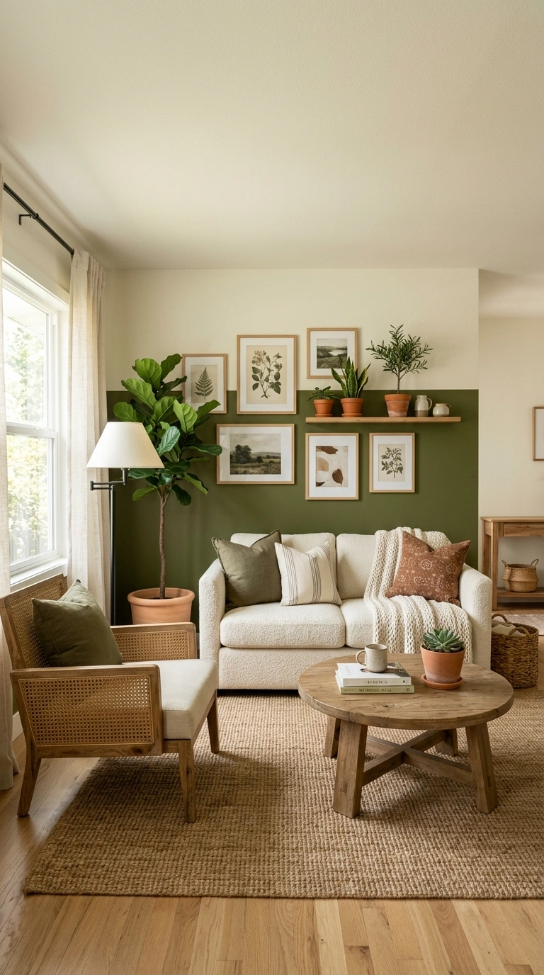
Olive green paired with ivory gives a living room an earthy, grounded feeling that works well in almost any season. Paint the lower half of the wall or a single accent wall in olive green, and keep the rest of the space in ivory to balance out the deeper tone. This combination pairs beautifully with natural materials like cane furniture, linen curtains, and wooden picture frames. A cream or ivory boucle sofa against an olive wall creates a soft, textural contrast that photographs well in almost any lighting. Adding houseplants in terracotta pots continues the earthy theme without adding more color to the walls. This pairing tends to work especially well in living rooms with large windows, since the olive tone can feel a bit dark in rooms with limited daylight. Keep flooring light, whether that is a pale rug or natural wood, to keep the whole room from feeling too heavy.
6. Soft Gray and Mustard Yellow
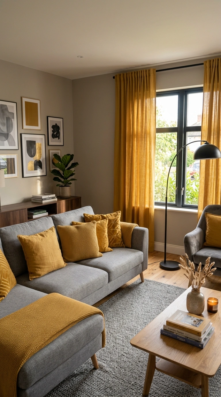
Soft gray walls with mustard yellow accents bring warmth and personality into a living room without needing a full color overhaul. Paint the walls in a soft, warm toned gray and let mustard show up through an accent chair, throw pillows, or curtains. This combination works well in living rooms with wood floors, since the mustard tone pulls in nicely with the warmth of the wood. A gray sofa becomes a neutral base that lets the mustard accents stand out as the main point of interest in the room. Adding black metal light fixtures or a black framed mirror gives the space a little more definition. This pairing photographs especially well in the late afternoon, when the yellow accents catch the light and add a warm glow to an otherwise neutral room. It works well for people who want color in their living room without committing to a bold paint choice on every wall.
7. Taupe and Off-White
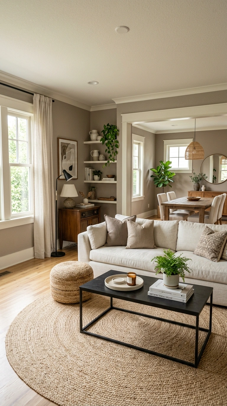
Taupe and off white is one of the easiest combinations to live with, since both colors are soft enough to blend into almost any style of furniture or decor. Paint the main walls in taupe and use off white for trim, ceilings, and larger furniture pieces like the sofa. This pairing works especially well in living rooms that connect to a dining area or kitchen, since the neutral tones flow easily from room to room without needing a hard stopping point. Add texture through a woven pouf, a linen throw, or a jute rug to keep the space from feeling too plain. A few black or dark wood accents, like a coffee table or picture frames, add contrast without disrupting the calm feeling of the room. This combination is a strong choice for anyone planning to sell their home soon, since it appeals to a wide range of tastes and photographs well in almost any lighting condition.
8. Deep Green and Warm Wood Tones
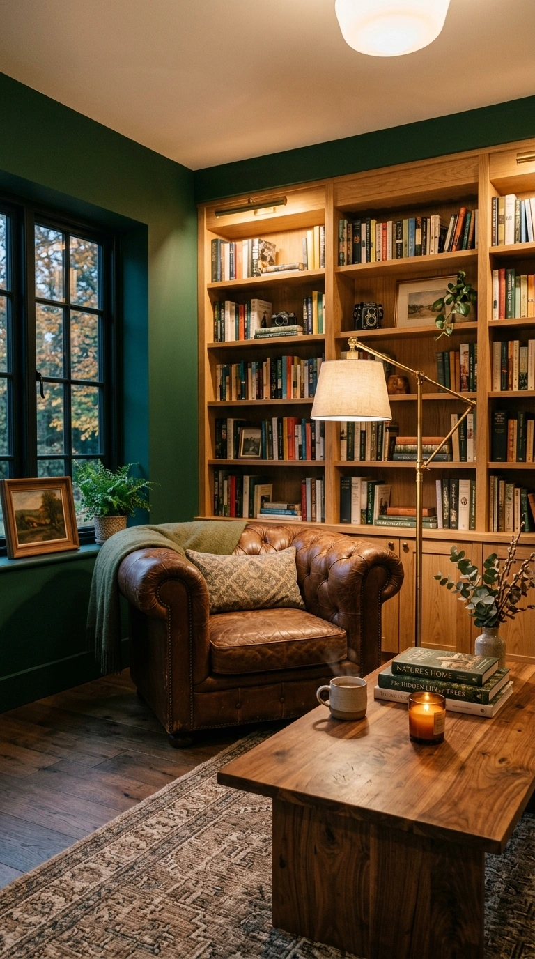
Deep green walls paired with warm wood tones create a living room that feels like a cozy study or reading room. Paint one wall, or the entire room, in a deep forest green, and let warm wood furniture do the rest of the work. This combination looks especially good with built in bookshelves, wood beams, or a wooden coffee table with visible grain. Brass reading lamps and leather seating add to the cozy, slightly traditional feeling of this pairing. Keep textiles in warm neutral tones like camel, rust, or cream so the room does not feel too dark overall. This combination works best in living rooms with good lighting, whether that means large windows or a mix of floor and table lamps, since deep green can feel heavy without enough light bouncing around the space. It is a strong choice for anyone who wants a living room that feels more like a retreat than a bright, airy space.
9. Dusty Blue and White
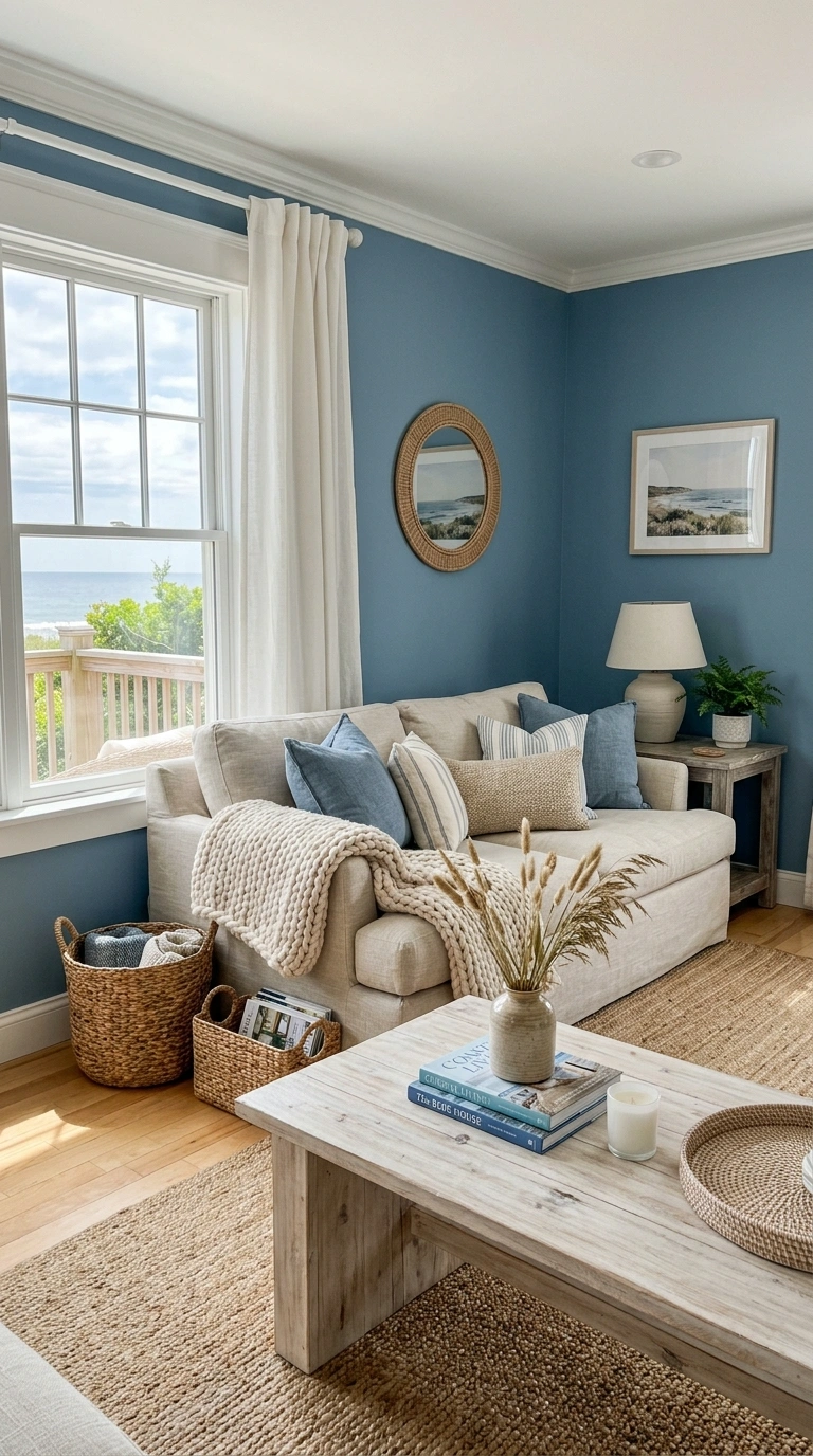
Dusty blue and white creates a living room that feels calm, coastal, and easy to relax in. Paint the walls in a soft dusty blue and keep trim, ceilings, and larger furniture pieces in white to keep the room feeling light. This combination works especially well in living rooms with a lot of natural light, since the blue stays soft and airy rather than looking cold. Add texture through woven baskets, a slubby linen sofa, or a chunky knit throw draped over the armrest. Light wood furniture, like a whitewashed coffee table, continues the relaxed feeling without adding too much contrast. This pairing photographs beautifully near a window, especially in the morning when soft light fills the room. It works well in both small and large living rooms, since the light color palette keeps the space feeling open rather than boxed in, no matter how much furniture is in the room.
10. Warm Gray and Rust Orange
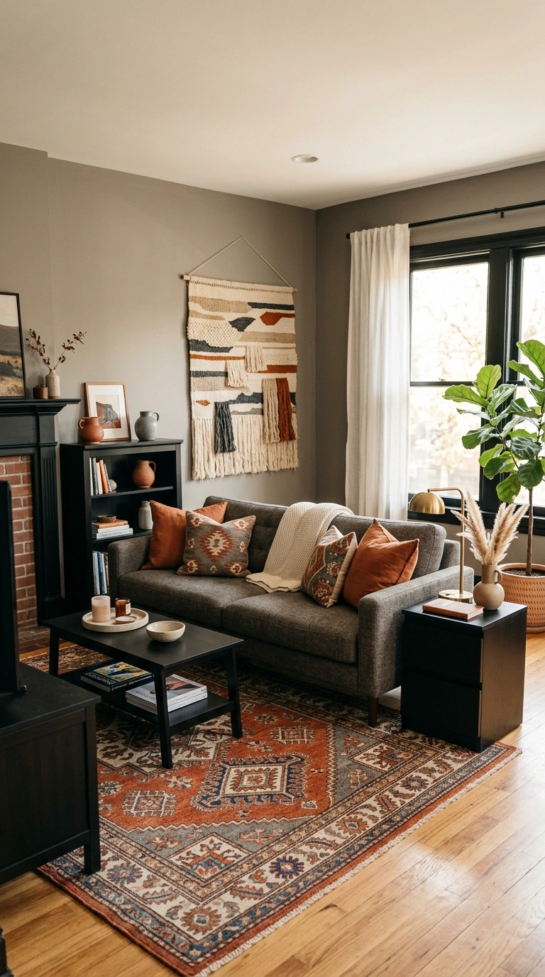
Warm gray walls paired with rust orange accents give a living room a cozy, autumn like feeling that works well year round. Paint the walls in warm gray and bring rust orange in through a statement chair, curtains, or a patterned area rug. This combination works especially well with black and wood furniture, since both tones ground the warmth of the rust without competing with it. A gray sofa with a few rust colored pillows becomes an easy focal point without needing to repaint every wall in the room. Adding a woven wall hanging or a few pampas grass stems continues the warm, textured feeling. This pairing is a good choice for living rooms that feel a bit cold or sterile, since the rust orange adds an instant sense of warmth. It photographs especially well in natural light, where the orange tones look rich rather than overpowering.
11. Cream and Chocolate Brown
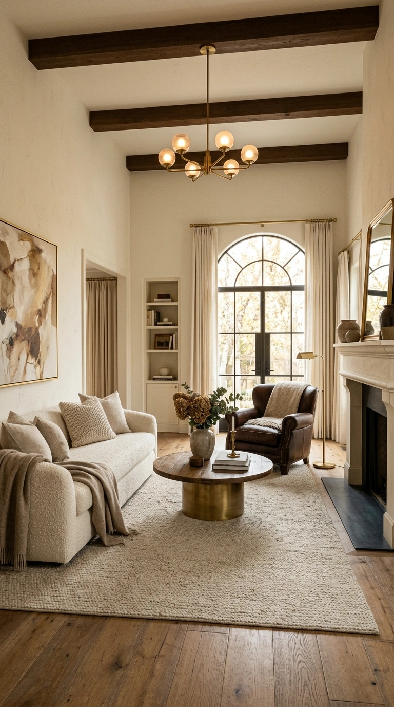
Cream and chocolate brown is a warm, grounding combination that has become popular again after years of everyone leaning toward gray. Paint the walls in a soft cream and bring chocolate brown in through a sofa, an accent wall, or wooden furniture with a rich, dark finish. This pairing works especially well in living rooms with high ceilings, since the darker brown tone helps balance out a lot of open space. Add brass or gold hardware to warm up the room even further, along with textiles in soft neutral tones like oatmeal or ivory. A brown leather armchair paired with a cream boucle sofa creates a nice contrast in texture as well as color. This combination photographs beautifully in both daytime and evening light, since the warm tones hold up well under lamp light. It works particularly well for people who want a living room that feels rich and cozy rather than bright and airy.
12. Light Blue and Soft Yellow
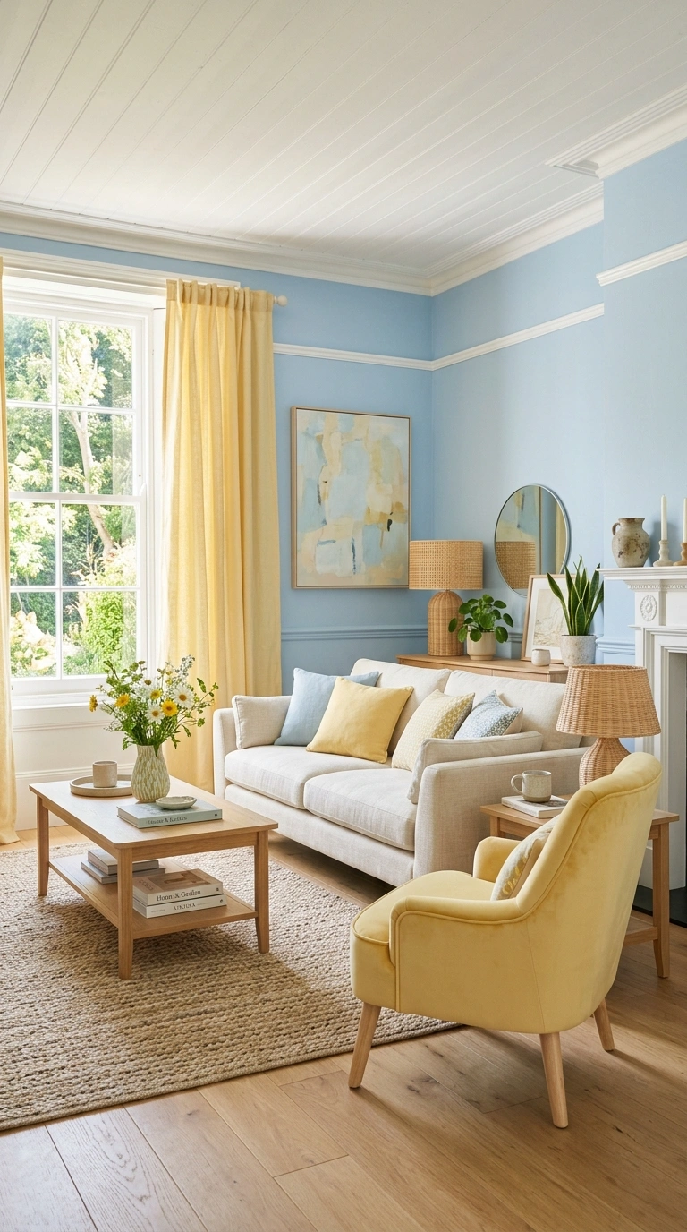
Light blue and soft yellow bring a cheerful, easygoing feeling into a living room without looking childish when done in the right shades. Paint the walls in a very light, almost powdery blue and add soft yellow through curtains, throw pillows, or a single accent chair. This combination works especially well in living rooms with south facing windows, since the extra light keeps both colors looking fresh rather than washed out. White trim and light wood furniture help keep the overall look clean and simple. A rattan lampshade or woven basket adds texture without introducing another color into the mix. This pairing is a good option for anyone who wants their living room to feel bright and welcoming, especially in homes where the living room doubles as a family gathering space. It photographs particularly well in the morning, when natural light makes both colors feel soft and warm.
13. Greige and Black Accents
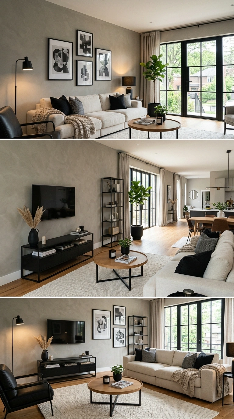
Greige, which sits somewhere between gray and beige, paired with black accents gives a living room a modern but still warm feeling. Paint the walls in greige and bring black in through window frames, light fixtures, or a single piece of furniture like a coffee table or media console. This combination works well because greige is warm enough to avoid feeling cold, while black adds enough contrast to keep the room from feeling flat or boring. A neutral sofa in cream or oatmeal keeps the focus on the wall color and black accents rather than competing with them. Adding a black framed piece of art or a black metal shelving unit continues the theme without needing another paint color. This pairing works especially well in living rooms with a mix of natural and warm artificial light, since the black accents stay sharp and defined no matter the time of day.
14. Terracotta and Cream
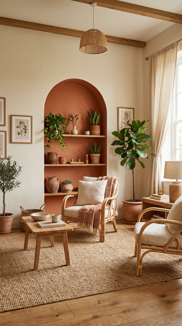
Terracotta paired with cream creates a warm, sunlit feeling in a living room, almost like stepping into a home somewhere warm and dry. Paint the main walls in cream and use terracotta on a single accent wall, an arched nook, or even just through furniture and textiles. This combination works especially well with woven and natural materials, like a jute rug, rattan chairs, or linen curtains in a soft cream tone. A few clay pots with green plants continue the earthy feeling without adding more color to the walls. This pairing tends to photograph beautifully with natural light coming in from the side, since it highlights the texture of the terracotta tone. It works well in both modern and more traditional living rooms, since the combination itself feels timeless rather than tied to a specific trend. Keep metal accents in brass or matte black to avoid competing with the warmth of the walls.
15. Soft Pink and Warm White
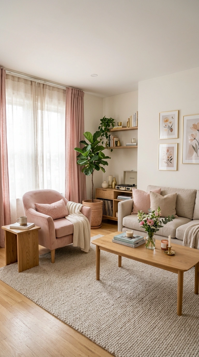
Soft pink and warm white create a living room that feels gentle and welcoming without leaning too feminine or trendy. Paint the walls in warm white and bring soft pink in through a sofa, an accent chair, or curtains. This combination works especially well when paired with natural wood furniture, since the wood warms up the pink and keeps it from feeling too sweet. A neutral rug in oatmeal or cream helps ground the room and keeps the color pairing from feeling too soft overall. Adding black or brass accents, like picture frames or a slim floor lamp, gives the space a bit more definition. This pairing photographs especially well in soft, diffused light, such as a room with sheer curtains, since it keeps both colors looking calm rather than overly bright. It works well for anyone who wants a living room that feels soft and comfortable without looking like a nursery.
16. Forest Green and Camel
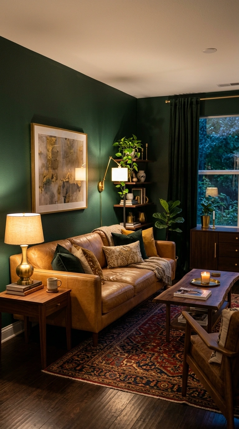
Forest green walls paired with camel colored furniture and accents create a living room that feels rich, warm, and a little bit like a well loved study. Paint the walls in a deep forest green and bring camel in through a leather or suede sofa, curtains, or an area rug. This combination works especially well with brass hardware and warm wood furniture, since both continue the cozy, grounded feeling of the room. Adding a few dark green or gold accent pillows ties the whole look together without needing extra paint colors. This pairing works best in living rooms with good lighting, since the deep green can feel a little heavy in a room that does not get much natural light during the day. It photographs especially well in the evening under warm lamp light, giving the room an inviting, almost old fashioned charm that feels different from typical bright, neutral living rooms.
17. Slate Blue and Warm White
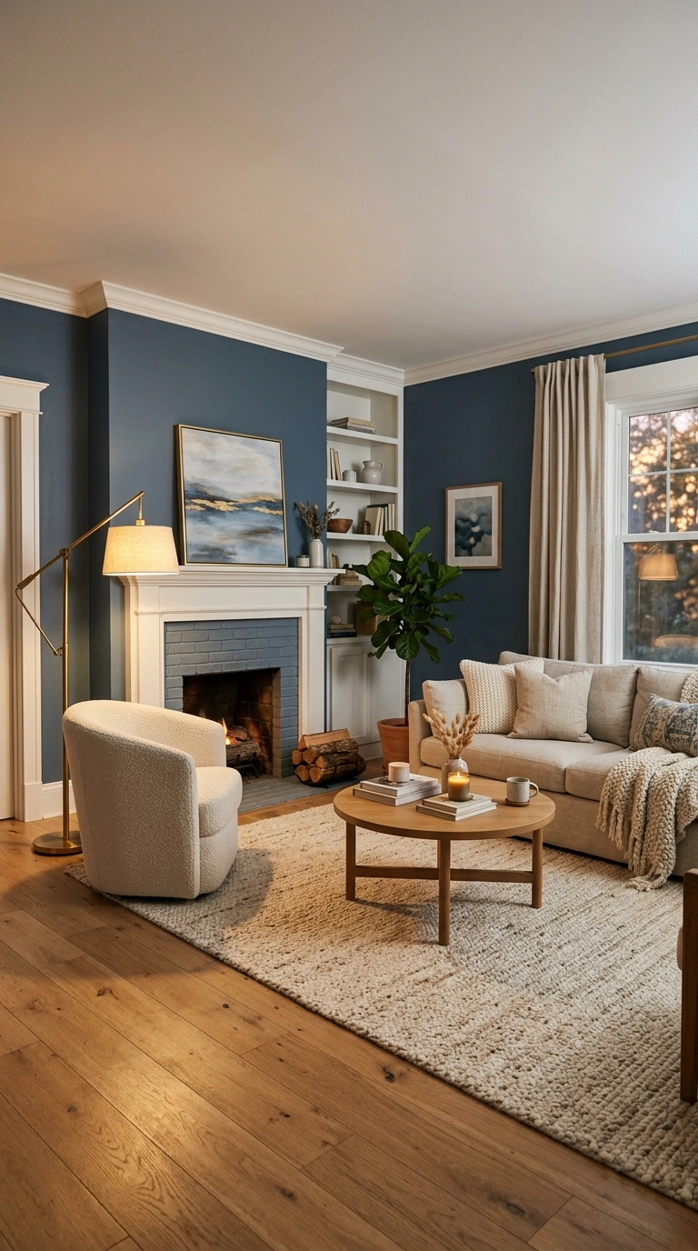
Slate blue paired with warm white gives a living room a calm, slightly moody feeling without making the space feel cold. Paint the walls in slate blue and keep trim, ceilings, and larger furniture pieces in warm white to balance out the deeper wall color. This combination works especially well with wood flooring, since the warmth in the floor keeps the overall room from feeling too cool toned. Adding textiles in cream, oatmeal, or soft gray helps the room feel layered rather than flat. A brass floor lamp or a few brass picture frames add a warm glow that plays nicely against the blue walls. This pairing photographs particularly well in the evening, when warm lighting brings out the depth in the slate blue tone. It works well for living rooms used mainly at night, such as media rooms or spaces where people gather for movies and quiet conversation.
18. Warm White and Natural Wood
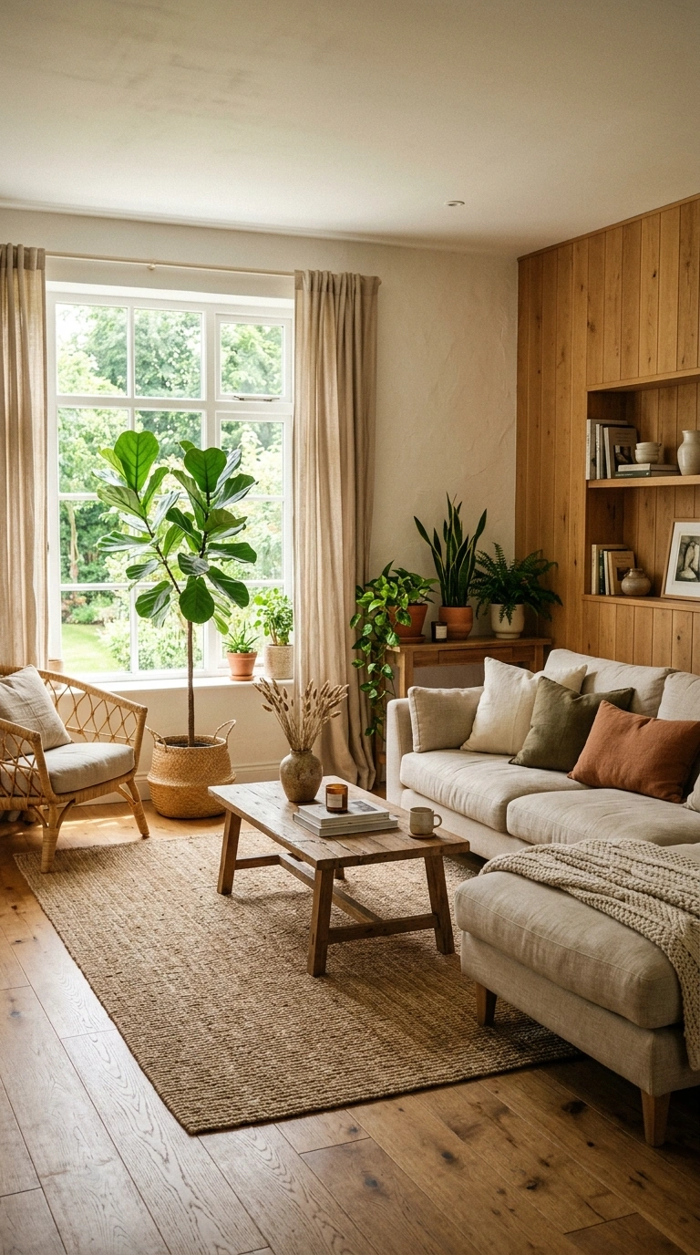
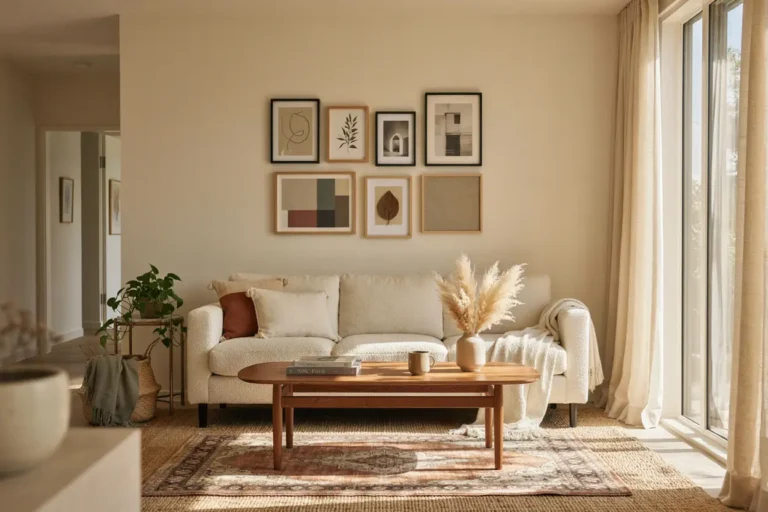
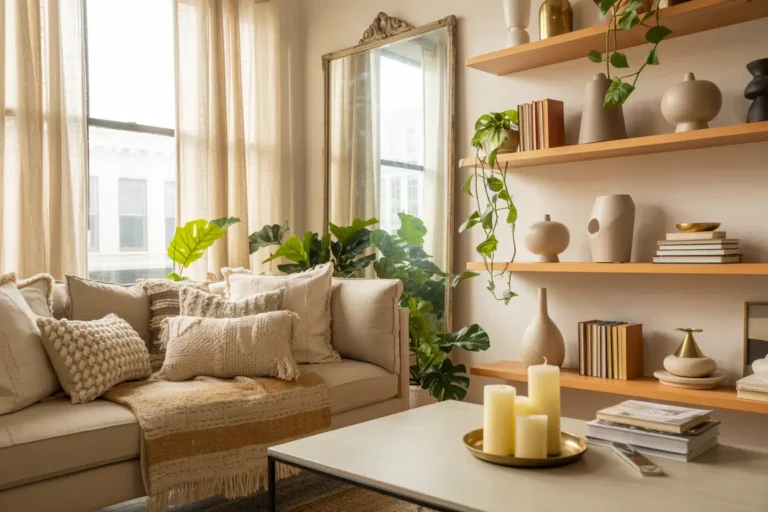
Warm white walls paired with natural wood tones create one of the simplest and most livable combinations for any living room. Keep the walls in a warm, slightly creamy white and let wood furniture, flooring, or paneling do the work of adding warmth and texture. This combination works in almost any style of home, from a small city apartment to a larger farmhouse style living room. Add texture through linen curtains, a woven rug, and a few plants to keep the space feeling fresh rather than plain. Because the walls stay neutral, this pairing gives you room to change out pillows, throws, and accessories without ever needing to repaint. It photographs beautifully in natural light, especially in rooms with big windows, since the wood tones catch the light and add warmth throughout the day. This combination is a strong choice for anyone who wants their living room to feel timeless rather than trend driven.
19. Muted Lavender and Gray
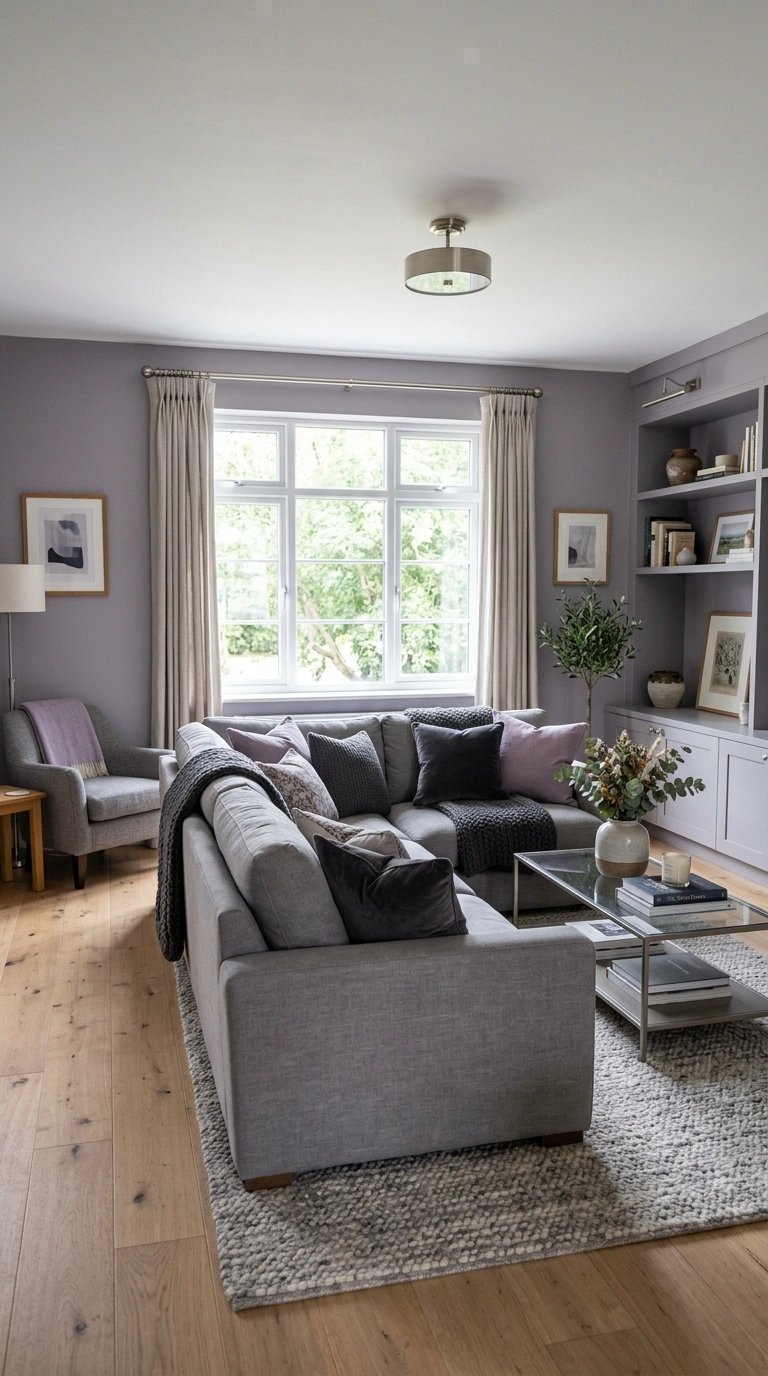
Muted lavender paired with gray creates a living room that feels soft and a little unexpected without being overly bold. Paint the walls in a very muted, grayish lavender and bring in gray through a sofa, rug, or curtains. This combination works especially well in living rooms with plenty of natural light, since strong sunlight can wash out lavender if it is too pale. Adding silver or brushed nickel hardware keeps the overall feeling cool and calm rather than warm. A few deep purple or charcoal accent pillows add contrast without introducing an entirely new color into the room. This pairing photographs well in soft, indirect light, such as a north facing window, since it keeps the lavender looking gentle rather than washed out. It works well for anyone who wants a living room that feels a little different from the usual gray or beige combinations without going too far into bold color territory.
20. Sand Beige and Deep Teal
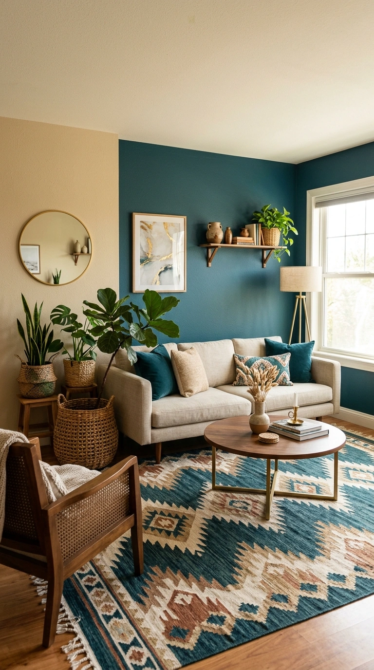
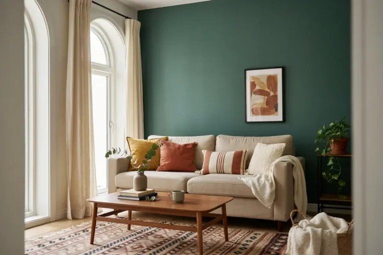
Sand beige paired with deep teal creates a living room that feels warm and a little unexpected at the same time. Paint the main walls in sand beige and bring deep teal in through an accent wall, a statement sofa, or curtains. This combination works especially well with brass and wood accents, since both warm up the teal and keep it from feeling too cool toned. A patterned rug that pulls in both colors helps tie the whole room together without needing extra paint. Adding a few plants in woven baskets continues the natural, grounded feeling of the space. This pairing photographs particularly well with warm afternoon light, since it brings out the richness of the teal against the softer sand walls. It works well for living rooms that could use a bit more personality without going fully bold, offering a nice middle ground between neutral and colorful decor.
21. Soft Yellow and White
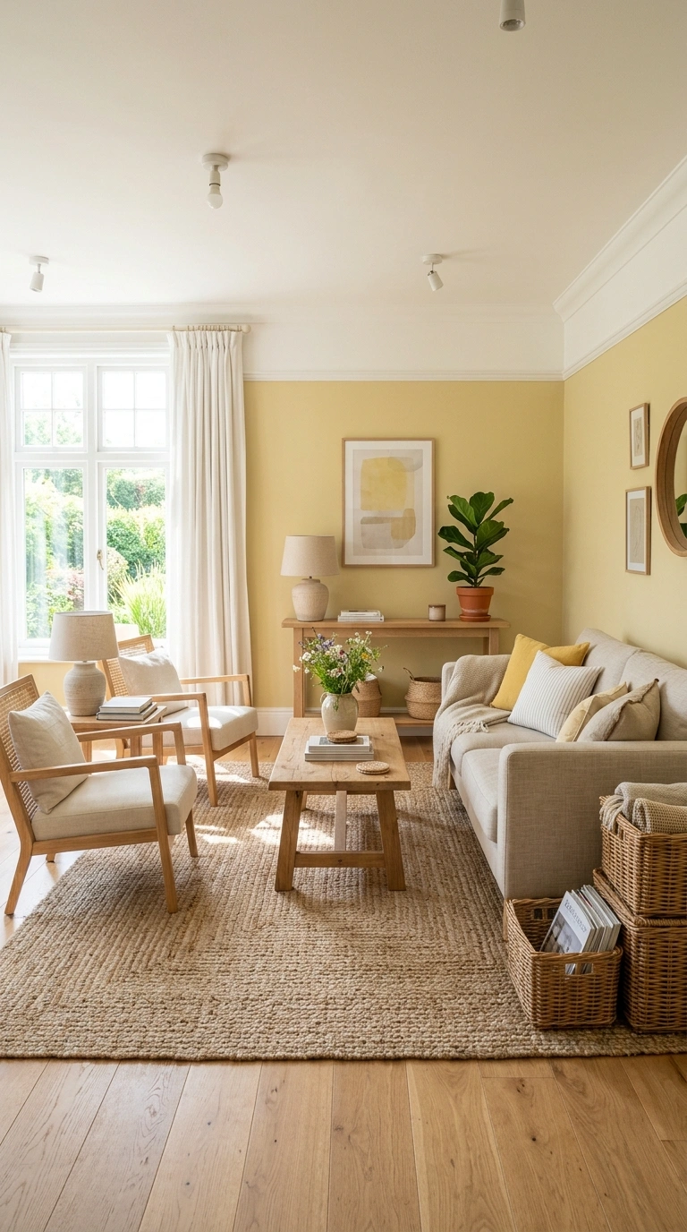
Soft yellow paired with white creates a living room that feels bright, cheerful, and easy to keep looking fresh. Paint the walls in a very soft, muted yellow and keep trim, ceilings, and larger furniture pieces in white. This combination works especially well in living rooms with limited natural light, since the yellow tone helps the space feel sunnier even on cloudy days. Add texture through a woven rug, linen curtains, and a few wicker baskets to keep the room from feeling too plain. Light wood furniture continues the warm, cheerful feeling without introducing another strong color. This pairing photographs especially well during the day, since natural light brings out the softness of the yellow rather than making it look too bright or artificial. It works well for families with young children or for anyone who wants their living room to feel welcoming and a little bit playful without going overboard on color.
22. Clay Pink and Charcoal
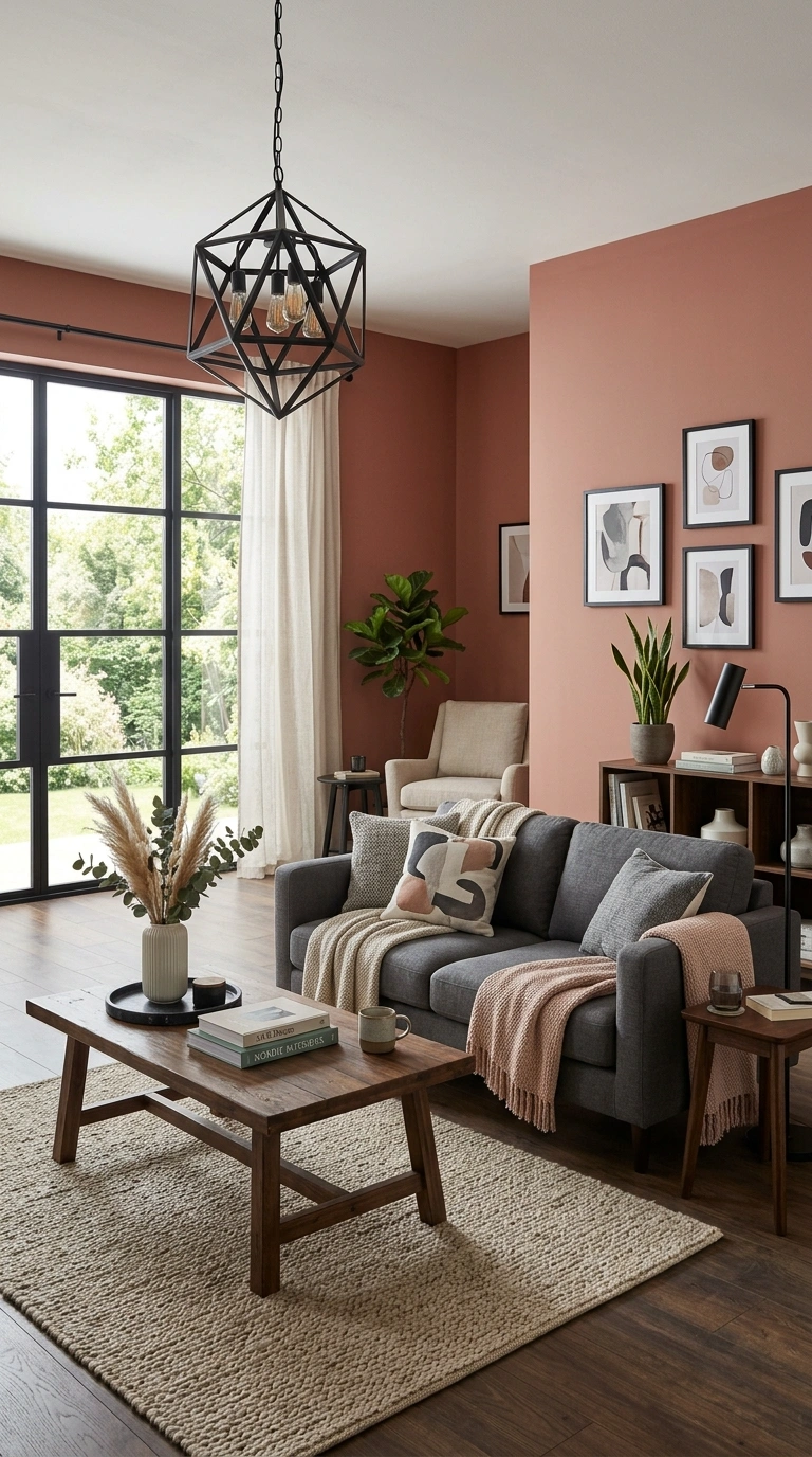
Clay pink paired with charcoal gives a living room a grounded, slightly moody feeling that still holds onto some warmth. Paint the main walls in clay pink and bring charcoal in through a sofa, coffee table, or window frames. This combination works especially well in modern living rooms, since the charcoal keeps the pink from feeling too soft or delicate. Adding black metal light fixtures and a few dark wood accents continues the grounded feeling of the space. A neutral rug in cream or oatmeal helps balance out the two stronger colors so the room does not feel too heavy overall. This pairing photographs particularly well in natural light, where the clay pink looks warm and earthy rather than bright or pastel. It works well for anyone who wants a living room that feels stylish and a little unexpected, without moving into fully bold or saturated color choices.
23. Two-Tone White and Gray
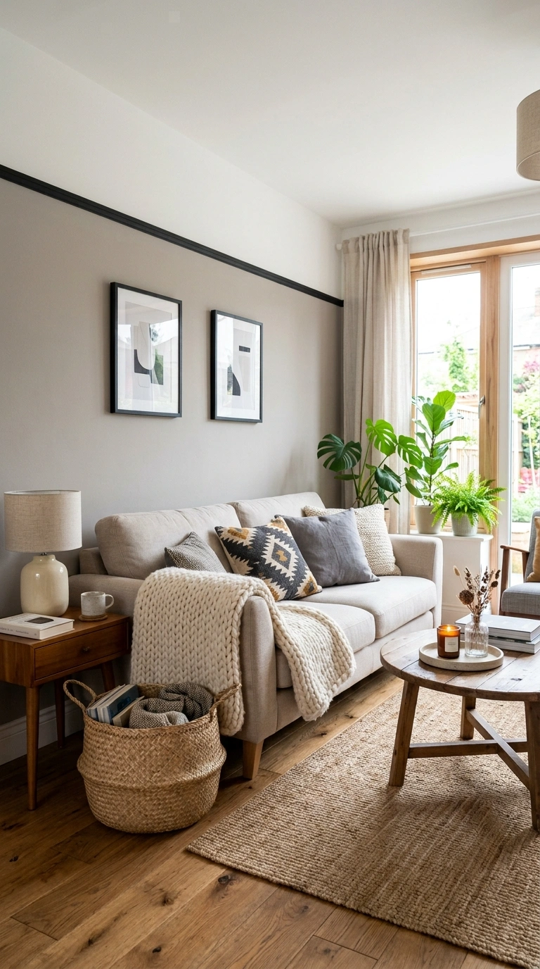
A two tone combination of white and gray keeps things simple while still adding a bit of visual interest to a living room. Paint the lower half of the wall, or one full accent wall, in a soft gray, and keep the rest of the room in a clean white. This combination works in almost any style of home and pairs easily with whatever furniture you already own, since both colors are neutral enough to work with warm or cool toned pieces. Add a black picture rail or trim line where the two colors meet for a more polished, finished look. Bring in texture through a chunky knit throw, a woven basket, or a patterned cushion to keep the room from feeling too plain. This pairing photographs beautifully in almost any lighting condition, making it a safe and reliable choice for anyone who wants their living room to look put together without taking any big color risks.
A Few Final Thoughts
Choosing paint colors for a living room does not have to be complicated once you understand how two shades work together instead of picking colors one at a time. Start with a combination that matches how you actually use the room, whether that is bright and cheerful or warm and cozy, and build the rest of your decor around it. Paint is one of the easiest things to change if you end up not loving it, so do not be afraid to try one of these pairings in your own space.
FAQs
What is the most popular paint color combination for a living room right now?
Warm neutrals paired with a deeper accent color, like cream with terracotta or greige with black, tend to be the most popular choice right now because they feel current without looking trendy or dated in a few years.
Should living room walls be lighter or darker than the ceiling?
In most cases, walls should be the same shade or lighter than the ceiling, since a ceiling that is darker than the walls can make a room feel like it is closing in, especially in living rooms with lower ceiling heights.
How many colors should I use in a living room?
Two main colors, plus one neutral like white or cream, usually works best. This keeps the room feeling intentional rather than busy, and it gives you room to add small pops of color through pillows, art, or accessories later.
Do dark paint colors make a small living room feel smaller?
Not always. A dark color on just one wall, paired with plenty of natural light and lighter furniture, can actually make a small living room feel cozier rather than smaller, as long as the rest of the room stays open and uncluttered.
How do I know if two paint colors will look good together?
Test both colors on a piece of poster board and hold them up in the room at different times of day, since lighting changes how colors look. If they still look balanced in both morning and evening light, they will likely work well together.