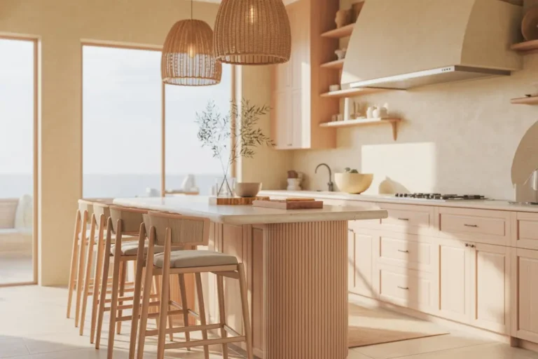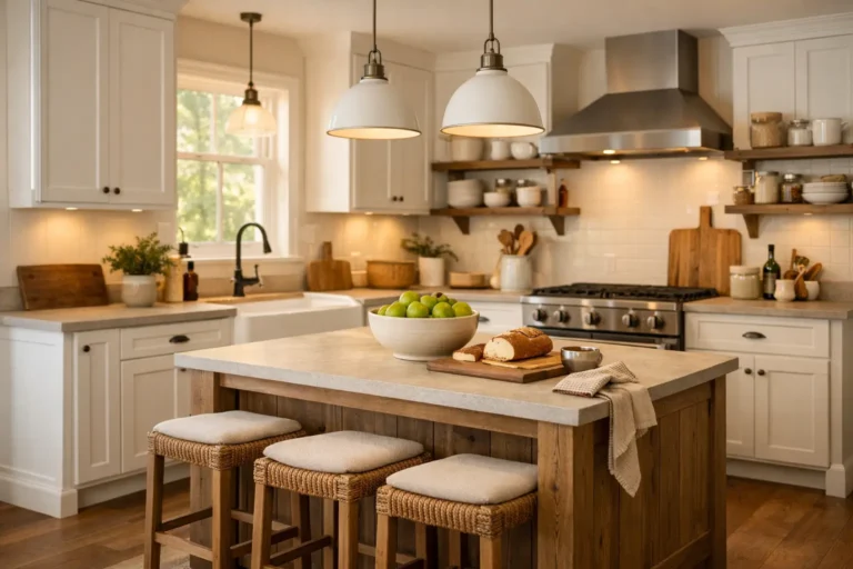
21 Kitchen Cabinet Colors That Never Go Out of Style

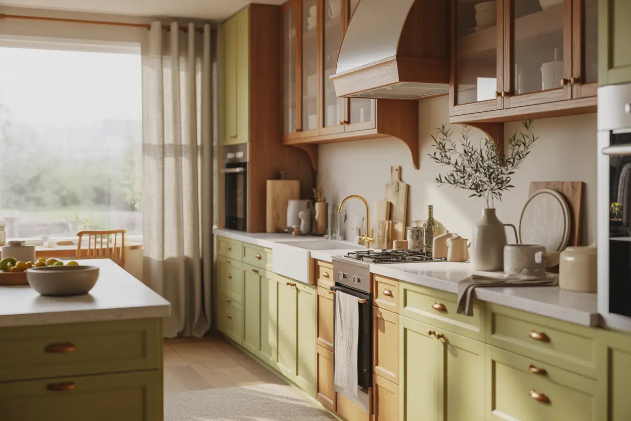
Kitchen cabinet colors can date a kitchen quickly, but the safest choice is not always plain white. A cabinet color tends to age well when its undertone works with the permanent finishes around it, including the countertops, backsplash, flooring, and natural light.
Warm white, natural oak, greige, sage, navy, and deeper wood tones can all have staying power, but they suit different kitchens. A color that looks soft and creamy in a sunny showroom may appear gray or dull in a north-facing room, while a dramatic navy that works beautifully in a large kitchen can feel heavy in a narrow space.
Below are 21 kitchen cabinet colors worth considering, along with the finishes they pair with best, where each color works well, and what to check before committing.
Before Choosing a Cabinet Color, Check These 4 Things
A cabinet color covers a large amount of visual space, so choose it alongside the materials that are staying in the kitchen rather than treating it as an isolated paint decision.
- Start with your fixed finishes. Place the cabinet sample next to your countertop, backsplash, and flooring. A warm cream countertop, for example, can clash with a stark blue-white cabinet even when both look good separately.
- Pay attention to undertones. Two beige cabinets can behave very differently if one leans pink and the other yellow. The same applies to whites, greens, grays, and taupes.
- Check the color throughout the day. Look at a large sample in morning daylight, afternoon light, and under your kitchen’s artificial lighting. Dark and muted colors can shift considerably as the light changes.
- Test vertically. Don’t judge a cabinet color from a small swatch lying flat on the counter. Cabinets are vertical surfaces, so tape a large sample to the cabinet door or wall and view it from across the room.
1. Soft Warm White Cabinets
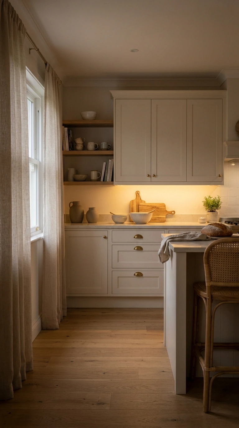
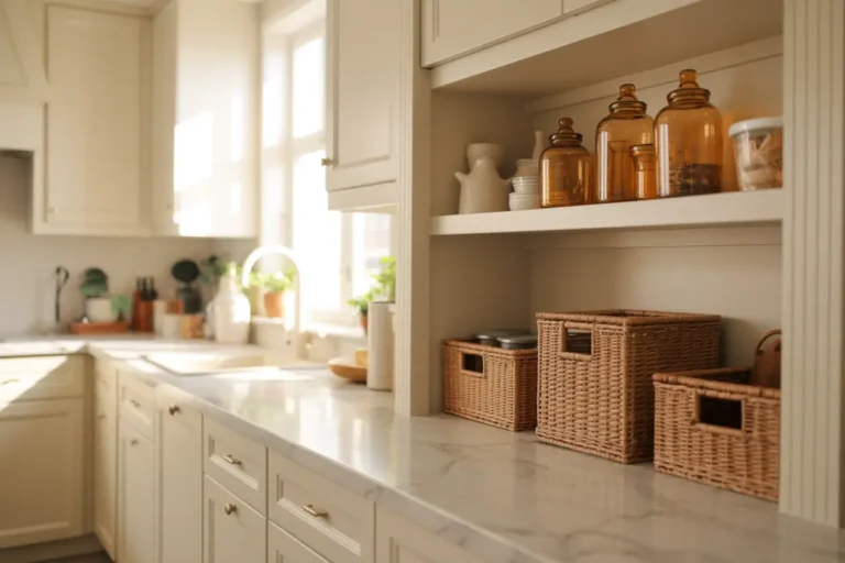
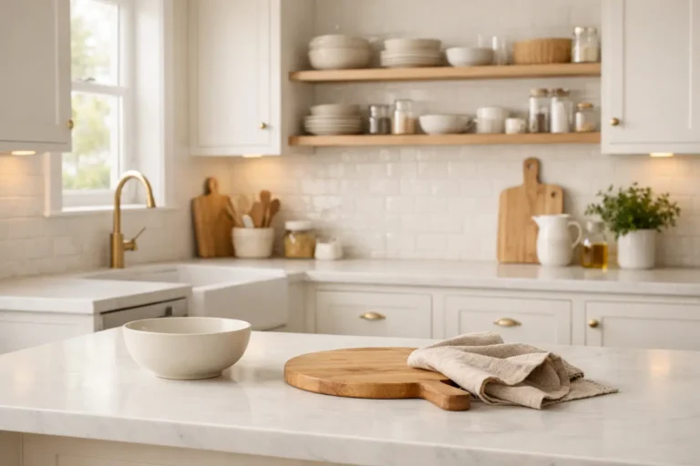
Warm white is one of the safest cabinet colors if you want a bright kitchen without the starkness that sometimes comes with pure white. Its cream, beige, or subtle yellow undertone also makes it easier to combine with natural materials.
It works particularly well beside oak flooring, cream or warm-veined stone, brushed brass, and handmade-looking tile. If your existing countertop contains beige, brown, or gold veining, a warm white often connects with those tones more naturally than an icy white.
I like adding linen window curtains when a kitchen has warm white cabinets because they soften natural light without making the room feel heavy. The gentle texture adds another layer of warmth, helping the space feel bright, calm, and comfortable throughout the day.
Good choice for: small kitchens, low-light spaces, traditional kitchens, warm minimalist interiors
Pairs well with: oak, walnut, warm quartz, marble with warm veining, brass and bronze
Watch out for: mixing noticeably warm cabinets with very cool white countertops
2. Deep Sage Green Cabinets
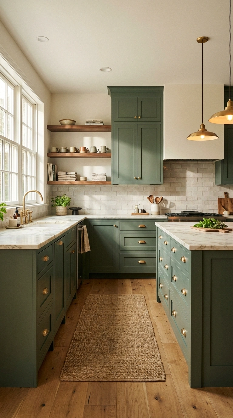
Sage is a useful choice when you want more character than beige or white but still need a cabinet color that behaves almost like a neutral. However, not every sage is equally versatile. A sage with warm, slightly yellow undertones generally works well with cream quartz, oak, walnut, travertine, and aged brass. Grayer sage shades can sit more comfortably beside cooler stone.
Also Read > 22 Kitchen Island Ideas With Smart Storage Solutions
Light also matters. Sage can appear fresh and earthy in a sunny kitchen but considerably grayer in a room with weak daylight. Test the sample on more than one cabinet before ordering or painting the entire kitchen. In a small kitchen, sage can still work well. Keep larger surrounding surfaces relatively light rather than combining green cabinetry with a dark countertop, dark backsplash, and dark floor all at once.
I’ve found that solid brass cabinet pulls with a warm brushed finish quietly tie this look together without taking attention away from the sage color. I like how the soft metal adds warmth, brings out the natural green tones, and pairs easily with wood, marble, and handmade-style tile.
3. Rich Navy Blue Cabinets
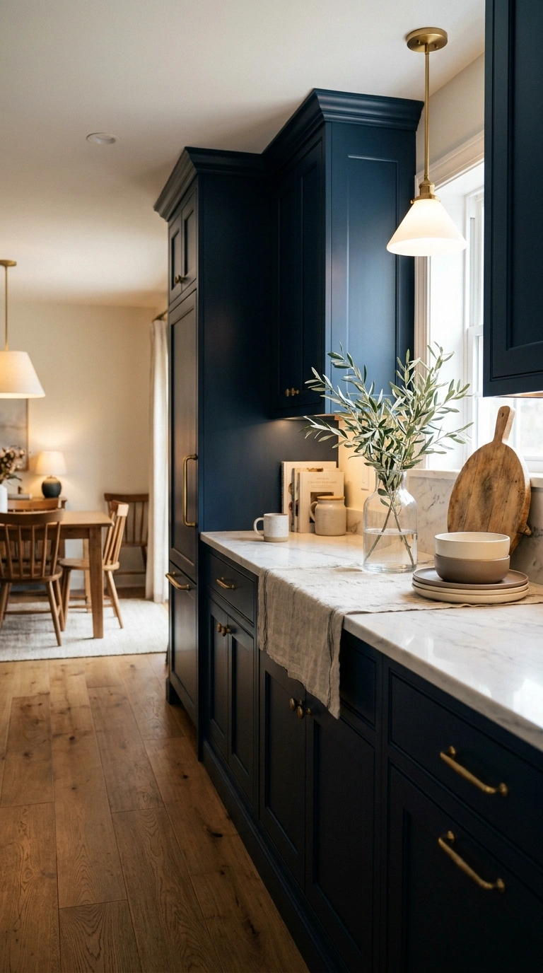
Navy has enough depth to create contrast but is more familiar and versatile than many brighter blues. That makes it one of the stronger choices if you want dark cabinetry without going completely black. It looks particularly sharp against white or lightly veined stone and can be warmed with oak, walnut, aged brass, or woven materials.
Navy does need sufficient visual breathing room. In a kitchen with limited daylight, dark flooring, and a narrow layout, navy on every cabinet can make the room feel enclosed. Using it on an island or the lower cabinetry is a lower-risk alternative. The finish changes the effect too. A satin finish reflects a little light and makes dark blue easier to maintain, while a very flat finish creates a softer architectural look but may show handling differently depending on the cabinet material.
I’ve found that woven counter stools help break up the richness of navy cabinets by adding natural texture. They keep the kitchen feeling relaxed instead of formal, and the woven finish pairs easily with wood floors, marble, and soft neutral accents.
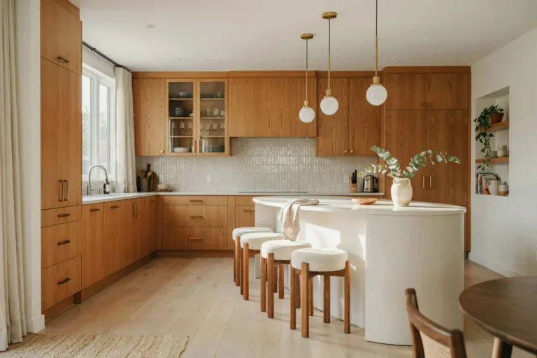
4. Natural Oak Wood Cabinets
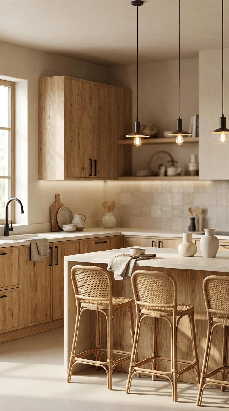
Natural oak is different from a painted cabinet color because its appeal comes from both the tone and the grain. Today’s lighter oak cabinetry also looks very different from the glossy orange-toned oak common in older kitchens. For a more current but long-lasting look, choose a finish that allows the natural grain to remain visible without pushing the wood heavily toward orange, gray, or an artificial-looking stain.
Oak is especially effective in kitchens dominated by hard surfaces. Wood grain adds warmth against quartz, stone, tile, and stainless-steel appliances without requiring another decorative color. It is also forgiving in family kitchens because natural variation in the grain can make minor marks less visually obvious than they may be on a perfectly uniform painted surface.
5. Charcoal Gray Cabinets
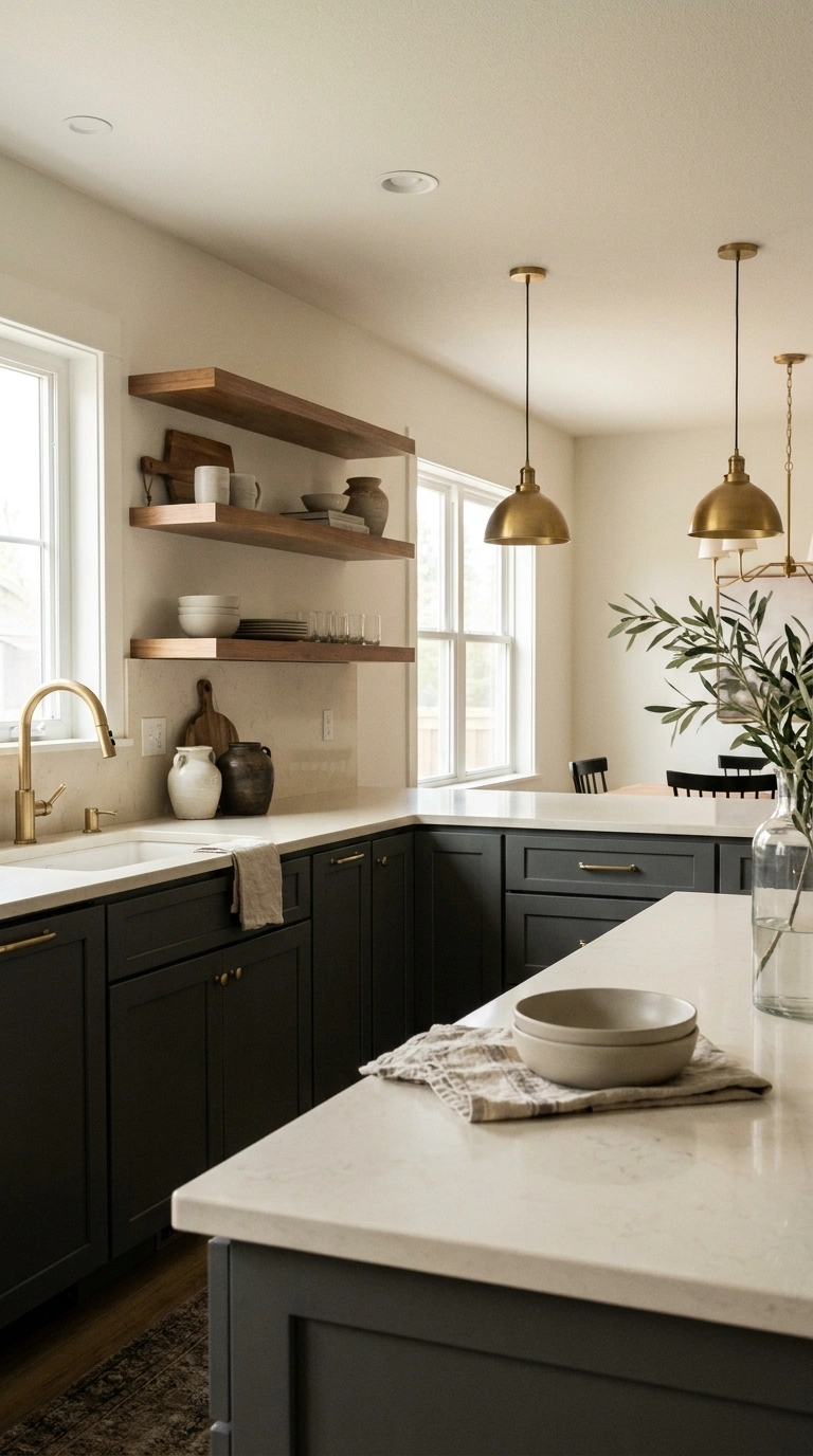
Charcoal provides much of the drama of black cabinetry but has a slightly softer appearance. It can work especially well when a kitchen needs contrast against pale stone, warm wood, or light walls. The undertone is important. Some charcoals lean blue, while others have warmer brown or green undertones. Compare the sample with your countertop rather than choosing a dark gray based only on how it looks online. Lighting is another consideration. Charcoal absorbs considerably more light than warm white, beige, or oak, so it is easier to use in a kitchen with good daylight or a well-planned combination of ceiling, task, and under-cabinet lighting.
For a smaller kitchen, consider charcoal lower cabinets with lighter walls or uppers. You keep the visual depth at the bottom of the room while leaving eye level brighter. Charcoal is more of a commitment than warm white or oak, but it remains considerably easier to adapt than many highly saturated cabinet colors.
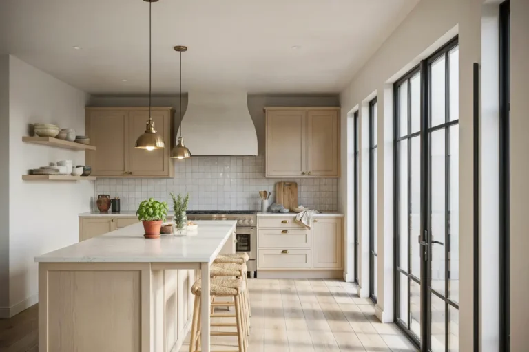
6. Creamy Beige Cabinets
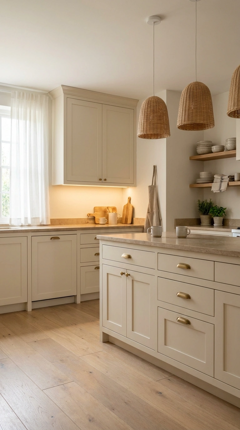
Creamy beige cabinets are a strong alternative to white when you want a light kitchen with more warmth. The color is neutral enough to live with for years, but it has enough depth to keep an all-neutral kitchen from feeling stark.
Beige works particularly well with materials that already have warm undertones, such as limestone, travertine, walnut, warm-veined quartz, and brushed brass. If your flooring contains honey, tan, or medium-brown tones, beige can also create a smoother transition between the cabinets and floor than a cool white.
The biggest mistake is assuming every beige works with every warm finish. Some shades lean yellow, peach, pink, or gray. Compare a large cabinet sample directly with your countertop and flooring before making the final choice.
7. Matte Black Cabinets
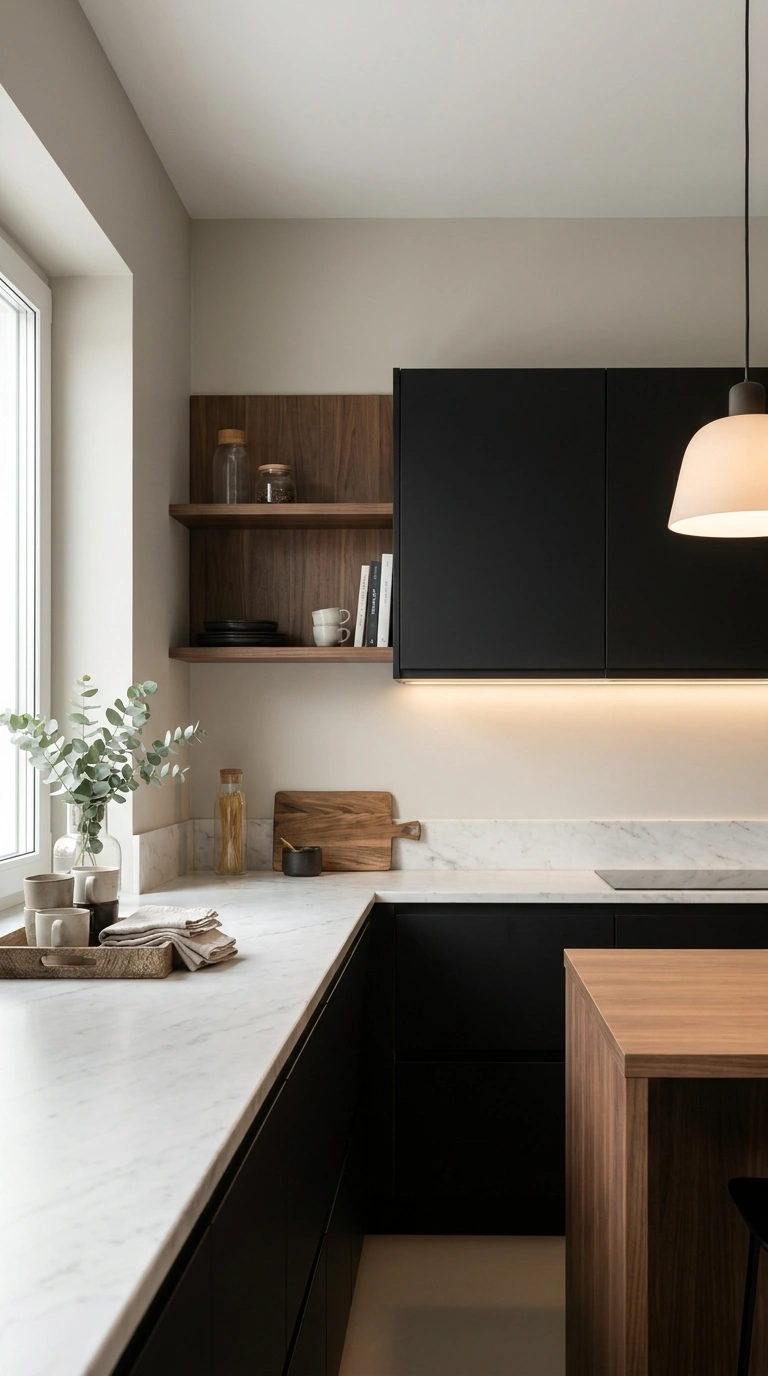
Matte black cabinets can remain stylish for years, but they require more planning than lighter neutrals. Black visually advances rather than recedes, so it has a stronger presence in the room.
It works particularly well when there is enough contrast around it. Pale countertops, warm wood flooring, light walls, or a bright backsplash prevent the cabinetry from turning into one large dark block.
Before choosing a matte finish, consider everyday maintenance too. Very dark, flat surfaces can reveal dust, grease, fingerprints, and water marks depending on the cabinet material. Ask for a finished door sample and handle it for several days rather than judging the finish only from a showroom display. For smaller kitchens, black is often easier to introduce on an island, pantry wall, or lower cabinets instead of covering every cabinet.
8. Dusty Blue Cabinets
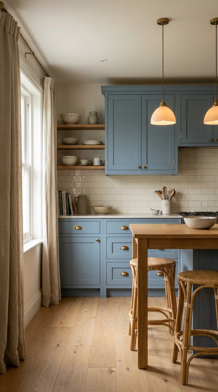
Dusty blue sits between decorative blue and a muted neutral. Its gray undertone makes it quieter than brighter coastal blues, which can make it easier to use across an entire kitchen. The exact undertone matters. Some dusty blues lean noticeably gray, while others have hints of green. Compare the color against your backsplash and countertop, particularly if either surface already contains strong gray, blue, or cream undertones. Dusty blue can work surprisingly well in a small kitchen when paired with light countertops and flooring. Unlike navy, it usually provides color without absorbing as much light.
One thing I always reach for with dusty blue cabinets is a textured natural woven runner rug. I’ve found it adds gentle warmth underfoot while bringing in the woven texture that helps the soft blue feel more relaxed and inviting without taking attention away from the cabinets or other finishes.
9. Warm Taupe Cabinets
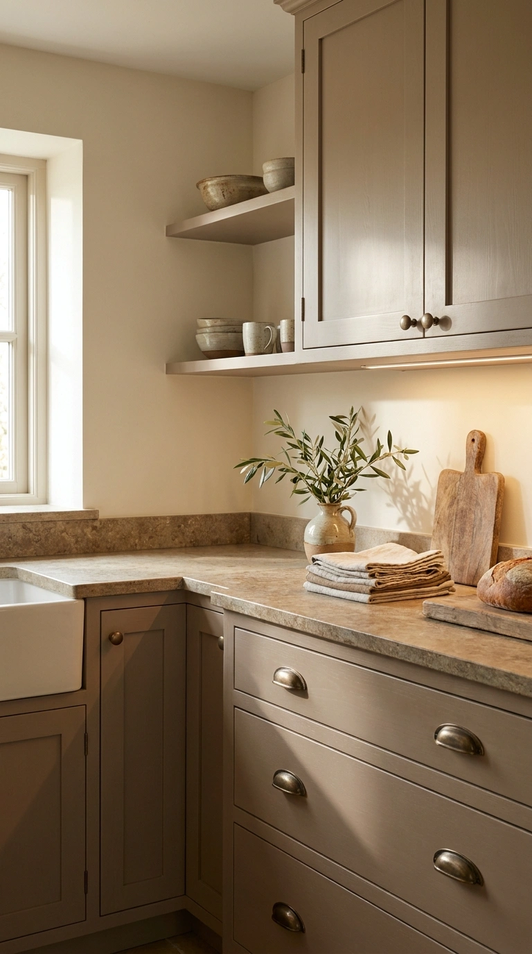
Taupe is useful when beige feels too warm but gray feels too cool. It combines brown, beige, and gray in different proportions, giving the cabinetry more depth than a straightforward neutral. That flexibility is also what makes taupe tricky. One shade may lean mushroom-brown while another looks almost gray. Rather than searching for the “perfect taupe” in isolation, choose the version that relates to the undertones already present in your kitchen.
Warm taupe works particularly well beside stone with beige or brown veining. Oak, walnut, bronze, and aged brass can reinforce its warmer side without turning the room yellow. Because it does not rely on a highly saturated color, warm taupe is among the lower-commitment choices on this list.
Also Read > 21 IKEA Coffee Bar Hacks for a Stylish Home Coffee Station
10. Classic Greige Cabinets
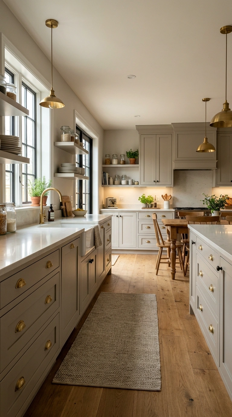
Greige combines gray and beige, but the best version for your kitchen depends on which side of that balance works with the existing finishes. A warmer greige can bridge cream countertops and oak floors, while a cooler greige may sit more comfortably beside marble, nickel, and cooler stone. This makes greige versatile, but it also means choosing from a tiny online color sample is risky.
Greige is particularly useful when you want cabinetry darker than off-white but don’t want beige to dominate the room. It provides subtle definition without creating the visual weight of navy, charcoal, or black. Pay particular attention to flooring. A greige with a violet or pink undertone can look noticeably different beside yellow-toned oak than it does on a standalone sample. If you’re remodeling gradually and expect to change hardware, lighting, or wall colors later, greige gives you considerable flexibility.
11. Soft Olive Green Cabinets
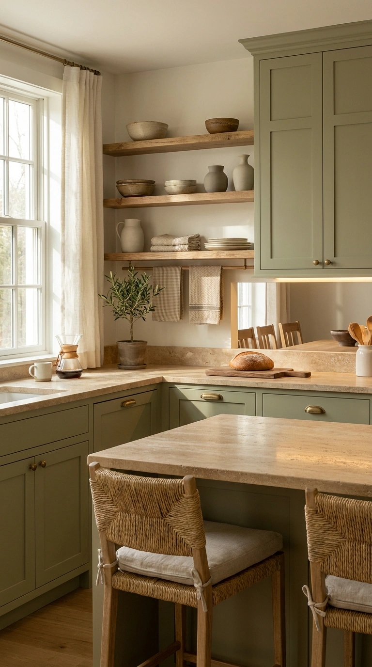
Olive is deeper and earthier than sage. It contains more yellow or brown, which gives it a warmer, grounded character and makes it particularly effective beside natural materials. Travertine, limestone, oak, walnut, unlacquered brass, and creamy stone all complement olive well. It can also work with terracotta, although using both across large surfaces creates a much warmer and more distinctive palette.
Because olive has more visual weight than sage, room size and daylight deserve attention. In a darker kitchen, consider using it below counter level or on a single bank of cabinetry while keeping surrounding surfaces lighter. Olive is also sensitive to artificial lighting. Very warm bulbs can exaggerate its yellow undertone, while cooler lighting may make it appear muddier.
I like adding linen café curtains because they filter sunlight while keeping the kitchen feeling open and relaxed. The soft fabric works beautifully with olive green cabinets and natural wood, adding texture without taking attention away from the cabinetry.
12. Warm Walnut Brown Cabinets
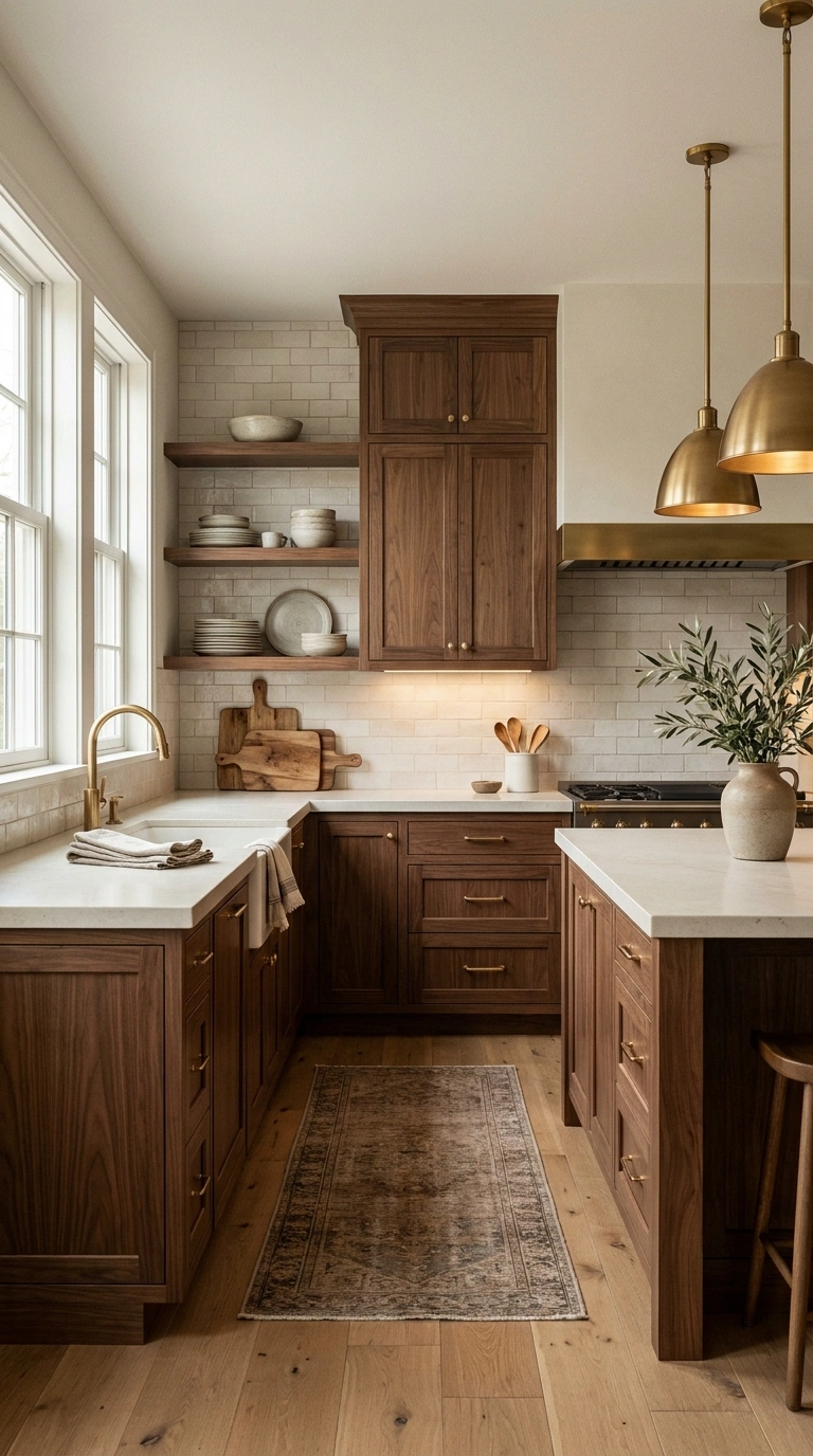
Walnut earns its place on this list for a different reason than painted brown cabinetry. The natural grain gives the surface movement and variation, so the cabinets don’t depend on one flat color for their character. Its deeper brown tone can make a kitchen feel substantial and warm without the heaviness of solid black. Walnut also creates an effective contrast against pale quartz, marble, plaster, and creamy walls.
Because walnut already has a strong visual grain, it usually doesn’t need a highly patterned backsplash competing with it. If both the countertop and backsplash have dramatic veining, the room can become visually busy. If you are mixing walnut with another wood, don’t try to make the two finishes almost—but not quite—the same. A deliberate contrast often looks more considered than two mismatched brown tones.
Walnut is particularly effective on flat-front cabinetry, where the grain becomes part of the design. Shaker doors can also work, but they create a more traditional effect.
13. Pale Mushroom Cabinets
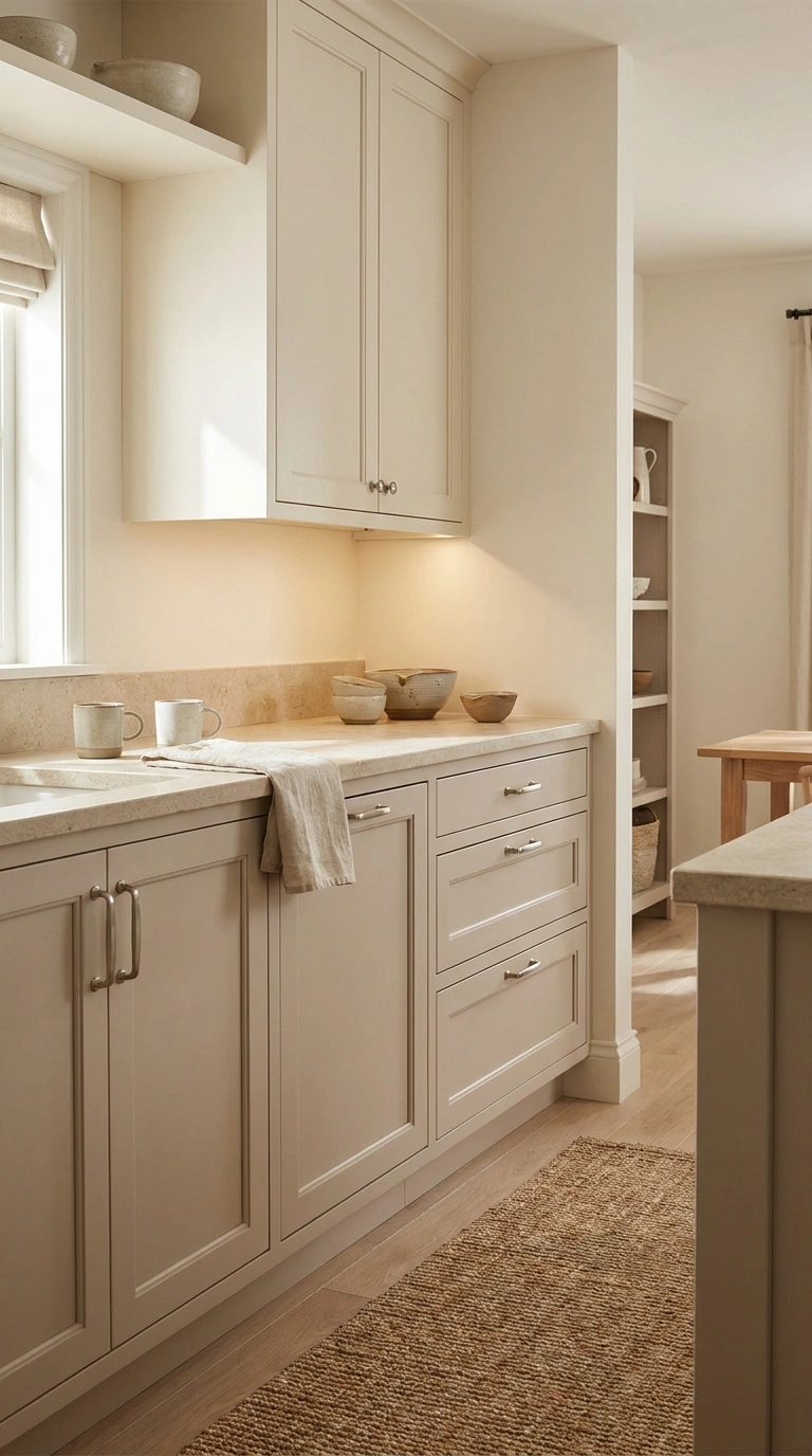
Pale mushroom is a warm neutral that sits somewhere between beige, taupe, and soft gray. It gives cabinetry more definition than off-white while keeping the kitchen light and understated.
Mushroom works especially well when a kitchen already contains warm stone, oak, or creamy surfaces. Its brown-gray undertones can connect these materials without creating the stronger yellow cast that some beige cabinets have.
Natural light can change this color considerably. In a bright south-facing kitchen, mushroom may appear warmer and more beige. Under cooler light, the gray side can become more noticeable. Always test the sample beside the countertop rather than against a plain white wall. If you’re deciding between mushroom and greige, mushroom generally feels warmer and earthier. That makes it particularly useful when natural wood is already a major part of the kitchen.
14. Crisp Off-White Cabinets
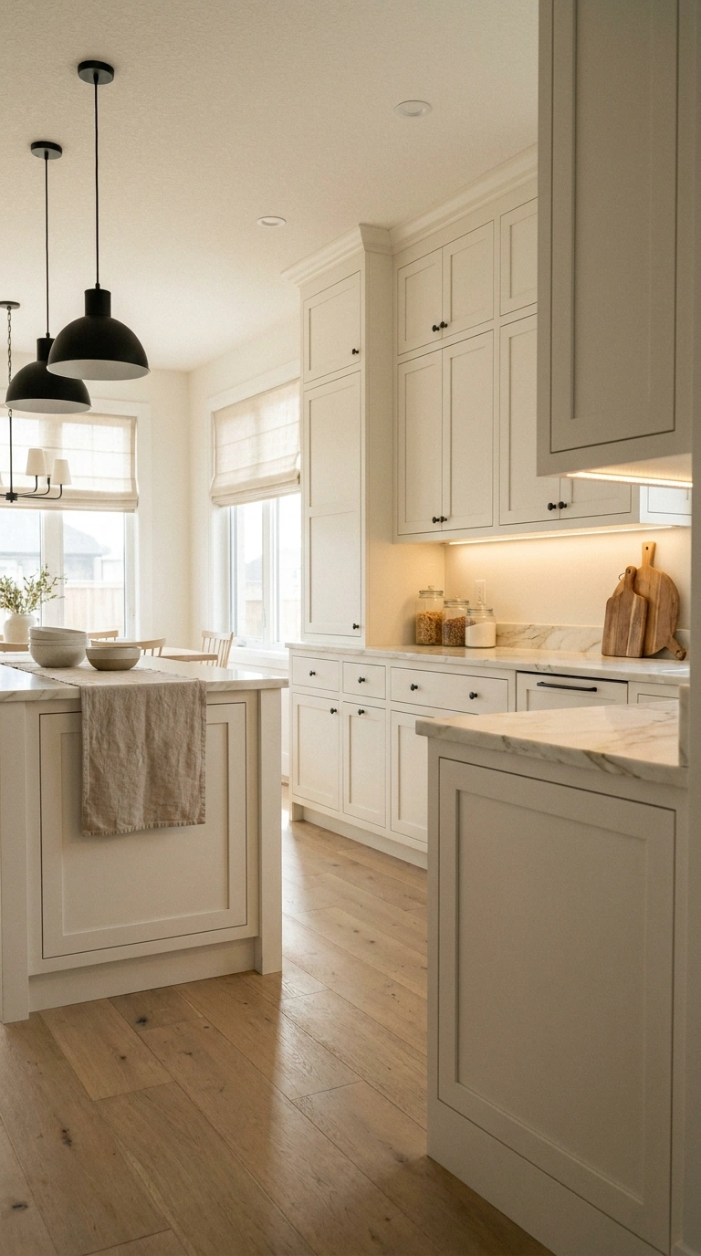
Off-white is one of the easiest cabinet colors to adapt as the rest of your kitchen changes. It provides the brightness associated with white cabinetry without necessarily creating the sharp contrast of a pure, cool white. The challenge is that “off-white” covers a large range of undertones. Some shades lean cream, others beige, gray, or even slightly green. The best choice is the one that relates to the permanent materials already in the room.
For example, a warm off-white can complement oak floors and cream stone, while a more neutral off-white may work better with white quartz and cooler marble. For homeowners prioritizing flexibility and longevity, off-white remains one of the lowest-risk choices in this guide.
I’ve found that adding a natural woven countertop basket helps reinforce the soft warmth of off-white cabinets without making the space feel busy. It brings in texture that balances the smooth cabinet finish while keeping everyday items organized and easy to reach, which helps the kitchen stay bright and welcoming.
15. Smoky Blue Gray Cabinets
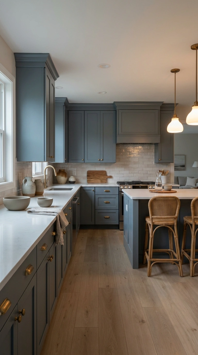
Smoky blue-gray gives you visible color without the intensity of navy. The gray component softens the blue, making it easier to use across a larger amount of cabinetry. This color works particularly well when the rest of the kitchen is relatively restrained. Creamy quartz, pale wood, simple tile, and warm metal hardware can prevent the blue-gray palette from becoming overly cool. Lighting deserves close attention. In cool daylight, some smoky blues can read predominantly gray. Under warmer evening lighting, more of the blue may become visible.
Good choice for: transitional, coastal, cottage and vintage-inspired kitchens
Pairs well with: cream quartz, pale oak, warm brass, nickel and soft white
Watch out for: cool gray flooring combined with cool blue-gray cabinets and cool lighting
16. Earthy Clay Cabinets
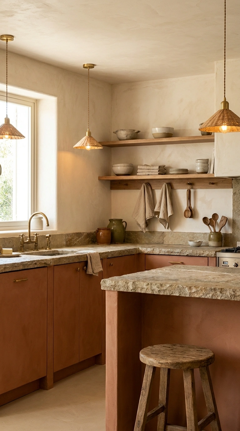
Clay cabinetry brings considerably more personality than white, beige, or wood. Its muted terracotta character can create a warm, inviting kitchen, particularly when paired with natural materials. Cream stone, pale oak, plaster-style walls, and warm metals complement clay without competing with it. Because the cabinet color is already expressive, keeping the countertop and backsplash relatively quiet often produces a more balanced result.
Clay is also strongly affected by undertones. Some versions lean brown and muted, while others move closer to orange or pink. The more saturated the color becomes, the greater the commitment. This is where I’d make an important distinction: clay can age beautifully, but it isn’t as universally timeless as warm white, oak, walnut, or mushroom. Choose it because its earthy warmth suits your home, not because you are looking for the safest neutral.
17. Soft Black Brown Cabinets
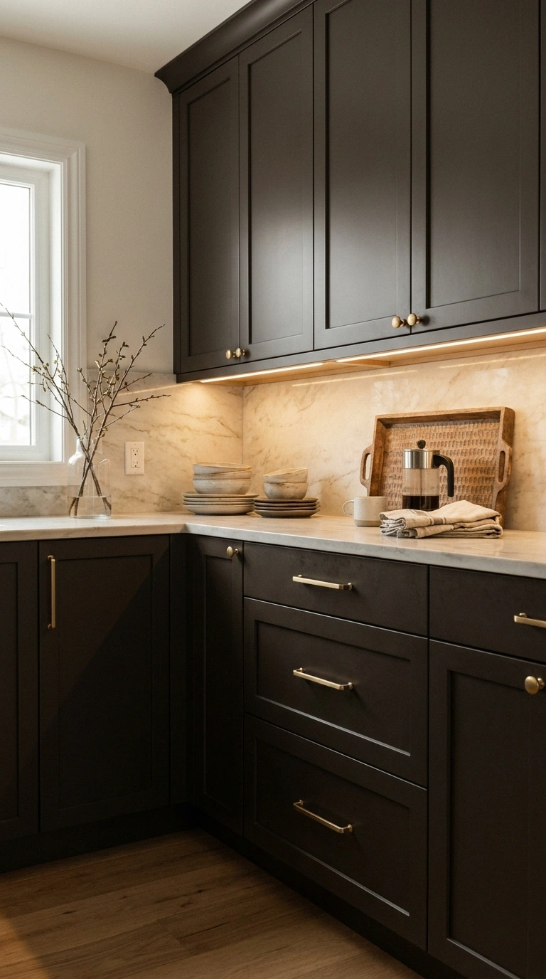
Black-brown cabinetry provides the depth of a very dark kitchen while retaining some of the warmth associated with wood and espresso tones. In daylight, it may read as deep brown; from a distance or in lower light, it can appear almost black. That subtle variation makes it useful when pure black feels too severe.
Pairing it with lighter surfaces is usually the safest approach. Cream stone, warm marble, pale oak, or light walls provide enough contrast for the cabinet shape and details to remain visible. Hardware can also change the character significantly. Brass emphasizes warmth, while black hardware creates a quieter, more monolithic appearance.
For a small kitchen, consider limiting black-brown to the lower cabinets or a tall pantry section rather than surrounding the entire room with it.
18. Muted Sand Cabinets
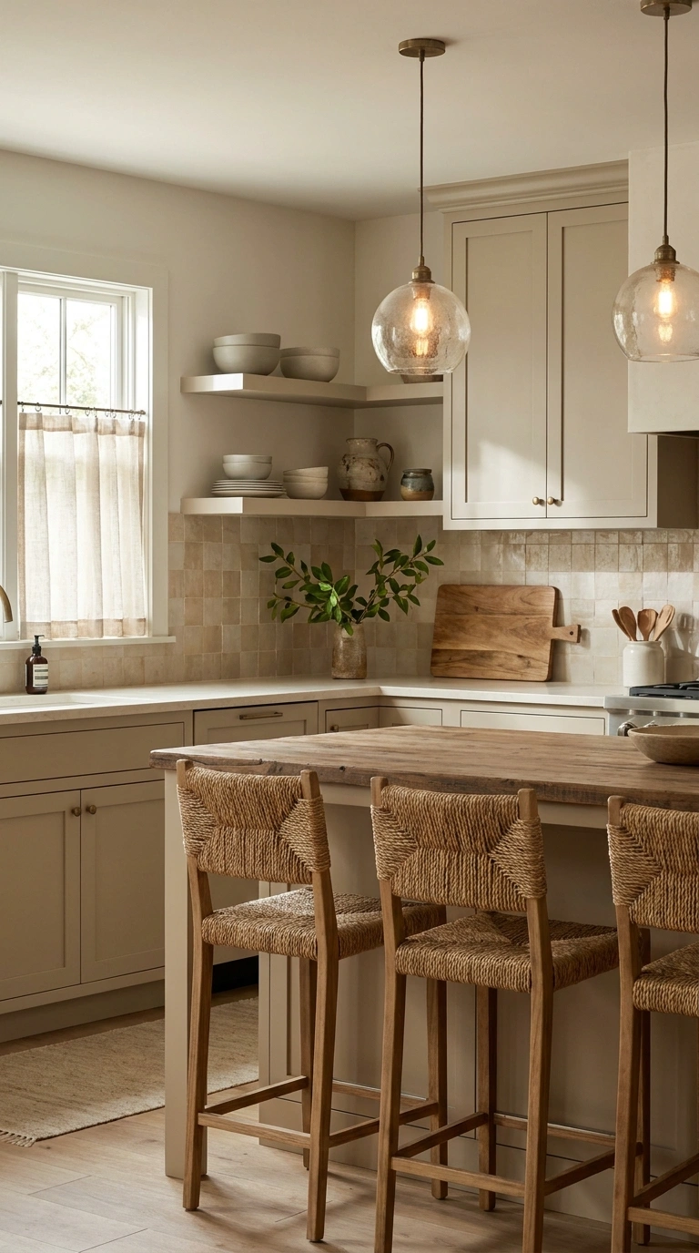
Muted sand is a light beige with an earthy rather than creamy character. It can provide the brightness people often want from white while creating a softer transition to wood, stone, and other natural materials. This makes sand particularly useful in kitchens where stark white would create too much contrast against warm flooring.
Because sand is subtle, texture becomes important. Flat neutral cabinetry beside a plain countertop and plain backsplash can lack definition. Visible wood grain, handmade-style tile, stone, or textured lighting can provide contrast without changing the restrained palette. Muted sand also performs well in small kitchens because it keeps large surfaces relatively light.
If you’re choosing between sand and beige, think of sand as the quieter, earthier option. It works particularly well when you want the room to feel warm without looking overtly creamy.
19. Forest Green Cabinets
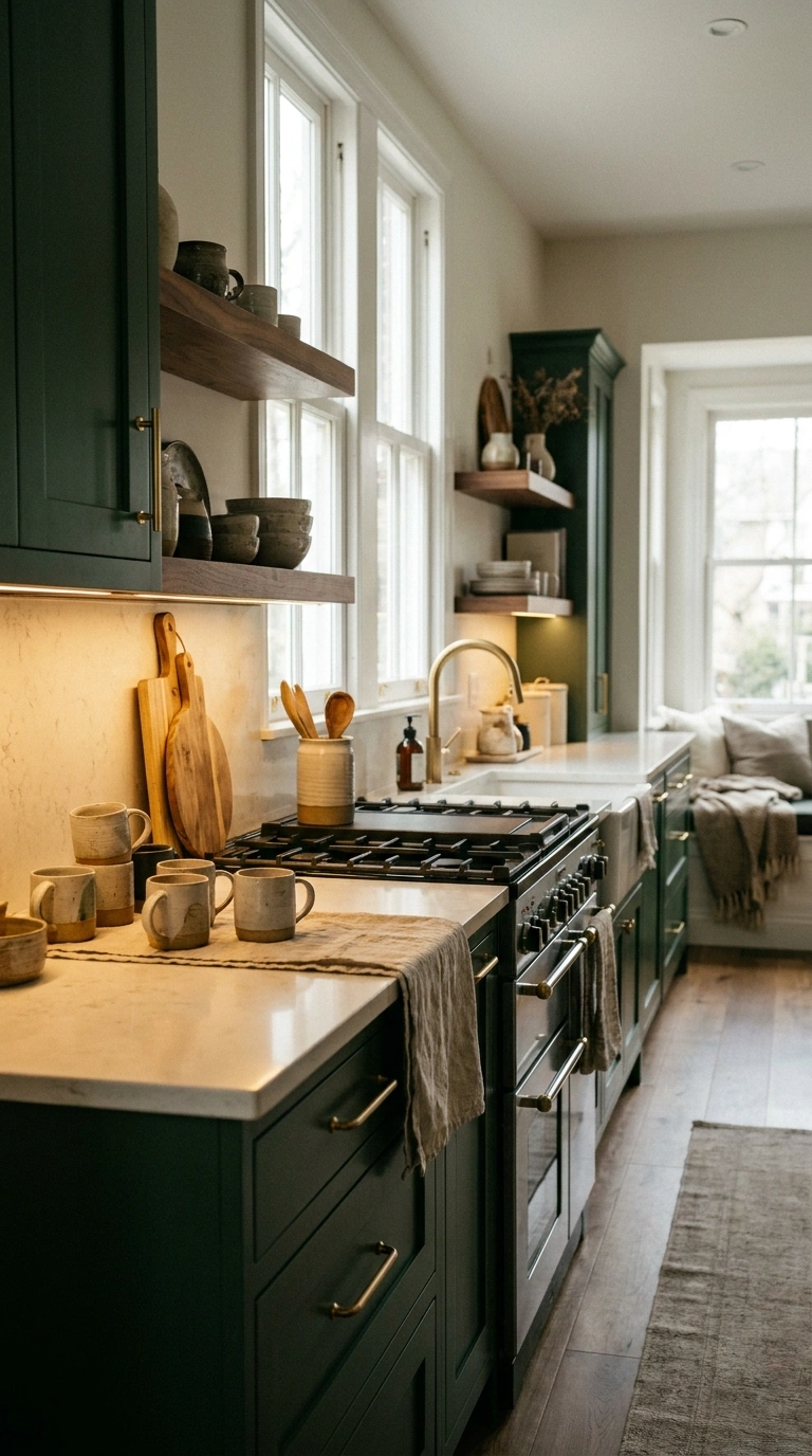
Forest green creates considerably more contrast than sage or olive. It works best when you want the cabinetry to become an intentional feature rather than quietly blend into the background.
The depth of the green pairs particularly well with pale stone and warm wood. Walnut can make forest green feel richer and more traditional, while light oak creates a fresher contrast.
Because forest green absorbs light, consider how much of it the room can comfortably handle. A large kitchen with windows may support full green cabinetry, while a smaller or darker kitchen may benefit from using it on an island or lower cabinets. Forest green can have real longevity, but it is a higher-commitment choice than sage. If you’re unsure about living with a dark color for years, introducing it on an island first is the safer approach.
20. Light Gray Beige Cabinets

Gray-beige is useful when you want a light neutral but find traditional beige too warm and standard gray too cool.
Its balanced character makes it relatively easy to combine with white tile, quartz, oak, and both warm and cool metal finishes. This flexibility is particularly valuable when you’re updating a kitchen without replacing every existing surface.
But don’t rely on the color name alone. Gray-beige samples can lean pink, green, violet, or yellow depending on the formula and surrounding light. A gray-beige cabinet is particularly effective when you want slight contrast against white walls without introducing a noticeable decorative color.
If you’re renovating for longevity rather than making a strong style statement, this belongs among the safer options because surrounding finishes can change without necessarily requiring new cabinetry.
21. Classic Espresso Cabinets
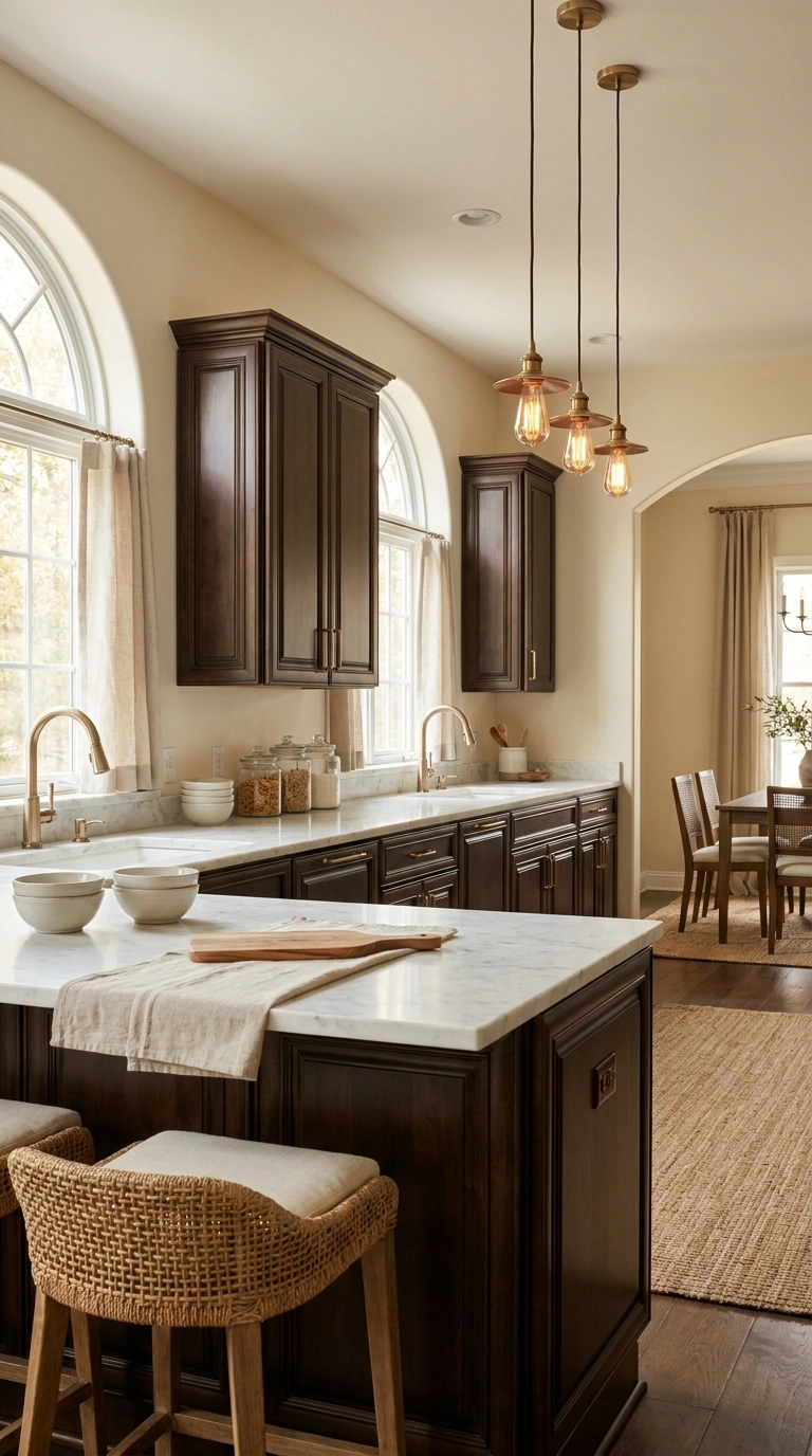
Espresso cabinets can still work in a current kitchen, but the surrounding finishes determine whether they feel rich or dated.
Older espresso kitchens were often paired with dark granite, dark flooring, ornate cabinetry, and warm yellow lighting. When all those elements appear together, the room can become visually heavy.
A more balanced approach is to contrast espresso cabinetry with lighter stone, simpler backsplashes, and adequate lighting. Pale flooring or walls can also help define the dark cabinets rather than allowing them to dominate the room. Door style matters here too. A simple Shaker or streamlined cabinet front generally gives espresso a cleaner appearance than highly ornate doors.
If you already have good-quality espresso cabinetry, you may not need to paint it simply because lighter kitchens are popular. Updating the countertop, hardware, backsplash, or lighting can sometimes change the entire impression.
That makes espresso a useful example of an important principle: a cabinet color does not become dated on its own. The combination of color, door style, hardware, countertop, backsplash, and lighting determines how the kitchen reads as a whole.
Which Kitchen Cabinet Colors Are the Safest Long-Term Choices?
Not all 21 colors carry the same level of commitment. If your priority is choosing cabinetry that will be easy to work around for many years, I’d narrow the list this way.
Lowest-Commitment Choices
Warm white, off-white, natural oak, mushroom, greige, gray-beige, and muted sand These colors provide a flexible foundation and can accommodate changes to hardware, lighting, wall paint, stools, and accessories without forcing a full cabinet update.
Timeless With More Character
Sage green, navy, dusty blue, olive, walnut, taupe, and charcoal These have stronger personalities but still pair with a broad range of established kitchen materials.
Higher-Commitment Choices
Matte black, earthy clay, black-brown, forest green, and espresso None of these are automatically a bad choice. They simply have more visual weight or distinctive color, so lighting, room size, and surrounding finishes become more important.
Conclusion
If flexibility and long-term appeal matter most, warm white, off-white, natural oak, mushroom, greige, and walnut are strong places to start. For more color, muted sage, navy, olive, and dusty blue can add personality without relying on an especially short-lived trend.
The final decision should come from your kitchen’s fixed materials and lighting, not from whichever cabinet color looks best in an inspiration photo.
Compare samples directly with the flooring, countertop, and backsplash, and view them at different times of day before committing. A cabinet color has the best chance of aging well when its undertones work with the materials that will remain in the room for years.